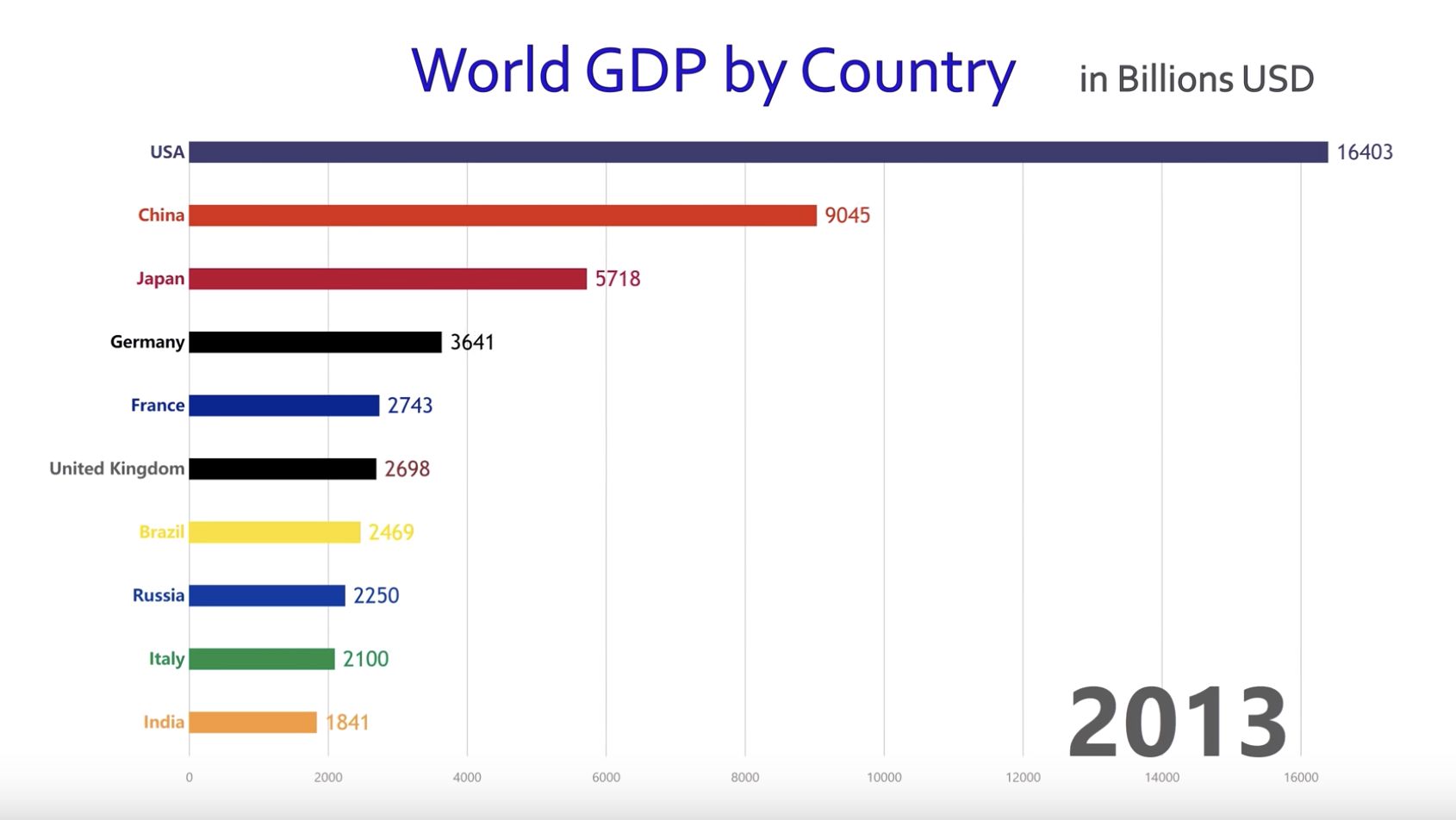
This is a powerful data visualization showing how the top 10 countries in GDP ranking has changed for 1960 – 2017. Basically it’s a simple bar chart but presented in a short video, which makes the presentation more dynamic. You can see US has been dominant for the entire period, Japan grew dramatically in 80s and 90s before it got stagnant, and recently China has grown remarkably. Since this is shared in YouTube and presented in a really simple way, the audience can be anyone interested in the world economy. The goal of this visualization looks really broad and I guess it is to attract many viewers by showing how the world economy has changed over the past 60 years in an interesting way.
I think this is effective in showing the change over the period in a dynamic way. Although the same message can be conveyed by putting different bar charts at different years, this visualization gives more vivid impression. On the other hand, the main message of this video can be focused better. I feel the chart uses too many colors and three minutes is too long. By highlighting charts of some specific countries, the main message of this presentation might be clearer and become more effective.