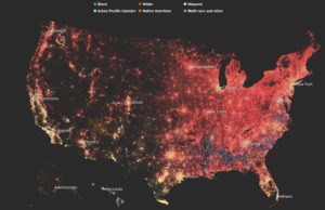
I chose to evaluate the Washington Post’s Segregation Map, from May of last year. I recently came across it while reading about housing and segregation, and I thought it was a really fascinating piece.
I think the audience is pretty broad, though the premise is that these readers care about racial segregation in the first place: the findings are compelling, but only to those who are paying attention to this issue. The goal of this particular piece seems to be pretty clear and stated in the headline: “take note, readers: It is true that America is supposed to be majority-minority in a matter of decades, but that does not mean we are integrated or getting along any better.” In today’s political climate, I think this finding is particularly compelling when we talk about what progress might actually look like.
In many ways, I think the visualization is extremely effective: it is taking quite a lot of census data about race and ZIP code representing 325 million people in a series of maps to show both population and race density. It makes a compelling argument for the fact that we have not, in fact, integrated despite a rise in diverse populations.
But at the same time, I feel it is slightly misleading: does the fact that Houston (as an example) looks more integrated on the map mean it is actually more integrated? My instinct says no, but the visualization challenges my own perspective, which ultimately makes it quite powerful.