Can statistics learning be intuitive? How can learning experience be more creative? Here is an interactive data storytelling example that I found both accurate and engaging: Seeing Theory.
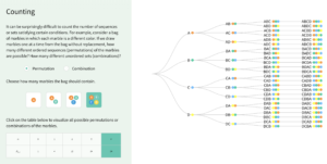
Seeing Theory is an interactive data visualization that makes statistics more accessible. It was built using D3.js, by a group of students from Brown University. By decomposing classic statistics theories to step-by-step playful interactions, Seeing Theory visualizes different statistical events to allow users to better comprehend the seemingly complicated logic behind statistics theories.
Seeing Theory has a wide range of audiences – from high school and college students who just entered the field of statistics, to professionals who want to have a brief understanding of statistics to help with decision-making but nothing too deep. It does a great job in combining both playfulness and learning objective, and tackles the very pain-point of traditional statistics learning experience – where the theories are counterintuitive and difficult to comprehend.
The methods that this visualization applies are groundbreaking and worth-scaling. Thinking about the common methods that embedded within our day-to-day learnings and teachings, are there opportunities can be further explored in order to make the process more engaging and enjoyable? How human-factors can better inform the design of data storytelling? Seeing Theory offers us an alternative of how future learning might look like.