The Future of American Integration

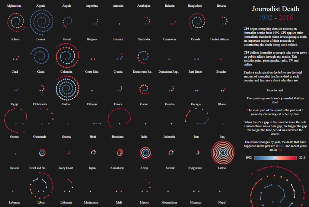
I chose to evaluate the Washington Post’s Segregation Map, from May of last year. I recently came across it while reading about housing and segregation, and I thought it was a really fascinating piece.

I think the audience is pretty broad, though the premise is that these readers care about racial segregation in the first place: the findings are compelling, but only to those who are paying attention to this issue. The goal of this particular piece seems to be pretty clear and stated in the headline: “take note, readers: It is true that America is supposed to be majority-minority in a matter of decades, but that does not mean we are integrated or getting along any better.” In today’s political climate, I think this finding is particularly compelling when we talk about what progress might actually look like.

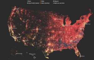
In many ways, I think the visualization is extremely effective: it is taking quite a lot of census data about race and ZIP code representing 325 million people in a series of maps to show both population and race density. It makes a compelling argument for the fact that we have not, in fact, integrated despite a rise in diverse populations.

But at the same time, I feel it is slightly misleading: does the fact that Houston (as an example) looks more integrated on the map mean it is actually more integrated? My instinct says no, but the visualization challenges my own perspective, which ultimately makes it quite powerful.


Journalist Death Records: A Global Overview

This interactive graph by Soha Elghany portrays the death records from the  CPJ (Committee to Protect Journalists). The visualization shows the number of journalists who have died around the world, it uses blue to represent past deaths and red for recent ones. It is also possible to interact with each of the spirals and explore every data point as a story.

The visualization’s goal is to provide an overview of a global problem and let the reader explore it story by story. In my opinion, the main audiences for this work are researchers and the general public. Because the focus is put into navigating stories rather than stats and predictions.

The visualization does a good job getting its core message through as in “journalists are being oppressed worldwide”.  Also, having the data points represented as spirals helps to understand the scale of the problem. However, each data point in the spiral is not the same, while for some countries a data point represents 2 deaths for others it can represent dozens. Also, there is no consistent datapoint sizing, in some cases, 49 deaths can be 4 data points whereas in others they are represented by 2 or 3 data points. From a reader perspective, the choice of font type and size is not ideal, it makes the visualization harder to read. In addition, the choice of colors does not enhance the reading experience. Regional filtering/grouping would have been very insightful to have in this viz.

Link to the data viz

Data Visualization is an Art

Anyone who enters the visitor center at NASA’s Jet Propulsion Lab gets a few fun treats to take pictures with – a cardboard model of Curiosity, a collection of mission patches; but one of the most eye-catching, and in my opinion, interesting, installations is this large sculpture with flickering lights. After your first glance, you begin to notice the pattern – the outside strands have lights that moves up or down, and the inside cylinder has text that appears on it. This stunning mixture of art and data visualization, JPL’s light sculpture is designed to help non-technical visitors learn just how connected we are with space. Using live data, the sculpture cycles between different US satellites, displaying the name of the current satellite on the central piece, and illustrating the magnitude of the data being uplinked and downlinked from that satellite at the time on the outside. The more data, the more lights will turn on, with uplinks moving up the sculpture, and downlinks moving down.

While this might not communicate detailed technical data, it’s a very effective visualization tool, because it’s targeted towards non-technical guests and tourists. Often, space feels “far off” and removed from daily life – this sculpture intends to form a different impression with visitors to show that the work being done at NASA matters, and that Earth is actually communicating with satellites in space all the time. Although there is an informational stand next to the sculpture, the eye-catching scrolling text allows you to deduce what information is being conveyed without reading the sign.

If you want to see the sculpture in action, check out a video here:

The Shrinking Middle Class Data Viz

Nicholas Rapp and Matthew Heimer released a set of visualizations on Fortune this past December illustrating different metrics to understand the economic status of the American middle class amidst growing economic inequality. The map pictured above depicts the “housing wage,” or hourly wage needed by a renter to afford the rent for a 2-bedroom apartment at the Fair Market Rent (FMR) in different cities across the country.

The intended audience here is anyone who would consider themselves a member of the middle class. We know from recent studies that many more Americans believe themselves to be middle class than are in actuality, and this viz capitalizes on that outsized identification by not defining what it means by the “middle class” in income, employment, or other economic terms.

The goal of this project is to demonstrate just how economically burdened middle class Americans are as the rich grow richer. The additional graphs and charts shown in this feature show America’s “awkward global company” in being a highly unequal developed country, and how the economic standing of the American middle class has degraded over the years in terms of personal savings, retirement savings, and purchasing power.

Though I think the housing wage map is evocative, it left me with more questions than answers about the state of housing for the middle class in different US cities.  The housing wage is depicted by the height of the skyscraper over the city, which is not the clearest symbology visually: the differences do not render well across all cases, and are mostly useful in understanding the extreme outliers (San Francisco, Seattle, NYC, etc.). The color gradient is organized from low to high required hourly wages, which is logical, but the shades of blue and orange at the bottom and top of the gradient respectively are not so easily deciphered with the naked eye and comparing heights of skyscrapers for cities not geographically near one another is also challenging.

I would appreciate more context with this data, since its ultimate goal is to generalize across a class of people. Including data about how many residents achieve this hourly wage level would be helpful to understand how inclusive the housing market is of the middle class. The available documentation do not help in answering some of my questions because I have a feeling the data were compiled at different geographies (e.g. the map indicates cities, but Area Median Income (AMI) is measured at the metro level). While the map is no doubt beautiful, and is admirable for labeling large and small cities across the country (despite choosing symbology that best serves the outliers), I found its symbology more confusing than visually inventive.


Mass Incarceration in the U.S.

I came across Prison Policy Initiative’s Mass Incarceration: The Whole Piece 2018 whilst doing research for a project. The pie chart shows the no. of people incarcerated, where (types of facilities) they are incarcerated in, why they are incarcerated, demographics of people incarcerated, and whether they are convicted or not.

The visualization aims to offer up a comprehensive overview of the state of mass incarceration in the United States in a single chart. So much of the information surrounding mass incarceration is fragmented because different facilities are run by different government bodies and states i.e. federal prisons vs. state prisons vs. local jails. Without a comprehensive overview, it is hard to articulate the scale and scope of mass incarceration in the country and harder to make a case for the urgency required for criminal justice reform.

Prison Policy Initiative’s work is mostly targeted at researchers and policymakers but the visualizations are also intended for the general public.

I think this pie chart does a good job at providing a high-level, quick overview of the state of mass incarceration as it shows the distribution of incarcerated individuals across federal, state prisons and local jails and a broad breakdown of the offenses. It is also helpful having all of that information encapsulated within a single chart. However, it works as a double-edged sword. Whilst helpful for a quick introductory overview of mass incarceration, compressing all that data in one chart doesn’t leave room for nuances; offense categories are blanketed. From a design perspective, the use of colors is confusing; the bar on the right seems misplaced; the groupings of categories is not consistent i.e. the middle ring shows a breakdown of convicted vs. non-convicted persons in local jails whereas the same ring shows a breakdown of offenses in state prisons. Finally, the visualization is incomplete is illustrating the state of mass incarceration – it only shows a breakdown of people in correctional facilities but doesn’t account for almost 5 million on probation and parole.