Dinner Hackers

Our Data Story

Incoming MIT Students have it tough. While classes are hard, so is the sudden independence and decision-making around food. This is particularly true for students on East Campus, many of whom don’t have a meal plan as first years. While nutritious food is, in theory, available and affordable, there are some challenges around making it available and accessible to students.

There are a few particular barriers we identified through conversations with undergraduate students:

  • The lack of shopping options that are available to the students
  • A lack of understanding around how much food costs and is required to prepare
  • The availability of unhealthy food more easily – it is more physically proximate than more healthful foods
  • Understanding what kinds of food are even available and healthy. When students see nutritious food, how do they act on it?

Understanding our Audience

  • Our audience for this particular data story is freshmen at MIT Orientation who are not on a meal plan. This is a game designed for groups of 4 to play for roughly 30 minutes that draws them in with the promise of a small prize and an opportunity to strategize (if not at MIT, then where?). The combination of discussion questions, literal storytelling, and data embedded in the game can allow people to connect different points of information.
  • We wanted to tell them this particular data story because we believe that this is an important and underlooked issue: a 2017 report showed that 13% of MIT undergraduate Students are food insecure, and while there have been initiatives by the administration to increase access to food, studies show that access is only half the equation: educating the buying public about their consumption choices can help them leverage this increased access to food in a meaningful way.
  • We also think that this game can have an outsized impact: even though at orientation realistically, only a small number of students will play, students live in close quarters and are likely to engage in conversation about this issue and help create larger conversation.

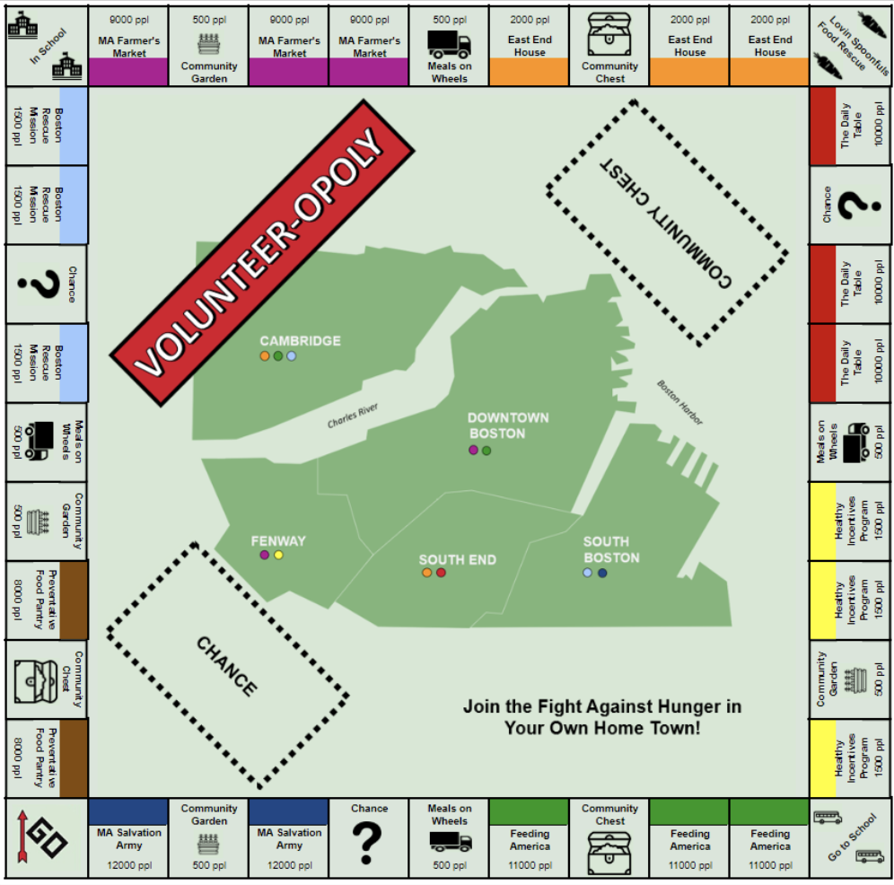
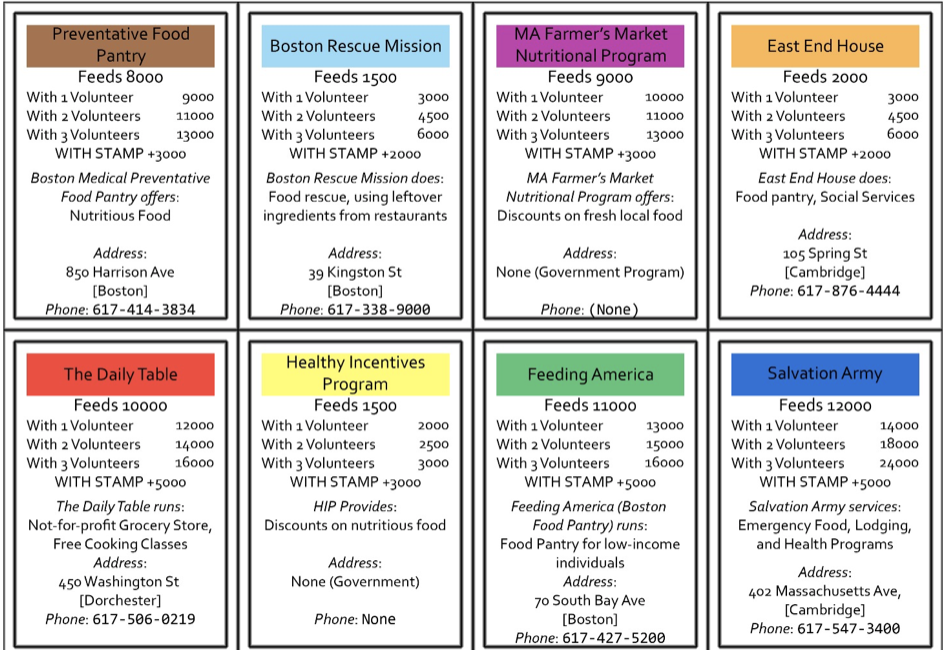
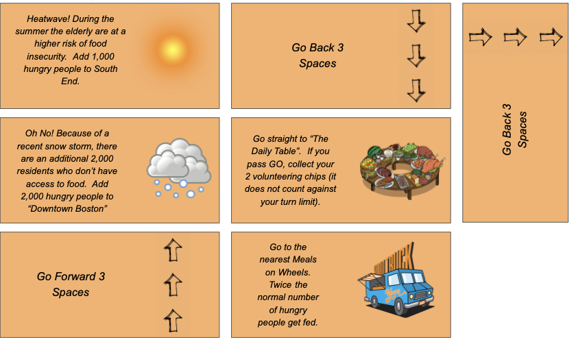
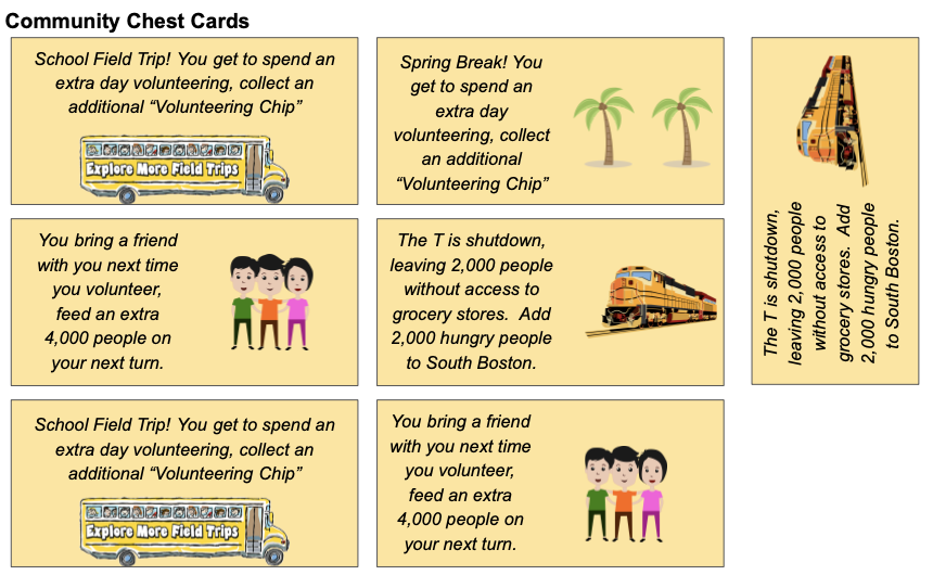
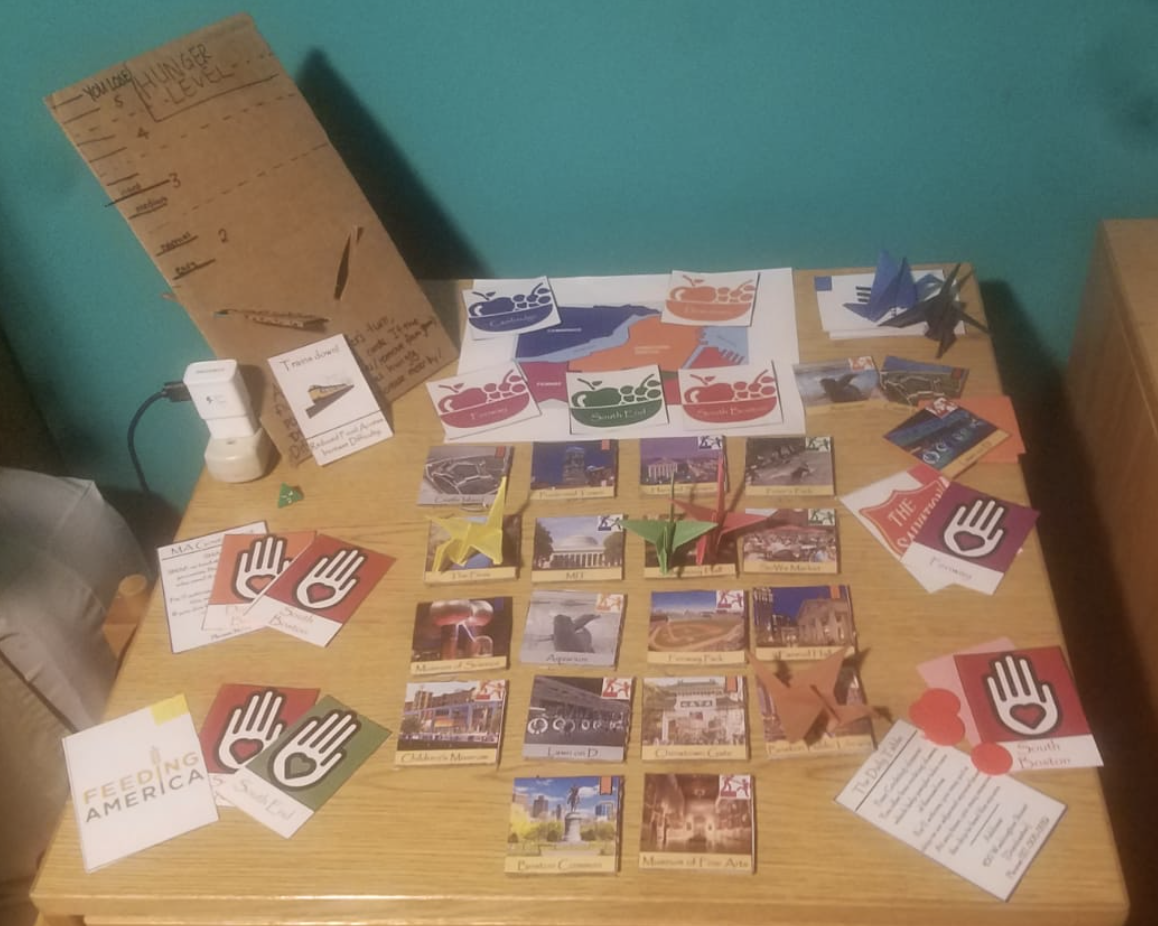
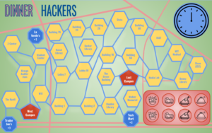
At a high level, our game is comprised of a board that resembles the MIT campus. Each player first draws a card which determines where on the board they start (the “role cards”). One of these players is the chef. Then, at each turn, players draw event cards and move spaces if possible. Finally, they draw food cards (the number varies depending on the event cards) with different point values depending on the nutrition values. Players must strategize on how to end up in the same place as the Chef, who then takes the food cards and tries to maximize the point values by filling in 8 empty “plates.” at the end of the board. To promote some social cohesion, we also included discussion questions on some of the event cards.

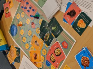
We ran a pilot game with four players (thanks to the promise of snacks) and received some valuable feedback. On the positive side, players felt that much of the board and the specific choices of events accurately reflected some of the barriers to free food. They also enjoyed discussion questions which prompted them to think about their lives and how to engage with others. Based on their feedback, we also made some changes to the actions to make the game more engaging; we also shortened the length of play time to increase the challenge component. Finally, we enhanced the discussion questions by centering them only around food.

Processing the data

When we started working on this process, it was driven largely by the data from the report from the Food Insecurity Solutions Working Group at MIT, which reported that 13% of undergraduate students have trouble accessing food. This alarming statistic suggested that more needed to be done to empower students into accessing food, and making sure that these were nutritious options. This game, driven by food supply and life event data, aims to create a social experience that also empower incoming students.

We incorporated a couple of data sources in our game, ranging from anecdotal and qualitative to specific nutritional data.

First, we looked at data from the MIT Sloan Slack channel to gather data on free food offerings and understand the nature of the food easily available around campus. We then added categories of home-cooked meals, based on anecdotal data of the popularity of dishes from cooking groups.

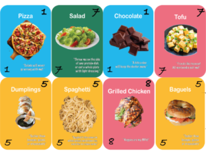
Our next step was to get point values for each of these dishes. Our rewards system values are derived from the USDA Food Composition database. We categorized approximately 40 foods into protein, produce (fruits and veggies), starches, and junk food. Proteins were ranked by “protein per 100 grams,” starches by “fiber per 100 grams,” and produce by “vitamins and minerals per 100 grams.” Junk food was given a 1-point value across the board. While an imperfect measurement method, this system allowed us to generally assess each food’s value as it pertains to decision-making for MIT freshmen.

In addition to this data, we also incorporated spatial data into the board game itself: the board is actually a schematic map/diagram of key buildings and landmarks akin to a subway system map that shows points in relation to each other. This allows us to connect the board game to incoming first years’ realities, and also serves as a tool to educate them about where different spots are.

To reflect daily happenings in student’s lives, we gathered instances of common events in their lives and translated those into event cards. Some of these include: happening upon free food, having to go to class, last-minute assignments, and transit memberships (such as the Blue Bikes) which increase the distances traveled. We set the proportions of each event type so that their probabilities matched the real world.

People, Planet, Partnership – Methodology

Lily Xie, Berlynn Bai, Nora Wu

For our project, we partnered with Lovin’ Spoonfuls to create a series of marketing infographics targeted at potential donors in Whole Foods. We started our project with a 30-minute conversation with Liz Ferguson, the Communications & Marketing Director at Lovin’ Spoonfuls. In addition to giving us context on the challenges the organization faced, Liz also provided us with a fact sheet containing their external facing marketing statistics about cost and impact. This fact sheet contained a diverse set of data, including:

  • Data about the organization, such as year founded and number of staff
  • Geographic data about reach
  • Food rescue data, e.g. pounds of food and types of food rescued
  • Food donation data, e.g. number of people reached
  • Environmental impact data that estimated carbon emissions from food rescued

While the Lovin’ Spoonfuls fact sheets was our primary data source, we also joined this with Massachusetts food waste data and Massachusetts Map the Meal Gap food insecurity data.

There was not much cleaning and validation we could do in this case, because the data provided to us was fairly high-level. For statistics that were publically available, such as the conversion of 3 lbs of food = 1 meal, we checked against other sources and studies. Many statistics, such as the reported pounds of food rescued by Lovin’ Spoonfuls in the past year, we had no way to validate.

Because this fact sheet was made to be shared with external viewers, much of the analysis was already done for us. In order to form our full story, we needed to join this data source with some aggregate data around Massachusetts hunger and food waste in order to make conclusions about how much impact Lovin’ Spoonfuls’ work had on total food waste and hunger in Massachusetts.

We wanted to tell a story about the multidimensional impact of Lovin’ Spoonfuls’ food rescue work. In our call, Liz said that one of their biggest storytelling challenges was around succinctly describing their impact on “people, planet, profit”, i.e. the impact their work has on improving health, reducing carbon emissions, and helping organizations profit. Because the audience for our story is anyone who shops at Whole Foods, we did not want to assume much data literacy when telling this story – to that end, we tried to convert the numbers to interpretable units. For example, Lovin’ Spoonfuls included data that their food rescue operations diverted the equivalent of 7,449,521.40 kg of CO2 from being emitted via landfill. From our user interviews, we learned that this number was difficult to understand. To work around this, we decided to instead use a conversion they provided for kg of CO2 to acre of trees planted, then ground that number in a space that Massachusetts residents can relate to (the Boston Public Garden).


People, Planet, Partnership

Lily Xie, Berlynn Bai, Nora Wu

In our project, we partnered with Lovin’ Spoonfuls, a food rescue organization based in Brookline, in order to reach and educate new donors. In a previous project for the class, we imagined ourselves as representatives from Lovin’ Spoonfuls to create a food waste map game for high schoolers; this time, we wanted to work more directly with the organization to target an audience and goal that was meaningful and impactful in real life. We were able to interview the marketing director at Lovin’ Spoonfuls about the challenges the organization faced and the most impactful data stories that still needed to be told.

Based on our interview, the goals of our data story are the following:

  1. To educate the communities in Cambridge about food insecurity, food waste and food rescue
  2. To promote the work and impact of Lovin Spoonfuls
  3. To encourage donation and behavioral change from our targeted audience

Our targeted audience is anyone who shops at Whole Foods. We chose consumers of grocery stores as our targeted audience because we believe they have purchasing power to fulfill the need of Lovin Spoonfuls. Lovin Spoonfuls operates under the impact model of “People. Profits. Planet” – by supporting Lovin Spoonfuls, individuals are supporting the health of food insecure individuals, making a positive impact to the environment, and (for donors) making a non-taxable donation. Lovin Spoonfuls also holds close relationship with retail stores so that the stores can generate profits through Lovin Spoonfuls’ purchases.

Lovin Spoonfuls is not a competitor for any grocery stores, rather, collaborating with Lovin Spoonfuls would help with branding and attract local attention through this partnership. After talking with the Communications & Marketing director at Lovin Spoonfuls, we learned that what Lovin Spoonfuls needs the most is monetary donation. Given the number of Whole Foods in Cambridge and its motto on “Whole Foods, Whole People, Whole Planet” , we believe that consumers of Whole Foods would be a perfect audience for our project.

In order to test out our prototype, we interviewed four individuals at the Whole Foods store on Prospect Street. Our interview questions follow three parts: 1) what is their pre-existing knowledge about food waste, food security and food rescue 2) what are their opinions on our current prototype 3) what are the factors that could lead to their donation (if not the existing prototype).

We learned that most people have a general idea of what food waste is, but haven’t thought about what happens to the wasted food. Instead of highlight the problem, we should help consumers to think about solution that can be done for food waste. In addition, the solution should link to the work of Lovin Spoonfuls – individual solution, such as buying less food, is not optimal in this scenario. We need to communicate that food waste is a systemic issue that cannot be solved by individual austerity, just as one of the interviews said,  “I would need to know why what this organization does is better than me just buying less”. Therefore, the message of transforming food waste to food insecurity and lack of access to healthy food is critical in our data story.

People also want to know, before they donate, where is the money going. Therefore, having “$1 = 1 meal” is important to inform the impact of each donation. In addition, we learned that people anchor on numbers but don’t always engage with the text. Having the number more evident, or finding different ways to visualize the number (such as 600 million lbs of food) would be more captivating and provocative for the audience.


Fighting Hunger in Cambridge

Team member names: Julie, Kate, Sarah, and Michael

Technique we want to use: data games, building off a past sketch to develop a more fleshed out idea that can actually be implemented.

Audience of the story: our ideal audience is a family of 4-5 people with a mother, father, and young children. The children should be 10+ and the family ideally would have the opportunity to go together to the same volunteering place or community service entity to help fight hunger in their area (city, state, etc.). We tried our game with a family that Rahul connected us with.

Our goal(s): by playing the game, we want people to learn about the different organizations that they can volunteer at in order to help fight hunger in Cambridge and Boston. The ultimate goal is to encourage people to take a more active role in volunteering for this cause.  

Context of the story: we are using a monopoly-like game board to help draw attention to a very important issue. The board and the game mechanics are driven by USDA budget spending data, food bank/charities donations data, and other food insecurity data. By playing the game, people can learn about how to volunteer in different organizations in their community.

The Sketch:

We used the mechanics and ideas of Monopoly, but we changed the meaning behind the spaces and rules in a way that represented the data well. The list of rules and instructions are detailed in the paragraphs below.

The Greater Boston Area is home to almost 70,000 people who are both food insecure (meaning they lack the ability to access enough food for their daily nutritional requirements) and they do not qualify for federal aid (programs like SNAP, WIC, etc.).  The purpose of this game is to visit the charities on the board, so that you can help them feed the hungry people in Boston. The goal is eliminate hunger from the board within 4 rounds.


Board Setup

  1. Choose one player to be the “Mayor” of Boston.  It is the Mayor’s job to monitor the levels of the hungry citizens across Boston.  The Mayor should begin the game by placing chips on each Boston district to represent the number of hungry people (see table 1 below).

Note, the chips have the following value:

Red = 10,000 ppl; Yellow = 1,000 ppl; Blue = 500 ppl

  1. Shuffle the orange “Chance” card deck, and the yellow “Community Chest” card deck, and place both on the designated spots on the board.
  2. Place a green die on the “Lovin’ Spoonfuls Food Rescue” square, with the 1 facing up.  This spot will be explained in the game-play section of the instructions.
  3. Have the Mayor pass out 2 green chips “Volunteer Chips” to each player.  These chips will be explained in the game-play section of the instructions.
  4. Place the Charity Property cards on the side of the board for easy reference throughout the game.
  5. Have each player write their initials on one of the white tokens, and place all white tokens on “Go”.

Table 1: Neighborhoods and Hunger

Neighborhood

Number of Hungry People

Cambridge

28,000

Fenway

10,500
Downtown

12,500

South End

6,500

South Boston

9,500

Game-Play

  1. Role the die to see which player goes first
  2. Role the pair of white dice, and advance your white token that many spaces.  

If you land on a Charity space:

  1. Choose any neighborhood in Boston with the corresponding color dot as the Charity you landed on, and remove the number of hungry people from that neighborhood as indicated on the bottom of the Charity’s square.  For example, if you land on “Feeding America” you can remove 11,000 hungry people from either Cambridge or Downtown Boston.
  2. At any point during your turn, you may choose to put down (and permanently leave there) one of your blue “volunteer” chips on the property you landed on, to indicate you want to volunteer there.  Now, every time anyone lands on this space, it will pay out a higher number of people fed. Read aloud the charity’s property card to find out the bonus, and to learn about that organization. Different players can stack up volunteer bonuses on the same square if they later land on it.

If you land on a different space, look at the Specialty Space instructions to see what action you should take. Players can also land on chance or community chest cards, which can either be detrimental or beneficial to the volunteering effort.

  1. If you rolled doubles on step 1, you may roll and go again.  Otherwise your turn is over, and pass the dice to the next player.
  2. When your white token passes “GO”, do the following:
  • Collect 2 more blue volunteer chips
  • Advance the die on “Lovin’ Spoonfuls Food Rescue” by 1.
  1. After you have passed GO on your 5th time (you have gone around the board 4 times), you are out of the game and must wait for the other players to finish.

The board game, property cards, chance cards, and  community chest cards are displayed in figures in the following pages.

Figure 1: Volunteer-opoly Board

Figure 2: Property Cards (Front and Back of Cards)

Figure 3: Chance Cards

Figure 4: Community Chest Cards


Assessment of the game:

  • In order to assess the impact of the game, we are going to use a pre and post-survey that participants will fill out. We hope that people will retain the information presented to them within the game and that they obtain a better understanding of food insecurity and other related issues within their community. The surveys ask certain questions to determine if these goals were met. A “success” for us would be that the players learned about fighting hunger, the details of the problem, and how they can help at different organizations to truly make an impact in the lives of others.


  • The game was tested by a family that Rahul provided as a contact. Overall, the play test went alright. The kids and the parent seemed to enjoy the game and learn some new information, yet the kids seemed bored at times. The volunteer chips gave a sense of choice, but using chips for everything may have been a bit confusing. That being said, the parent was excited about the volunteering opportunities and ideas to do with her kids. After talking with the family about the game, one main recommendation was to make the game more discretized, such as choosing what you can do at a particular location or organization and how long (number of hours) you choose to spend there.


  • Please use the link seen below for a full list of the survey questions:

https://docs.google.com/document/d/1XIF4ql6CLKZzX-T-n82g9OkY7XciQwZEk6AzptCLiw0/edit?ts=5cd6db83


  • Reflection: Even though we did not have great results, it does not mean that the game failed, and we can use this as a learning opportunity in which we act upon feedback from our audience. For instance, this has shown us that rule sets for games are very difficult to write and that we most likely needed to place greater emphasis on the gameplay and less focus on the data to get a more positive result. That being said, we believe that if we target an older audience (middle school to high school kids), keep the same goals, and develop a more new game, then the game would be received better. For example, older kids would be more capable of acting upon any intentions of volunteering that may arise.


    • Based on this reflection, we created a new game based upon the premise of Forbidden Island. We titled this game “Food Desert”. We addressed the feedback given to us by having a more collaborative game with an older audience.
      • In order to make this game we created the following items: 18 points of interest tiles, 18 points of interest hunger cards, one hunger meter with slider, 25 volunteer cards, 5 disaster cards, 6 charity role cards, 5 city volunteer crests, a color coded map, and origami crane player pieces colored according to the colors of the corresponding charity logo. Please see the picture below for what the game looks like.

      • The end goal of this game is to feed the city of Boston, by getting volunteers in each part of the city. The terminology of the game is carefully chosen so that when players strategize, they talk about volunteering, their home city, and the charity organizations that they are playing. This is in contrast to monopoly, where there was very little player choice, and thus there was little discussion between players about what to do. Part of the playtesting feedback for this new game was that having the game be collaborative was a good decision, because it keeps goodwill between the players. During the playtest, the huge difference between food pantries and all other charities meant that the players only ever cared about food pantries. This difference has been artificially reduced, in order to provide game balance, and stress the importance of all these programs

————————————————————————————————————————–

Data Used:

  • Food stamp monthly budget for single person
  • Pounds of food donated to the Greater Boston Food Bank by donation type (food bank, soup kitchen, after school programs, etc.)
  • Meals on Wheels food donated, scaled to city of Boston population
  • General statistics from food rescue organizations and shelters
  • Weekly meal data from the USDA

References:


Fueling Frenzy: Methodology

Team Members: Theresa, Tanaya, Philip

Fueling Frenzy is an iteration of the Games Sketch: Fuel Frenzy data game, with a complete deck of cards and two sets of rules, so the deck can be used for a suite of multiplayer games that teach basic concepts of meal planning with balanced nutrition.

The data we used appears mostly in the cards’ attributes.

Data: Cards

We surveyed the free food available in the Sloan Slack to create the “Free food” deck, with card frequency based directly on the number of times each food was offered in the free food channel. The foods available in general deck were chosen after observing the food available on campus in dining halls, the student center, and an independent living group’s monthly menu. Foods that were observed more frequently (3+ times) appear twice in the deck, and foods that appear less frequently (1 or 2 times) appear once in the deck. Event cards were based on the MIT event calendar and food outbreak data.

The foods are divided into four categories: Protein, starch, fruits&veggies, and junk. The cards are ranked within their category based on what we judged as the category’s stereotypically-associated nutrient. Proteins were ranked by grams of protein, starches by grams of fiber, fruits&veggies by milligrams of vitamins, and junk by kilocalories. The nutrient data was found in the USDA food composition database. Most categories have foods ranked from 10 points to 2 points. Junk food is the only category with foods worth only 1 point, and with a maximum of only 5 points, after we agreed through discussion that some junk foods are substantial enough that it is unrealistic to rank them all as 1 point. However, junk foods still do not qualify for any bonus points, and thus simulate the fact that junk food is used only to meet immediate hunger/snackish-ness and not for nutritional gain.

The data as it’s applied to the cards is summarized in the Food Scores spreadsheet.

Story: Orientation, Freshman Year

The story is follows the ways that freshmen learn to be thoughtful when making food choices over the course of their first semester at MIT. The games are intended to be played in order during a session of orientation.

The session begins with the game of chance, followed by a discussion in the orientation group, followed by the strategy game. The random chance game simulates the mentality that freshmen often start with–just eat enough to be full, find food wherever it’s available–and then makes them reconsider whether this strategy is sustainable. Discussion questions asked by the orientation leader may include: What kinds of meals did you make? Is anything missing from, or over-abundant in, those meals? Would you eat like that in real life? Do you think the meals you created here provide enough fuel to a) go on a run? or b) ace a long test? How have you been eating during orientation?  

The orientation leader would then explain the rules of the strategy game, which incorporates a more thoughtful approach to meal planning through a point-based card game. Through bonus points and nutrition goals, the game encourages players to think about balanced meals and the ways that different foods complement each other nutritionally.

A concrete, material takeaway of this orientation session is a booklet of simple recipes teaching freshmen how to cook staple foods like steamed broccoli, fish, and potatoes. While the orientation leader is passing this out, he or she could again have a short discussion and answer questions from the freshmen about food options on campus. Some of the prompts for this discussion might include: were you surprised by any of the nutritional values of the foods? Were the meals you made in the strategy game more like meals you’d eat in real life? What strategies were more successful in pairing foods to maximize nutrition? If you ran out of cards before the end of the game, how might you change your strategy in the future?

The combination of the simulation through game play and debrief discussion create an environment for thoughtful engagement with the challenges of eating healthy at MIT.

The presentation for our game, which includes rule sheets, can be found here.