How Much Food Is In Our Trash


The data say that the US wastes a LOT of food. We want to tell this story because most of people do not aware the food waste problem. Through a playful data storytelling, we aim to help older elementary school students to better understand the problem of food waste and value of food saving using an interactive classroom activity.

DATA SOURCES: food wasted from EPA. food/person/yr from EPA. Food weights from quick google.

How does the game work

Students in the interactive classroom settings will be asked to volunteer. First, a student need to drag an apple from the trash to the compost to get started. The design concept of this action was to engage student with a mindset of food composting. After “composting” the apple, students will see a big number of “132.9 Billion” pounds of food wasted each year in the US, which counts 31% of total US produced food each year. A pie chart which demonstrates the percentage will give students a more intuitive understanding of this food waste problem.

Our goal of this data storytelling is more than just publishing numbers. Students can click “what can I do to help” to further explore how their actions of food saving can contribute to reducing food waste. Furthermore, we designed a “what is your favourite food” session and translated the abstract number concept to food cartoons. Students can select their favourite food and check the amount of their favourite food, equivalently, would be wasted if people do not take actions in food saving.

Design Ethos

Before starting the narratives design, we as a group spent time discussing how to better engage students of young ages. Specifically, we wanted to lower the barrier of conceptual understanding of data for children, and design activities that allow more students to engage in an interactive classroom setting. To be able to achieve the goal, we used analog of different children-loved foods, big pie charts, and cartoons to intrigue the interests and curiosity of students.

What can be done more?

Due to time constraints, we were not able to iterate our design. Many of details would be better attended of if there were more time. For example, the contrasts of years and days may lead to confusions for students if they do not pay attention to read line by line. We would also like to iterate the interaction design between each actions to make the storytelling more cohesive and compelling.


Julie Ganeshan, Sarah Von Ahn, Berlynn Bai

Common causes of colony collapse for hobbyists

Team Member Names: Lily Xie, Melinda Salaman, Sarah Caso, Victoria Palacin

Data source: Honey Bee Colonies, Released August 1, 2018, by the National Agricultural Statistics Service (NASS), Agricultural Statistics Board, United States Department of Agriculture (USDA).

Summary: The data say that for small-scale bee farms (5 colonies or less), the colony loss rate is more than double during the winter months compared to the rest of the year. We want to tell this story because, while varroa mites are the biggest health stressors for small and large farms, they disproportionately affect large bee farms and therefore many sources warn beekeepers about mites as the most important stressor to watch out for. We noticed that small-scale beekeepers could save a lot of colonies if they were more prepared for winter, even though the USDA does not list it as a major health stressor in the report.

Audience: Our audience is comprised of small-scale, hobbyist beekeepers that are just getting started with farming bees. They have just purchased a beekeeping kit or joined the “Backyard Beekeepers Association.” They may have done some research about the obstacles to taking care of bee colonies, but are most likely only minimally informed. They also might have seen statistics for large-scale bee farmers and be worried about the wrong health stressors.

Data: Our data source (“Honey Bee Colonies”) is a multi-year report around colony loss in America published by NASS from USDA. This data source contains two pages of insights presented in an executive summary format, as well as a series of charts. The first six charts are full of information about the number of colonies lost, added, or renovated on large-scale bee farms, which they define as having five or more colonies. This data is disaggregated by quarter over 2017 and 2018 (January – March, April – June, etc.) as well as by U.S. state.The next set of charts outlines colony health stressors for large-scale bee farms in the United States, again disaggregated by quarter over 2017 and 2018, as well as by U.S. state. Finally, there was data on the number of colonies lost to Colony Collapse Disorder (CCD) on large-scale bee farms in the U.S., broken out by quarter in 2017 and 2018. At the end of the report, the same information is shared about small-scale bee farms (with inventory of less than five colonies), though this is not as disaggregated as it was for the larger farms, and typically presented as annual figures.

We did not consider the quarterly or location-based disaggregated data as useful for our target audience, and therefore looked at these figures primarily as annual aggregates.

To tell our story effectively, we wanted to present 3 pieces of information:

  1. Scale of colony loss: We start our story by illustrating how many colonies were lost in 2017. While we assume some prior knowledge about loss/CCD, many hobbyists might not know the national scale of the issue. We present the data in a creative chart format that compares the weight of total bees lost to CCD to the weight of nearly 200 African elephants, giving the reader a sense that this is a significant loss of bees worthy of paying attention to. We present this data to show that colony loss is an important problem, and that the viewer should keep reading. 
  2. Common causes of CCD: The foundation of our story is based around the shared understanding of mites, parasites and pests as the major causes of colony loss. In order to start breaking down this assumption, we show the different distributions of large-scale and small-scale stressors. The stressors are presented with stacked creative charts because we want to alert hobbyist beekeepers that the risks they may have read about on the internet for large-scale farms are not quite the same for small-scale farms. Our data shows that mites and pests disproportionately affect large-scale farms compared to small-scale.
  3. Seasonality of colony loss for small-scale farms: Our story concludes by highlighting winter as an important cause of colony loss that affects hobbyists but not larger farms. We show the seasonality trends of small vs large farms as a line chart, in order to illustrate continuous trends over time. Our data shows that small-scale farms observe spikes in colony loss during the colder months of January through March, while large-scale farms do not seem to have any seasonality in loss trends.

Format: We decided to make a small pamphlet to describe popular causes of colony loss and redirect readers’ attentions to risks posed by cold weather. Pamphlets are already commonly used for guides and “how-to” literature, so we wanted to present our “Common causes of colony collapse for hobbyists” in a format that matched readers’ expectations. The pamphlet opens up into a 8.5×11 sized poster that shows the impact of winter on small-scale farms and also includes a feeding log that farmers can use to keep track of their winter food supply. We chose to incorporate a reveal into our format because the narrative of our story follows a “setting it up and knocking it down” arc. We use the inner pages of the pamphlet to set up the expectations around common culprits of colony collapse, then use the transition into the poster to involve reader in an “aha” moment and reinforce our narrative with physical action. Our poster also includes a blank log for tracking feeding in order to add some utility to the product. We hope that beekeepers can hang up this poster in their house to serve as a reminder to check in on their bees during the winter and keep track of when the colonies were last fed.

Closing the Food Insecurity Gap

Team members: Ayush Chakravarty, Katherine Soule, Nora Wu, Amy Vogel

Introduction

The data say that Boulder Food Rescue was effective in reducing local food insecurity. We want to tell this story because food rescue is an innovative and sustainable way of helping those who are food insecure, and we think this method should be implemented in more cities. Thus, we took on the role of food security advocates in order to educate our target audience – city officials – on this potential solution to food insecurity.

Summary

One of our data sources was the Boulder Food Rescue (BFR), which had data on all of their donations in 2018, including details such as the type of food, weight of food, recipient, donor, transport mode used by the donor, and more. This data allowed us to measure the impact that BFR had on Boulder’s food security, as well as to understand the logistics of their operation. Both of these aspects were important for predicting the impact of and ease with which food rescue might be implemented in other cities.

Since our target audience is city officials, we decided that our visualization would be displayed on tablets at a food security conference organized for those city officials. The data is somewhat interactive, so we envisioned people looking through our visualization in the lobby at said conference, in preparation for a session or lecture that would give more details on how food rescue works. Thus, we aimed to create something that would give a high-level overview of (1) why food security matters, (2) BFR’s logistics and impact, and (3) what food rescue could look like for other cities. The goal is to get city officials excited about food rescue as a viable approach and to encourage them to seek more detailed information on the issue.

In line with this goal, our project features 3 separate “pages” or “slides,” which users can click through:

  1. The first slide explains why food security is a problem in general.
  2. The second slide shows the impact BFR had in “closing the gap,” and gives some information on how they were able to do that.
  3. The final slide emphasizes the potential impact that food rescue could have in your city (i.e. the city where the conference attendee works).

To encourage user interaction, each slide includes some level of interactivity, such as the ability to expand a statistic in order to learn more about it, or hovering over a piece of a chart to get more information on it.


Food for Thought: Understanding Food Insecurity in Middle School

Our audience for this teacher-facilitated interactive are middle schoolers in the setting of a nutrition or health class. We chose to target this audience because food insecurity is a newer and more nuanced term than hunger—one that much of the team did not encounter until later on in our educations—but can affect people at any age. Because middle school aged children are beginning to go through puberty, gain autonomy in different realms of their lives and are not the intended audience in any food security interactive we encountered in our research, we thought this provided the unique opportunity to contribute to the available resources and do so for a population not usually targeted.

The data say 12 million American youth experienced food insecurity in the past year. As we embarked on our research, we noted how many resources geared toward youth focused on the causality between abject poverty (often in the global south) and hunger, even though food insecurity is a widespread phenomenon in the United States—even in wealthier, progressive states. We wanted shine a light on this problem at home because food insecurity can have effects on one’s academic performance, energy for activities, mood, physical appearance, and long term health, and we thought it was likely that this audience would not have engaged with food (in)security substantively in their educations, despite certainly understanding the concept of feeling hunger as a universal human experience. The Feeding America dataset is among the most accessible resources available for measuring food access in America, so we wanted to create a resource using this data that teachers could utilize in familiarizing their students with the concept of food (in)security as a localized concept.

Our interactive aims to provide  moments where students’ are co-creating data that can be used to question their assumptions about food (in)security (i.e. in comparing their caloric intake to that of the class, and understanding that food insecurity does not just involve not having any food to eat, but also not having high quality food to eat). The interactive also tries to demonstrate why food insecurity matters to middle school students using accessible examples (i.e. scoring poorly on an exam or not performing well in an athletic competition).  Finally, in an effort to avoid imparting widespread anxiety about food (in)security, the interactive includes suggestions of how to combat food insecurity in one’s hometown via ideas like planting food in a community garden or volunteering at a food rescue.


We feel the interactive succeeds in using easily understood, but powerful, data to introduce students to a sophisticated concept, and providing simple examples, explanations, and recommendations that can be absorbed within one class setting. Our interactive could be improved in a myriad of ways including incorporating more types and sources of data (as more youth-specific

or hyperlocal data becomes available) and sharpening the connection between online and offline activities that the students are asked to engage with throughout the facilitation.


Team: Rubez, Wataru, Tanaya

Threats to the North Dakota Bee Industry and What Can Be Done to Fix Them

Team Member Names: Zhu Shikun, Theresa Machemer, and Michael Rieker

Audience of the story: government officials and policy makers in North Dakota

Our goal: improve the overall health of honeybees and develop healthy farmer/beekeeper relationships, which will lead to better agricultural, honey production, and pollination results.

Who we are in the story: we are part of a honey bee advocacy group, and we are members of the Honey Bee Health Coalition. We secured a short meeting with their board to talk about the economic benefits of bee health.

Context of the story: We are presenting to the Economic Development Foundation of North Dakota, a board of their state government. More specifically, this is a meeting in North Dakota’s capital building, and we are discussing legislation with policymakers and head environmentalists.

Link to the presentation:

https://docs.google.com/presentation/d/1_XnFRfQMA0xmcTtTzFRbu0tbcwyBZp5GsfZJhoL3HeQ/edit#slide=id.g524761fe51_1_0


The Story:

When considering what we would do for our first sketch, we ended up choosing to work with the bee data. After analyzing the bee colony and honey yield data, the next step was trying to determine a story that we could tell using this data. Bees, the honey they produce, and their relationship with agriculture are an important story because one-third of the food we eat depends on bees and other pollinators.

Our first thought was to split the data up into three geographic regions and see how honey production and bee health differed among those regions. The three regions were the Pacific Northwest, Southeast, and the Midwest. The Pacific Northwest included Washington, Oregon, Idaho, Montana, and Wyoming. The Southeast included North Carolina, South Carolina, Tennessee, Florida, Georgia, Alabama, and Mississippi. The Midwest included Illinois, Indiana, Iowa, Kansas, Michigan, Minnesota, Missouri, Nebraska, North Dakota, Ohio, South Dakota, and Wisconsin. When comparing the data exploration for each of the regions, we realized that something about the Midwest really stood out.

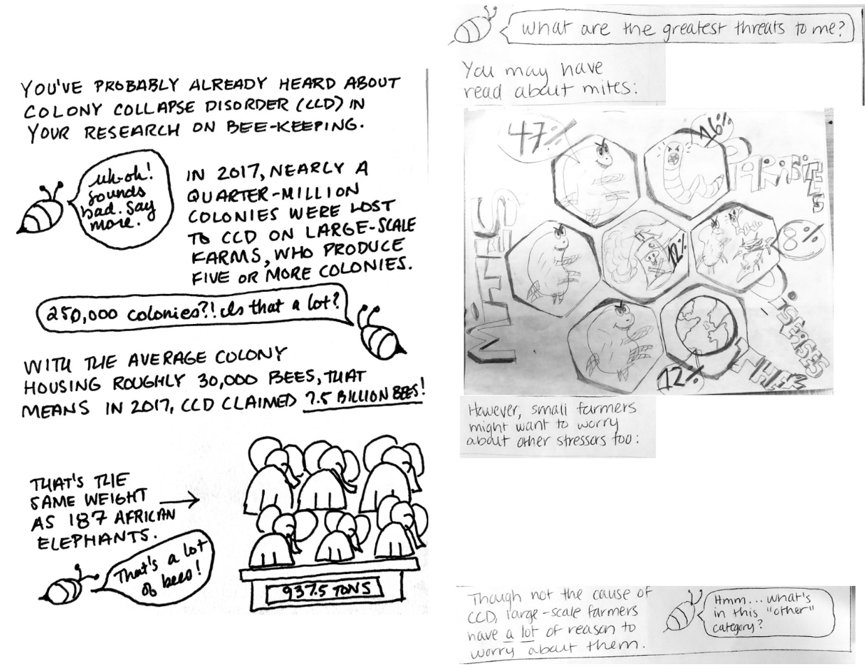
We realized that North Dakota produces the most honey in the United States and has been doing so for many years. North Dakota is also the largest exporter of bees for the purpose of pollination. Our group analyzed features such as number of honey producing colonies, yield per colony, honey stocks, and the price of honey. We believe that most of these features would be suitable proxies for bee health. North Dakota also ranks first in the production of flaxseed, canola, durum wheat, all dry edible beans, all dry edible peas, spring wheat, honey, lentils, sunflowers, barley and oats. Flaxseed, canola, dry edible beans, and sunflowers are all pollinated by bees.

The data for North Dakota was very surprising as no one in our group knew this information beforehand. This led us to performing a lot of research about North Dakota beekeeping and how it affects the United States. More specifically, we learned about the problems that the beekeeping industry is currently experiencing and what can be done to address these issues. The focus of our presentation is bringing up these problems and showing the effects that they can have on the economy, agriculture, and consumers. We are advocating for more assistance to mitigate these issues in the best way possible. This involves a more sustainable relationship between farmers and beekeepers that will lead to better overall bee colony health.

The data used for this project came from USDA honey bee surveys (honey production and colony health), the Honey Bee Health Coalition Website, and the Bee Culture website. The USDA surveys helped us to come up an initial analysis of the situation and allowed to provide evidence of the importance of North Dakota and the problems associated with the U.S. beekeeping industry. The Honey Bee Health Coalition is composed of numerous organizations, agencies, researchers, and beekeepers that seek to improve the conditions of the honeybee. The coalition provided much more detail about the situation at hand and helped us to gain a better understanding of what is being done to help the bees.

When considering how to present the data, we opted for mostly traditional charts and graphs considering our audience and the type of meeting we are having to present the data. Creative charts also worked for some of the statistics that we wanted to emphasize. We felt that a PowerPoint would work well for this scenario, given that it is representative of a meeting with policymakers. We used graphics to show comparisons and relationships between different states and honey production related variables. This is effective because it enabled us to differentiate North Dakota from other states in a way that was simple, yet very descriptive. For the presentation itself, we first wanted to highlight the importance of North Dakota in the bee industry, and then second, present the problem to the stakeholders and its impact on the world around us. We then propose some potential solutions and next steps that can be taken to improve the plight of the bees. Finally, the presentation goes into the impact of these solutions and corrective actions. We also included numerous supporting slides that can be used to address questions from the policymakers or to go into further detail about the beekeeping situation.

It’s important to note that we could definitely have used data to support other pieces of the sketch, but we will be focusing on the main parts of the project for this turn-in.


——————————————————————————————————————

REFERENCES:  


  • https://www.agweb.com/article/honey_bee_health_report_cites_multiple_factors_for_bee_disappearance/