Fuel for School

Group members: Lilian Eix, Amy Vogel, Shikun Zhu

The data say that each and every food is different according to its nutritional makeup. We want to tell this story because each nutrient contributes to one’s well-being in a different way; though we often think of making food choices based on budgeting calories, a different (and perhaps healthier) attitude to instill in kids is to think of food as fuel to help them accelerate in their daily activities. To do so, we used data from the USDA Food Composition Database.

Our audience is middle schoolers, who are typically thinking about nutrition and body image seriously for the first time, as they are going through puberty. When learning about nutrition, kids are often taught about roughly how many calories they should eat per day, about balancing the different food groups, that certain foods are “unhealthy”/”bad,” and that other foods are “healthy”/”good.”

Our goals are to create a game that would teach kids about nutrition in a more positive light and to emphasize the importance of a healthy breakfast. In our game, while some foods are certainly more “fuel efficient” than others, more importantly, different types of “fuel” will help the character with different types of activities. The player (a middle school student) can select what their character will eat for breakfast, and then see how the character performs throughout a typical school day.

We didn’t want kids to get in the habit of obsessing over numbers, so we intentionally hid the nutrition facts from the game screen (though in a final version we would also supply the user with the option to learn more about the nutrition information if they wanted to). Instead, the nutrition facts are indirectly communicated through the user’s strength, energy, and focus levels. Through formulas based on nutritional science, we used the protein, carbohydrates, and sugar content from our selected foods to determine how much strength, energy, and focus each food would contribute to the character. After breakfast, the character bikes to school, attends class, goes to P.E., and then takes a test. In each of those four activities, their strength, energy, and focus levels determine how well they will do. At the end of the game, the user has the opportunity to play again, which is crucial, because repetition is how they will learn the effect of different food choices.

Link to game: https://scratch.mit.edu/projects/304291992/

The Hidden Weight of Food

Group: Sarah Von Ahn, Amy Vogel, Theresa Machemer

The data say a lot of water is used to produce the food we eat.  We want to tell this story because we don’t often think about the resources used to produce our food. We want to educate interested museum-goers, so that they can (a) make more informed consumer decisions to lower their water footprint and (b) learn about the ways that water is used to produce food.

Our audience is members of the public who visit science museums (e.g. families or field trip groups), with the interactive display targeted at youth audience members age 10 and up, due to its height and weight. The pyramid display is accessible to all ages, as its appearance is striking, and the descriptive sign adds detail but doesn’t provide information that is crucial to the display. Science museum-goers are primed to learn and expect to walk up to displays and interact with them, making them the ideal audience to experience every level of this project.

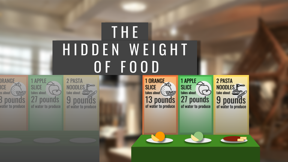
The data we used is the water footprint data, which detailed the water used to produce various food items. We used the global averages for each food because there is not a region that produces every food item, and we did not want to compare across regions, which would have introduced variables like differences in transportation, climate, and agriculture technology. We then picked foods that would encompass ‘one day of meals.’ In our sketch, we created the model for an orange, an apple, and a pasta dinner. A final product would include breakfast, lunch, a snack, and dinner. This ‘day of food’ provides the narrative structure for the display, as the meals of a day are familiar and provide a chronological order to interact with the sculpture.

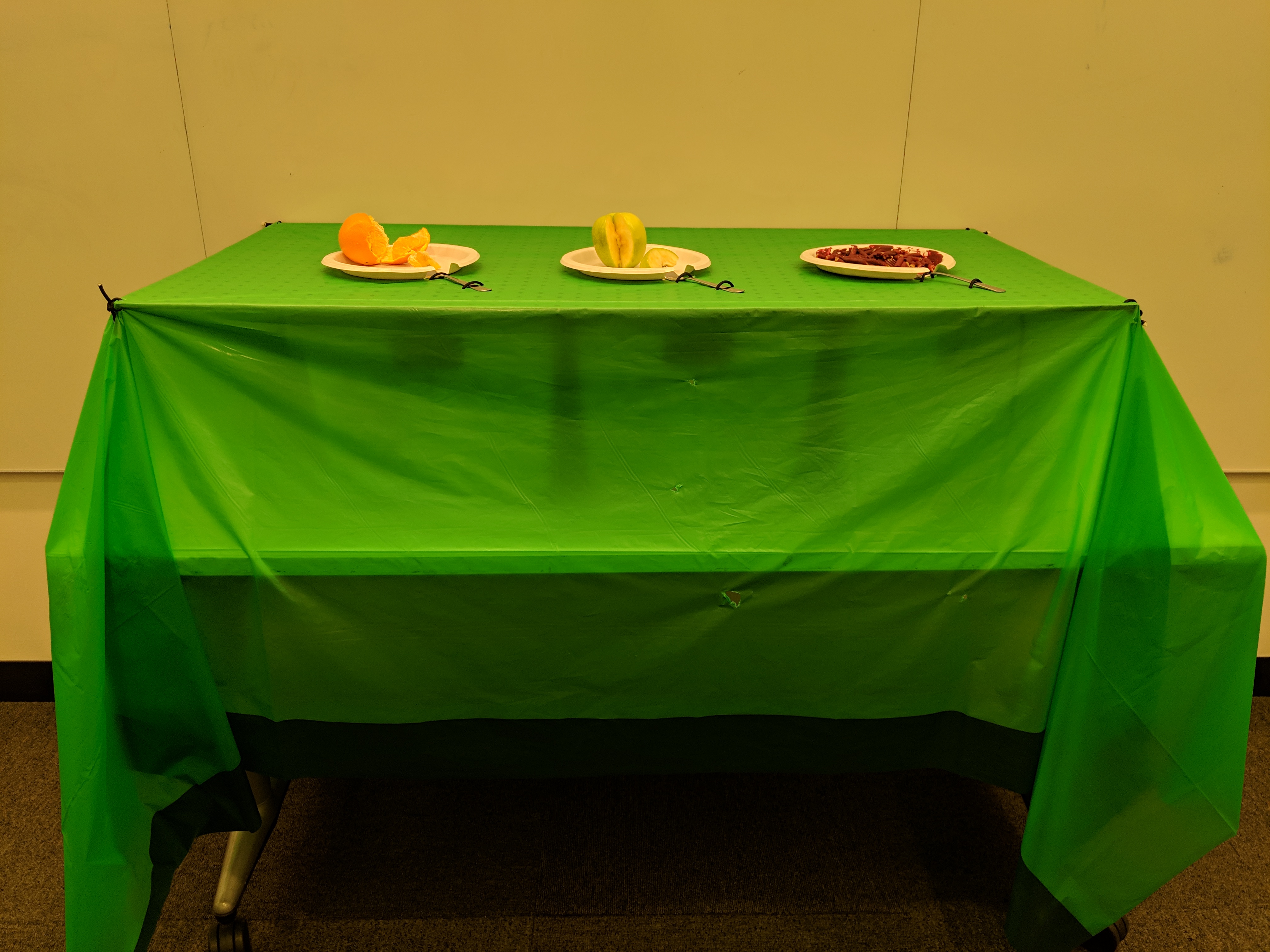
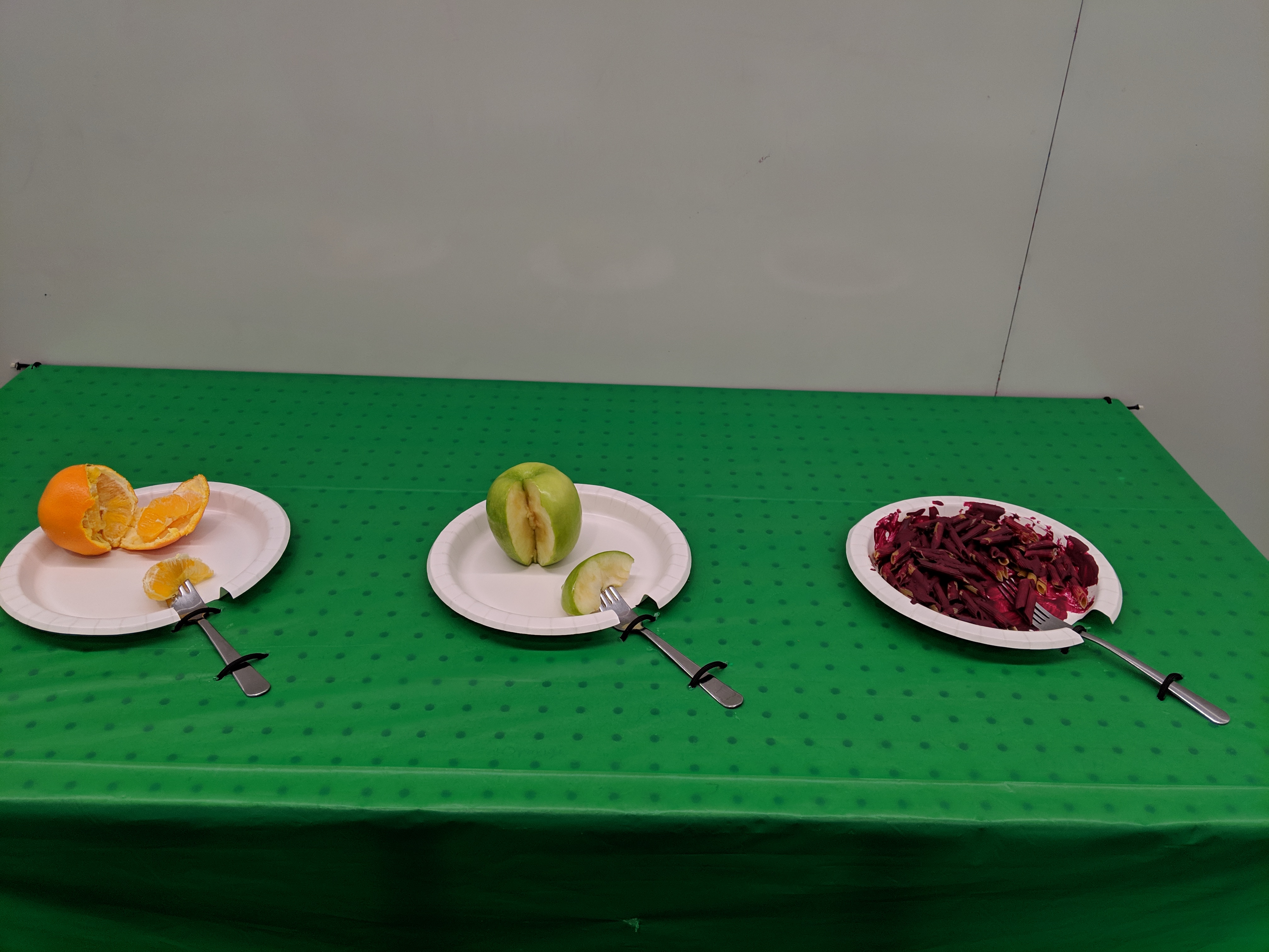
The sculpture, an exhibit in a U.S. science museum, is titled “The Hidden Weight of Food.” The hook is a long table with plates of food. Each plate has a fork with a bite-sized piece of food on it, such as a slice of apple. When you lift the fork, you realize it’s much heavier than a slice of apple should be. Upon being surprised and interested to learn more from the exhibit, you read the sign and realize that the weight you’re lifting is the weight of the water used to produce that bite of food. For a slice of apple, that’s a full 27 pounds. The museum-goer can then go through the many plates of food, compare weights of different food items, and think and read about why different foods require more or less water to produce.

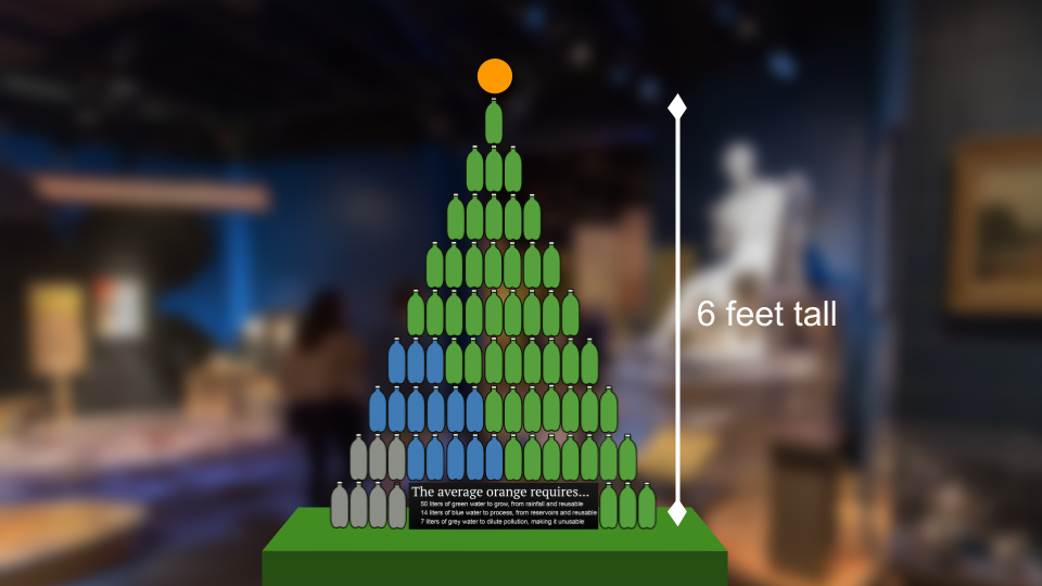
The table of weighted meals will have a path through it to a second section of the exhibit, which invites them to investigate further. The second section has pyramids of 1-liter bottles that are full of green, blue, and grey water, next to the foods they represent. For example, one orange requires, on average, 71 liters of water to produce, including 50 liters of green water (water from rainfall that is reusable after producing an orange), 14 liters of blue water (water from reservoirs like lakes and groundwater that is reusable after producing an orange), and 7 liters of grey water (water that becomes polluted while producing an orange, and is thus not reusable). This would be connected with information about water conservation.

The table of weighted food is effective because it pairs a familiar set-up (and thus expectations), food set out on a table, with a surprising result, the weight when you try to pick up the fork, that subverts the expectations. The title is an effective metaphor because the weights are literally hidden under the table and because the water used to produce food is invisible on the final food product. Without some data visualization, it’s impossible to tell how much water is used to produce your food.

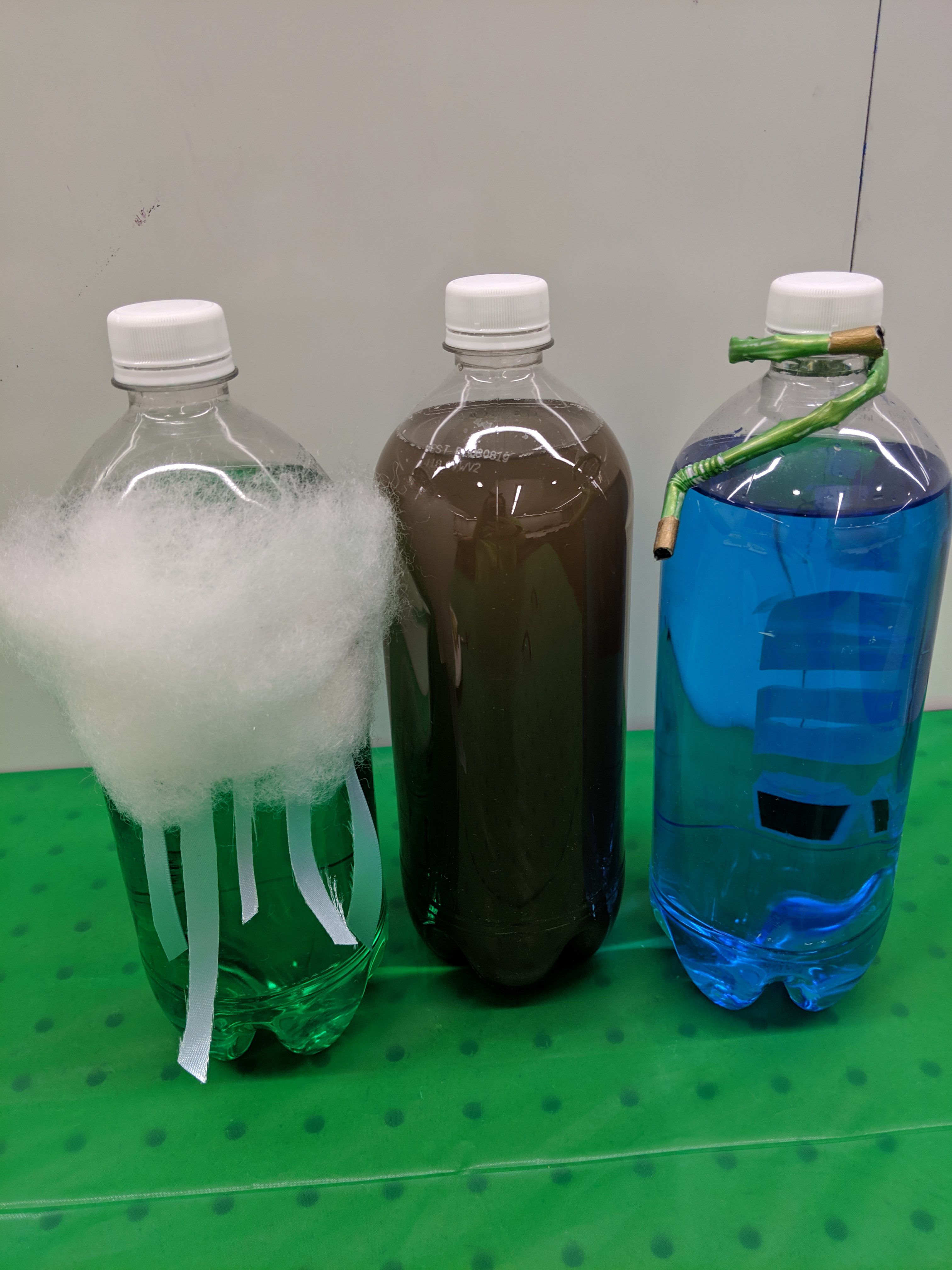
Liter bottles in the pyramid are effective because they are familiar units, intuitive to read, that can visualize volume, which is normally difficult to conceptualize. Food coloring of the water in the blue and green water bottles and dirty water in the grey water bottles make clear from a distance the proportions of each type of water used to produce the food on display. Curiosity about the different kinds of water invites the viewer to come closer to the pyramid, where they would further understand the meaning of the different colors by the dirt in the grey water (pollution), the cloud on the green water (rainwater), and the hose on the blue water (irrigated water). If they were particularly interested, they could read the informational sign that goes with it.

Overall there are many levels to viewing the data sculpture from far away and up close, in both the first and second sections of the exhibit. Additionally, there is the metaphor of the weight of the water and the design of the liter bottles (color and accessories) to explain the types of water, and information to “go further” into kinds of water, water footprints, and food choices to reduce your water footprint.

Closing the Food Insecurity Gap

Team members: Ayush Chakravarty, Katherine Soule, Nora Wu, Amy Vogel

Introduction

The data say that Boulder Food Rescue was effective in reducing local food insecurity. We want to tell this story because food rescue is an innovative and sustainable way of helping those who are food insecure, and we think this method should be implemented in more cities. Thus, we took on the role of food security advocates in order to educate our target audience – city officials – on this potential solution to food insecurity.

Summary

One of our data sources was the Boulder Food Rescue (BFR), which had data on all of their donations in 2018, including details such as the type of food, weight of food, recipient, donor, transport mode used by the donor, and more. This data allowed us to measure the impact that BFR had on Boulder’s food security, as well as to understand the logistics of their operation. Both of these aspects were important for predicting the impact of and ease with which food rescue might be implemented in other cities.

Since our target audience is city officials, we decided that our visualization would be displayed on tablets at a food security conference organized for those city officials. The data is somewhat interactive, so we envisioned people looking through our visualization in the lobby at said conference, in preparation for a session or lecture that would give more details on how food rescue works. Thus, we aimed to create something that would give a high-level overview of (1) why food security matters, (2) BFR’s logistics and impact, and (3) what food rescue could look like for other cities. The goal is to get city officials excited about food rescue as a viable approach and to encourage them to seek more detailed information on the issue.

In line with this goal, our project features 3 separate “pages” or “slides,” which users can click through:

  1. The first slide explains why food security is a problem in general.
  2. The second slide shows the impact BFR had in “closing the gap,” and gives some information on how they were able to do that.
  3. The final slide emphasizes the potential impact that food rescue could have in your city (i.e. the city where the conference attendee works).

To encourage user interaction, each slide includes some level of interactivity, such as the ability to expand a statistic in order to learn more about it, or hovering over a piece of a chart to get more information on it.


My Sunday in Data

The following is the list of digital data that I created on Sunday, February 17:

  • Sent messages via Facebook, WhatsApp, Instagram, Slack, and SMS: data on the messages I compose and the people I talk to
  • Registered for an event on Eventbrite (and responded “going” to the same event on Facebook): data on my whereabouts for that date/time and the type of events that appeal to me
  • Added an event to my Google Calendar: usage data (when I make changes to my calendar, what kind of events I create, where my event will be, etc.)
  • Liked a post on Facebook: data on people I interact with and posts that get my attention
  • Listened to an album on Spotify: data on what kind of music and artists I like, what time I listen to music, for how long I listen to music, etc.
  • Made 2 phone calls to 2 different movie theaters: phone data
  • Edited a Google Doc: data on when I made changes and what changes I made
  • Tracked a UPS package: data on what time and how frequently I am checking my package’s status
  • Wore my Fitbit: activity data (where I have been, how many steps I have taken, how much activity I have done, how much I slept, what time I woke up, how much I sat still, etc.)
  • Ordered a drink at Starbucks using the Starbucks app: data on my app usage, the drink I ordered, the time I ordered it, etc.
  • Logged into Google Starbucks wifi: data on the info they collect from me (name and email), when/where I am logging in, and what I am doing while using their wifi
  • Browsed the web: every website I visit, the time I visit it, how much time I spend there, etc.
  • Used my Pixel, iPad, and Macbook: screentime data for each device
  • Downloaded files from Dropbox: Dropbox usage data, as well as download history on my computer
  • Edited files on Dropbox: more usage data
  • Used Google Maps to map a route: data on my intended origin/destination, and my actual route to get there
  • Rode the T: data on my origin stations and the time that I tapped my Charlie Card
  • Bought movie tickets: customer data for the movie theater, and financial data for my bank account/credit card
  • Downloaded the Zipcar app and logged into it: download/usage data
  • Visited Mathworks site for help with Matlab documentation: the types of uses I am interested in using Matlab for, how long I spend looking at each page, etc.
  • Coded on Matlab: Matlab usage data, computer usage data, Dropbox data since the files were backed up to Dropbox

Bonus non-digital data creation: I signed off as a witness that my housemate cleaned the bathroom.

Moovit Public Transit Insights

I found Moovit’s Global Cities Public Transit Usage Report while looking for public transit statistics to use to market a different transit-related company. Moovit is a transit navigation app — the data presented here was collected through that app. From this page, you can access the same report in many languages, as well as similar reports that are country-specific. This suggests that Moovit wants to appeal to a global audience. Across that global audience, I think Moovit wants the attention of people in the public transit realm — the major players (e.g. planners) and the stakeholders (e.g. committed transit users). I think that this is ultimately meant to market their products, as they have a newer product (mobility analytics tool) meant for planners and want to demonstrate that they have lots of data.

Overall, I found most of the slides visually compelling and easy to understand. The slide pictured above represents commute time by bus length and color gradient (green to red). The color gradient is intuitive because the longer/slower the commute, the more red it is. However, showing commute length through bus length is a bit odd — though it’s a public transit symbol, they could have chosen something more relevant to the notion of time.

The second-to-last slide, on the other hand, demonstrates walking distance (also length) in a very intuitive way. For each city, we see a person walking towards a flag/bus stop, with the length of their path proportional to that city’s average walking distance to transit. The slide after it shows the percentage of people walking over 1 km to transit, and uses the exact same visual – this is slightly confusing because the percentage is represented as a distance.

In general, I appreciate Moovit’s consistent use of the green-to-red gradient, with green = good/convenient/fast and red = bad/inconvenient/slow. They use transit graphics when possible, but sometimes it was forced and did not make sense in context. Lastly, the overall format of the report makes it easy to compare many cities within different categories, but far less intuitive to compare one city over multiple categories. Though, I was happy to discover they have a webpage especially for this purpose. I think that this report is effective in showing off their transit data to people already interested in the topic (such as major players and stakeholders); however, the interactive webpage is probably more fun, engaging, and easy-to-follow for the average person.