I found Moovit’s Global Cities Public Transit Usage Report while looking for public transit statistics to use to market a different transit-related company. Moovit is a transit navigation app — the data presented here was collected through that app. From this page, you can access the same report in many languages, as well as similar reports that are country-specific. This suggests that Moovit wants to appeal to a global audience. Across that global audience, I think Moovit wants the attention of people in the public transit realm — the major players (e.g. planners) and the stakeholders (e.g. committed transit users). I think that this is ultimately meant to market their products, as they have a newer product (mobility analytics tool) meant for planners and want to demonstrate that they have lots of data.
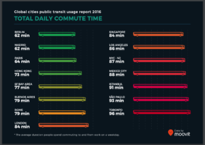
Overall, I found most of the slides visually compelling and easy to understand. The slide pictured above represents commute time by bus length and color gradient (green to red). The color gradient is intuitive because the longer/slower the commute, the more red it is. However, showing commute length through bus length is a bit odd — though it’s a public transit symbol, they could have chosen something more relevant to the notion of time.
The second-to-last slide, on the other hand, demonstrates walking distance (also length) in a very intuitive way. For each city, we see a person walking towards a flag/bus stop, with the length of their path proportional to that city’s average walking distance to transit. The slide after it shows the percentage of people walking over 1 km to transit, and uses the exact same visual – this is slightly confusing because the percentage is represented as a distance.
In general, I appreciate Moovit’s consistent use of the green-to-red gradient, with green = good/convenient/fast and red = bad/inconvenient/slow. They use transit graphics when possible, but sometimes it was forced and did not make sense in context. Lastly, the overall format of the report makes it easy to compare many cities within different categories, but far less intuitive to compare one city over multiple categories. Though, I was happy to discover they have a webpage especially for this purpose. I think that this report is effective in showing off their transit data to people already interested in the topic (such as major players and stakeholders); however, the interactive webpage is probably more fun, engaging, and easy-to-follow for the average person.