The data say that the US wastes a LOT of food. We want to tell this story because most of people do not aware the food waste problem. Through a playful data storytelling, we aim to help older elementary school students to better understand the problem of food waste and value of food saving using an interactive classroom activity.
DATA SOURCES: food wasted from EPA. food/person/yr from EPA. Food weights from quick google.
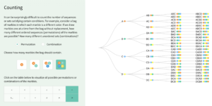
How does the game work
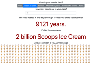
Students in the interactive classroom settings will be asked to volunteer. First, a student need to drag an apple from the trash to the compost to get started. The design concept of this action was to engage student with a mindset of food composting. After “composting” the apple, students will see a big number of “132.9 Billion” pounds of food wasted each year in the US, which counts 31% of total US produced food each year. A pie chart which demonstrates the percentage will give students a more intuitive understanding of this food waste problem.
Our goal of this data storytelling is more than just publishing numbers. Students can click “what can I do to help” to further explore how their actions of food saving can contribute to reducing food waste. Furthermore, we designed a “what is your favourite food” session and translated the abstract number concept to food cartoons. Students can select their favourite food and check the amount of their favourite food, equivalently, would be wasted if people do not take actions in food saving.
Design Ethos
Before starting the narratives design, we as a group spent time discussing how to better engage students of young ages. Specifically, we wanted to lower the barrier of conceptual understanding of data for children, and design activities that allow more students to engage in an interactive classroom setting. To be able to achieve the goal, we used analog of different children-loved foods, big pie charts, and cartoons to intrigue the interests and curiosity of students.
What can be done more?
Due to time constraints, we were not able to iterate our design. Many of details would be better attended of if there were more time. For example, the contrasts of years and days may lead to confusions for students if they do not pay attention to read line by line. We would also like to iterate the interaction design between each actions to make the storytelling more cohesive and compelling.
Julie Ganeshan, Sarah Von Ahn, Berlynn Bai