People, Planet, Partnership – Methodology

Lily Xie, Berlynn Bai, Nora Wu

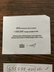
For our project, we partnered with Lovin’ Spoonfuls to create a series of marketing infographics targeted at potential donors in Whole Foods. We started our project with a 30-minute conversation with Liz Ferguson, the Communications & Marketing Director at Lovin’ Spoonfuls. In addition to giving us context on the challenges the organization faced, Liz also provided us with a fact sheet containing their external facing marketing statistics about cost and impact. This fact sheet contained a diverse set of data, including:

  • Data about the organization, such as year founded and number of staff
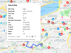
  • Geographic data about reach
  • Food rescue data, e.g. pounds of food and types of food rescued
  • Food donation data, e.g. number of people reached
  • Environmental impact data that estimated carbon emissions from food rescued

While the Lovin’ Spoonfuls fact sheets was our primary data source, we also joined this with Massachusetts food waste data and Massachusetts Map the Meal Gap food insecurity data.

There was not much cleaning and validation we could do in this case, because the data provided to us was fairly high-level. For statistics that were publically available, such as the conversion of 3 lbs of food = 1 meal, we checked against other sources and studies. Many statistics, such as the reported pounds of food rescued by Lovin’ Spoonfuls in the past year, we had no way to validate.

Because this fact sheet was made to be shared with external viewers, much of the analysis was already done for us. In order to form our full story, we needed to join this data source with some aggregate data around Massachusetts hunger and food waste in order to make conclusions about how much impact Lovin’ Spoonfuls’ work had on total food waste and hunger in Massachusetts.

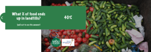
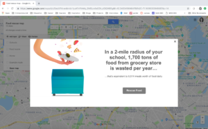
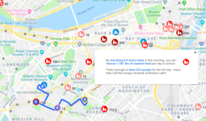
We wanted to tell a story about the multidimensional impact of Lovin’ Spoonfuls’ food rescue work. In our call, Liz said that one of their biggest storytelling challenges was around succinctly describing their impact on “people, planet, profit”, i.e. the impact their work has on improving health, reducing carbon emissions, and helping organizations profit. Because the audience for our story is anyone who shops at Whole Foods, we did not want to assume much data literacy when telling this story – to that end, we tried to convert the numbers to interpretable units. For example, Lovin’ Spoonfuls included data that their food rescue operations diverted the equivalent of 7,449,521.40 kg of CO2 from being emitted via landfill. From our user interviews, we learned that this number was difficult to understand. To work around this, we decided to instead use a conversion they provided for kg of CO2 to acre of trees planted, then ground that number in a space that Massachusetts residents can relate to (the Boston Public Garden).


People, Planet, Partnership

Lily Xie, Berlynn Bai, Nora Wu

In our project, we partnered with Lovin’ Spoonfuls, a food rescue organization based in Brookline, in order to reach and educate new donors. In a previous project for the class, we imagined ourselves as representatives from Lovin’ Spoonfuls to create a food waste map game for high schoolers; this time, we wanted to work more directly with the organization to target an audience and goal that was meaningful and impactful in real life. We were able to interview the marketing director at Lovin’ Spoonfuls about the challenges the organization faced and the most impactful data stories that still needed to be told.

Based on our interview, the goals of our data story are the following:

  1. To educate the communities in Cambridge about food insecurity, food waste and food rescue
  2. To promote the work and impact of Lovin Spoonfuls
  3. To encourage donation and behavioral change from our targeted audience

Our targeted audience is anyone who shops at Whole Foods. We chose consumers of grocery stores as our targeted audience because we believe they have purchasing power to fulfill the need of Lovin Spoonfuls. Lovin Spoonfuls operates under the impact model of “People. Profits. Planet” – by supporting Lovin Spoonfuls, individuals are supporting the health of food insecure individuals, making a positive impact to the environment, and (for donors) making a non-taxable donation. Lovin Spoonfuls also holds close relationship with retail stores so that the stores can generate profits through Lovin Spoonfuls’ purchases.

Lovin Spoonfuls is not a competitor for any grocery stores, rather, collaborating with Lovin Spoonfuls would help with branding and attract local attention through this partnership. After talking with the Communications & Marketing director at Lovin Spoonfuls, we learned that what Lovin Spoonfuls needs the most is monetary donation. Given the number of Whole Foods in Cambridge and its motto on “Whole Foods, Whole People, Whole Planet” , we believe that consumers of Whole Foods would be a perfect audience for our project.

In order to test out our prototype, we interviewed four individuals at the Whole Foods store on Prospect Street. Our interview questions follow three parts: 1) what is their pre-existing knowledge about food waste, food security and food rescue 2) what are their opinions on our current prototype 3) what are the factors that could lead to their donation (if not the existing prototype).

We learned that most people have a general idea of what food waste is, but haven’t thought about what happens to the wasted food. Instead of highlight the problem, we should help consumers to think about solution that can be done for food waste. In addition, the solution should link to the work of Lovin Spoonfuls – individual solution, such as buying less food, is not optimal in this scenario. We need to communicate that food waste is a systemic issue that cannot be solved by individual austerity, just as one of the interviews said,  “I would need to know why what this organization does is better than me just buying less”. Therefore, the message of transforming food waste to food insecurity and lack of access to healthy food is critical in our data story.

People also want to know, before they donate, where is the money going. Therefore, having “$1 = 1 meal” is important to inform the impact of each donation. In addition, we learned that people anchor on numbers but don’t always engage with the text. Having the number more evident, or finding different ways to visualize the number (such as 600 million lbs of food) would be more captivating and provocative for the audience.


Rescue Mission

Food Rescue: High School Edition

Berlynn Bai, Ayush Chakravarty, Lily Xie


The data say that within two miles of one Boston High School in the Fenway area, over 9,000 pounds of food is wasted a day from grocery stores alone. We want to tell this story because more people, especially high school students about to venture out into the real world, deserve to understand food reuse and rescue initiatives better.

Our audience is high school students at Boston High Schools, and our goals are to (1) convey the pressing issue of food waste, and (2) demonstrate the ease of participating in food rescue, particularly for students who may have a community service requirement before graduating from high school.

To build this interactive google maps experience, we used two data sources. The first is the list Boston, Cambridge, and Somerville list of public high schools, and the second is a dataset of Massachusetts Food Waste. Using a batch geocoder, we converted the addresses of the high schools to latitude/longitude coordinates so that they could be mapped over the Massachusetts Food Waste data. The key variables of concern were the establishment name, location, and the pounds of food wasted per year.


The idea behind using Google Maps to tell this particular story was to use a medium that students were familiar with — after all, this is an app that integrates into our everyday lives. First, we hope to make it easier to link their own location to the hyperlocal nature of food waste. Seeing red dots next to one’s own blue dot might make it easier to realize that students walk past these places every day. Second, it makes the ask easier to explore: what does the student need to do to get involved? If they have 30 minutes a week, where could they go to pick up food?

The final activity for students would look as follows:

  1. Students open the food rescue map, where darker colors indicate higher amounts of food waste.
  2. They search for their home address and add a marker
  3. Based on their commutes, they find out how to add one stop to their commute to school
  4. Calculate how much food they rescued and this is how much they could feed their school!

Data log – 2/24/19

Roughly chronologically, this past Sunday:

  1. My iPhone logs when my alarm went off and how many times I pressed the snooze button.
  2. I send conversation data to Apple via iMessage. I also generate data about my location and device usage, which is possibly anonymized and sold/distributed to third parties.
  3. I adjust the temperature on my thermostat and take a shower, which sends data to Eversource to tell them how much energy I have used and how much they should bill me.
  4. I also use a shower speaker to listen to podcasts in the bathroom. My podcast app collects data on what I’m listening to, for how long, etc and shares it with third parties.
  5. Does the act of being alive count as a data point? By consuming resources and expelling waste, I am also producing data (e.g. environmental studies monitoring the production of CO2).
  6. When I take the bus to Allston, I share data with the MBTA about my (or, my CharlieCard’s) whereabouts.
  7. On the bus, I am also captured by the CCTV cameras. On my walk to/from the bus stop, I’m sure I am captured on other cameras as well.
  8. I’m sure I open my social media and email apps numerous times during this trip. Here, I create data that can be turned into information about my interests, my network, how I spend my time, where I am, and so on.
  9. I visit a coffeeshop where my partner works. I don’t give transaction data (because the meal is free) but, as my order is entered as a comp order, I generate data about the # of free meals being given out that day. That is also stored by the third party point-of-sale service.
  10. More cameras in the coffeeshop. Perhaps this footage goes to the owners, but I suspect it also goes to some sort of hosting service/server on its way back to those folks.
  11. Back at home, I open up my browser to look up a recipe for beef stew. My machine and browser collect data on me, as does the website I visit and any third-parties I bump into.
  12. I go to the grocery store and give Market Basket my transaction data as I buy some food. I also give my bank data about this transaction – perhaps they share that with third parties, too?
  13. I cook and give more data away, thru the same podcast and energy routes as before.
  14. While I eat and watch Netflix, I am creating data about my watch and browse patterns.
  15. Going to bed, I set my alarm for Monday morning – generating more data to be stored in my iPhone and passed on to Apple and others.

Data presentation: museum of capitalism

Capitalism Museum

Recently, I visited the Museum of Capitalism exhibit at SMFA. Among the pieces on display, there was an interactive sculpture titled “The Minimum Wage Machine”, which invited folks to crank a handle to churn out one penny every four seconds – or, $9/hour.

Since the piece sits in a gallery within a university, I think the audience of this piece might be students, academics, and folks wanting (and able) to seek out art. Not everyone has the time, mobility, or financial resources to make the trip out to this gallery, and not everyone might know about or be the target market for the SMFA. I only happened to stumble upon this gallery when I was trying to get to the SMFA store, and likely wouldn’t have known about it otherwise. I would also guess that the audience of this piece is folks who do not earn minimum wage.

I think the goal of this presentation is to create a personal connection and understanding of the minimum wage. By inviting active participation with the body through the use of the hand crank, the artist creates an embodied understanding of what it means to earn $9/hour through active work (rather than purely an intellectual one). There is also a temporal element of this presentation – in order to “make” the hourly wage, the viewer understands that they would need to stand there and crank the machine for a full sixty minutes; the time it takes to earn $9 is also embodied. I also think that, by creating the base unit a single cent, this presentation also aimed to emphasize how low the minimum wage is. A penny is generally understood to be low value, and by breaking down $9 into one-cent units, the artist invites viewers to think about how little money is being made.

I thought that this was an effective data presentation. I personally am very interested by kinetic communication of data/communication that involves the physical body, and thought that this presentation made the feeling of earning minimum wage relatable for anyone who saw the sculpture. I also think the piece was memorable, in part because it involved movement and touch, which also makes the presentation effective in my mind.