What Does Data Tell Us About Refugee Flows? And what it failed to tell?

Link to data visualization for What Does Data Tell Us About Refugee Flows In Africa And The Rest Of The World?

Link:  https://www.iafrikan.com/2015/08/13/what-does-data-tell-us-about-refugee-flows-in-africa-and-the-rest-of-the-world/

As one of the most controversial and ongoing topics in the world, refugee and immigrants are important issue in international affairs. The two sets of diagram in the link covered pretty much everything about the issue: population, year, origin country – asylum country, the trend of population change etc. I will analyse the one of “refugee project”. (Link: http://www.therefugeeproject.org/#/2017)

The Refugee Project


1.What data is being shown?

The population of refugee from known origin country and how they distribute into different asylum countries from 1975-2017. When clicking a specific year with specific country or the default “world”, it also tells you those important events happening to that country from the 1975-2017 or events happening on that year. You can also choose between origin country and asylum country, divided by color, to have two perspectives about the flow of refugee population.

2.Who you think the audience is?

It`s a strong database and beautifully designed interactive diagram, very useful for both researcher and people who are interested in refugee topic.

3.What you think the goals of the data presentation are?

Using both cartography and specific statistics of the population and flow of refugee, it successfully provide audience a brief idea of what countries/regions generated most refugee and what countries/regions accept the most of them. Cross-referenced with the chronicle suggested, it highlighted the possible cause of refugees.

4.Whether you think it is effective or not and why?

The interactive of origin/asylum country, divided by color and the radial pattern is very effective to see the flow. Also they set a histogram to indicate the overall population trend which tells you the flow in a timeline. Both of them are impressive and useful. The only drawback I can think of is the lack of the comparison between different countries, and the percentage of refugee with the population of the whole countries. If provided, we can better understand the density of the incident which caused the refugee flow and how much they affected the country.

 

Data Visualization Review

https://www.politico.com/magazine/story/2017/11/03/are-american-women-really-better-off-215782

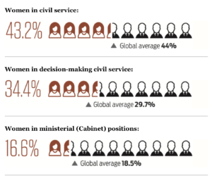
The piece I selected is from Politico, “Are American Women really better off?” The article made visualization based on an index that measures women’s public service leadership by country. It highlights certain data from the overall dataset. For instance, the percentage of women in civil service (43.2%), the percentage of women in decision-making civil service (34.4%), and the percentage of women in ministerial positions (16.6%). The author chose to visualize it based on a scale presentation. Out of 10 “individual images”, roughly 4.32 indicates female images using red outline whereas the rest shows male images using a black outline. I thought instead of a pie chart, such illustration made it more apparent the gender gap in decision-making public service positions. In addition, there is a text and triangle indicating a global average to show where the US is compared to the global average. 

Other visualization in this article includes donut charts, bar chart and pie chart, etc.

When I first read the article (right after it was published), I found the representation using personal image to indicate gender gap in positions was very effective. However, now when I look back, I found a different way to visualize may have a better impact.

Actually, I was as involved with the global women’s leadership index creation process at the Wilson Center before the index got launched. The index was created based on three pillars: pathway, position and power of women in public leadership. The rationale is that we shouldn’t solely look at positions women held – because in some context, a majority in positions doesn’t mean power (like Rwanda); in another context, there was no pathway to enable decision-making position. Therefore, the index was measured by the weighted average of three scores based on the pathway (data collected based on access to education, labor market, maternity leave, etc), position, and power(data collected based on good governance index, public perception, etc).

If I were to replicate this visualization, I would use graphics to showcase the steps from the pathway, to position and to power for women in leadership positions in a storyline – so that it is not just a creative use of individual datapoint, but to connect different data points to tell a story. I also thought when we managed to translate the numbers into human narratives using data visualization, it will not only enhance the importance of the numbers themselves but amplify the impact that can be relatable to a wider audience. 

Data presentation: museum of capitalism

Capitalism Museum

Recently, I visited the Museum of Capitalism exhibit at SMFA. Among the pieces on display, there was an interactive sculpture titled “The Minimum Wage Machine”, which invited folks to crank a handle to churn out one penny every four seconds – or, $9/hour.

Since the piece sits in a gallery within a university, I think the audience of this piece might be students, academics, and folks wanting (and able) to seek out art. Not everyone has the time, mobility, or financial resources to make the trip out to this gallery, and not everyone might know about or be the target market for the SMFA. I only happened to stumble upon this gallery when I was trying to get to the SMFA store, and likely wouldn’t have known about it otherwise. I would also guess that the audience of this piece is folks who do not earn minimum wage.

I think the goal of this presentation is to create a personal connection and understanding of the minimum wage. By inviting active participation with the body through the use of the hand crank, the artist creates an embodied understanding of what it means to earn $9/hour through active work (rather than purely an intellectual one). There is also a temporal element of this presentation – in order to “make” the hourly wage, the viewer understands that they would need to stand there and crank the machine for a full sixty minutes; the time it takes to earn $9 is also embodied. I also think that, by creating the base unit a single cent, this presentation also aimed to emphasize how low the minimum wage is. A penny is generally understood to be low value, and by breaking down $9 into one-cent units, the artist invites viewers to think about how little money is being made.

I thought that this was an effective data presentation. I personally am very interested by kinetic communication of data/communication that involves the physical body, and thought that this presentation made the feeling of earning minimum wage relatable for anyone who saw the sculpture. I also think the piece was memorable, in part because it involved movement and touch, which also makes the presentation effective in my mind.

Can Statistics Learning be Intuitive?

Can statistics learning be intuitive? How can learning experience be more creative? Here is an interactive data storytelling example that I found both accurate and engaging: Seeing Theory.

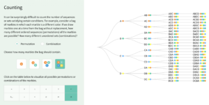
Seeing Theory is an interactive data visualization that makes statistics more accessible. It was built using D3.js, by a group of students from Brown University. By decomposing classic statistics theories to step-by-step playful interactions, Seeing Theory visualizes different statistical events to allow users to better comprehend the seemingly complicated logic behind statistics theories.

Seeing Theory has a wide range of audiences – from high school and college students who just entered the field of statistics, to professionals who want to have a brief understanding of statistics to help with decision-making but nothing too deep. It does a great job in combining both playfulness and learning objective, and tackles the very pain-point of traditional statistics learning experience – where the theories are counterintuitive and difficult to comprehend.

The methods that this visualization applies are groundbreaking and worth-scaling. Thinking about the common methods that embedded within our day-to-day learnings and teachings, are there opportunities can be further explored in order to make the process more engaging and enjoyable? How human-factors can better inform the design of data storytelling? Seeing Theory offers us an alternative of how future learning might look like.

Moovit Public Transit Insights

I found Moovit’s Global Cities Public Transit Usage Report while looking for public transit statistics to use to market a different transit-related company. Moovit is a transit navigation app — the data presented here was collected through that app. From this page, you can access the same report in many languages, as well as similar reports that are country-specific. This suggests that Moovit wants to appeal to a global audience. Across that global audience, I think Moovit wants the attention of people in the public transit realm — the major players (e.g. planners) and the stakeholders (e.g. committed transit users). I think that this is ultimately meant to market their products, as they have a newer product (mobility analytics tool) meant for planners and want to demonstrate that they have lots of data.

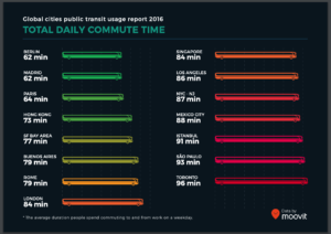
Overall, I found most of the slides visually compelling and easy to understand. The slide pictured above represents commute time by bus length and color gradient (green to red). The color gradient is intuitive because the longer/slower the commute, the more red it is. However, showing commute length through bus length is a bit odd — though it’s a public transit symbol, they could have chosen something more relevant to the notion of time.

The second-to-last slide, on the other hand, demonstrates walking distance (also length) in a very intuitive way. For each city, we see a person walking towards a flag/bus stop, with the length of their path proportional to that city’s average walking distance to transit. The slide after it shows the percentage of people walking over 1 km to transit, and uses the exact same visual – this is slightly confusing because the percentage is represented as a distance.

In general, I appreciate Moovit’s consistent use of the green-to-red gradient, with green = good/convenient/fast and red = bad/inconvenient/slow. They use transit graphics when possible, but sometimes it was forced and did not make sense in context. Lastly, the overall format of the report makes it easy to compare many cities within different categories, but far less intuitive to compare one city over multiple categories. Though, I was happy to discover they have a webpage especially for this purpose. I think that this report is effective in showing off their transit data to people already interested in the topic (such as major players and stakeholders); however, the interactive webpage is probably more fun, engaging, and easy-to-follow for the average person.