Average Voter Wait Time by Race

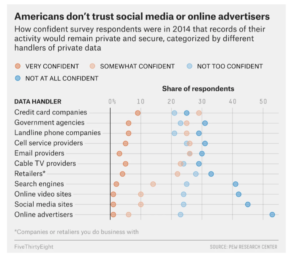
This graphic illustrates average poll wait time by race in the 2012 presidential election. The data comes from the Cooperative Congressional Election Study, a survey administered by YouGov and analyzed by Harvard University.

The graphic was published on Mona Chalabi’s Instagram page. The intended audience is interested in politics and current events, but not interested in digesting large amounts of technical information. The caption reads “This is what happens when people of color live in places with a lack of poll workers and voting machines.” The author seeks to catch the audience’s attention and to highlight an unjust situation: longer wait times for people of color, and link it to an actionable policy: the distribution of poll workers and voting machines.

This graphic is effective in catching the audience’s  attention and communicating in a charismatic and approachable way. I like the way the author blends illustration and data. She brakes the rule of bar charts and wraps the bars to illustrate a line. In my opinion, the aesthetic advantage of this artistic license outweighs the disadvantage that numeric comparisons are harder to measure visually.

Additionally, I believe that she chose a convincing metric to support her point. However, I would like more information on how the data was gathered, the distribution of voting resources, and the effect of wait time on voters in order to better understand the apparent injustice highlighted. Additionally, I worry that with more information, for example average wait times grouped in other ways, a more complex story could arise.

American Survey on Private Data Usage


https://fivethirtyeight.com/features/the-trouble-with-leaving-facebook-is-that-we-like-facebook/


  • What data is being shown – this data presentation shows how Americans responded to a 2014 survey detailing how confident they were about the secure usage of their data by various data handlers. The survey results are broken down into four levels of confidence, and this is shown by the different colors in the graphic. The survey responses are split into 11 different data handler categories.


  • Intended audience(s) – two possible intended audiences are: 1) managers or executives of companies in these various industries, and 2) Americans or others who are interested in how people feel about the use of their personal data within different sectors.


  • Goals of the data presentation – the objective of the graph is to show that Americans are not confident at all in certain industries regarding how their personal data is used or stored. From the graphic, it seems that Americans do not trust a majority of the data handlers. In particular, the author of the graph wants to highlight the extreme lack of confidence in social media sites and online advertisers among other industries and companies.


  • Effectiveness of the data visualization: I do not think this data presentation is effective because it is difficult to determine what the audience is supposed to be focusing on in the graph. The headline tells you the main point of the visual, but the actual data handler categories that are mentioned in the headline are placed at the bottom of the graph. I think it would be more effective to move the “social media sites” and “online advertisers” categories to the top of the visual and make them stand out more. However, the data presentation does have a clear and concise headline and the horizontal representation of the data seems to work well.

Dangerous Scooter Data Presentation

I recently saw a data presentation about electric scooter injuries. It shows data on what types of injuries occur, what type of accidents occur, and the helmet wearing percentage of riders. The data is from two emergency departments in Southern California. The target audience is people who ride or may consider riding electric scooters. The goal of the presentation is to convince people that electric scooters are more dangerous than one might initially think and that they should take precautions such as wearing a helmet. It is mostly effective at doing this but could have a clearer message. I think they could make the helmet wearing message more prominent. It is small and at the bottom. The percentage is strikingly low and they don’t do much to draw attention to it. A visualization of the 4.4% would really help it out. The title sort of implies a message of “scooters are dangerous and should be avoided “rather than “riders need to take the risks of scooters more seriously and wear helmets”. They could also strengthen their message by highlighting how common serious injuries and accidents are by using the color code in the donut chart to indicate severity rather than commonness (which is already being shown by the donut chart). The graphics do a good job of emphasizing the danger aspect and drawing the readers attention.

Link to graphic

Colorful, Emotional, Interactive Sound Cloud

Interactive map of sounds organizes nonverbal “vocal bursts” into categories like surprise, contentment, awe, and pain.

In a study released on February 5th, UC Berkeley scientists presented their statistical analysis of “vocal bursts”— wordless exclamations — in a cloud of colorful points organized by their emotional connotation. The webpage is interactive, so a viewer can hover the mouse over a point and the sound will play automatically. The scientists were able to group the exclamations into 24 different kinds of emotions, whereas earlier studies capped the emotional variety to 13.

The data in this sound map are the over-2,000 vocal bursts, recorded by the researchers, by 56 male and female participants from the U.S., Kenya, India, and Singapore. The participants included both professional actors and non-actors, and the vocal bursts were responses to “emotionally evocative scenarios.”

The audience of this data visualization is primarily other experts in psychology and human behavior, although it is accessible for any user. As to its goals, according to the press release, “the map could theoretically guide medical professionals and researchers working with people with dementia, autism, and other emotional processing disorders,” to practice recognizing the different nonverbal cues. It also provides insight into human behavior.

It’s unclear what the ‘click and drag’ function of the webpage is supposed to accomplish. Otherwise, the webpage is effective at displaying the data because the sections are clearly labeled and colored as the vocalizations blend from one emotion into the adjacent ones.