Fighting Hunger in Cambridge

Team member names: Julie, Kate, Sarah, and Michael

Technique we want to use: data games, building off a past sketch to develop a more fleshed out idea that can actually be implemented.

Audience of the story: our ideal audience is a family of 4-5 people with a mother, father, and young children. The children should be 10+ and the family ideally would have the opportunity to go together to the same volunteering place or community service entity to help fight hunger in their area (city, state, etc.). We tried our game with a family that Rahul connected us with.

Our goal(s): by playing the game, we want people to learn about the different organizations that they can volunteer at in order to help fight hunger in Cambridge and Boston. The ultimate goal is to encourage people to take a more active role in volunteering for this cause.  

Context of the story: we are using a monopoly-like game board to help draw attention to a very important issue. The board and the game mechanics are driven by USDA budget spending data, food bank/charities donations data, and other food insecurity data. By playing the game, people can learn about how to volunteer in different organizations in their community.

The Sketch:

We used the mechanics and ideas of Monopoly, but we changed the meaning behind the spaces and rules in a way that represented the data well. The list of rules and instructions are detailed in the paragraphs below.

The Greater Boston Area is home to almost 70,000 people who are both food insecure (meaning they lack the ability to access enough food for their daily nutritional requirements) and they do not qualify for federal aid (programs like SNAP, WIC, etc.).  The purpose of this game is to visit the charities on the board, so that you can help them feed the hungry people in Boston. The goal is eliminate hunger from the board within 4 rounds.


Board Setup

  1. Choose one player to be the “Mayor” of Boston.  It is the Mayor’s job to monitor the levels of the hungry citizens across Boston.  The Mayor should begin the game by placing chips on each Boston district to represent the number of hungry people (see table 1 below).

Note, the chips have the following value:

Red = 10,000 ppl; Yellow = 1,000 ppl; Blue = 500 ppl

  1. Shuffle the orange “Chance” card deck, and the yellow “Community Chest” card deck, and place both on the designated spots on the board.
  2. Place a green die on the “Lovin’ Spoonfuls Food Rescue” square, with the 1 facing up.  This spot will be explained in the game-play section of the instructions.
  3. Have the Mayor pass out 2 green chips “Volunteer Chips” to each player.  These chips will be explained in the game-play section of the instructions.
  4. Place the Charity Property cards on the side of the board for easy reference throughout the game.
  5. Have each player write their initials on one of the white tokens, and place all white tokens on “Go”.

Table 1: Neighborhoods and Hunger

Neighborhood

Number of Hungry People

Cambridge

28,000

Fenway

10,500
Downtown

12,500

South End

6,500

South Boston

9,500

Game-Play

  1. Role the die to see which player goes first
  2. Role the pair of white dice, and advance your white token that many spaces.  

If you land on a Charity space:

  1. Choose any neighborhood in Boston with the corresponding color dot as the Charity you landed on, and remove the number of hungry people from that neighborhood as indicated on the bottom of the Charity’s square.  For example, if you land on “Feeding America” you can remove 11,000 hungry people from either Cambridge or Downtown Boston.
  2. At any point during your turn, you may choose to put down (and permanently leave there) one of your blue “volunteer” chips on the property you landed on, to indicate you want to volunteer there.  Now, every time anyone lands on this space, it will pay out a higher number of people fed. Read aloud the charity’s property card to find out the bonus, and to learn about that organization. Different players can stack up volunteer bonuses on the same square if they later land on it.

If you land on a different space, look at the Specialty Space instructions to see what action you should take. Players can also land on chance or community chest cards, which can either be detrimental or beneficial to the volunteering effort.

  1. If you rolled doubles on step 1, you may roll and go again.  Otherwise your turn is over, and pass the dice to the next player.
  2. When your white token passes “GO”, do the following:
  • Collect 2 more blue volunteer chips
  • Advance the die on “Lovin’ Spoonfuls Food Rescue” by 1.
  1. After you have passed GO on your 5th time (you have gone around the board 4 times), you are out of the game and must wait for the other players to finish.

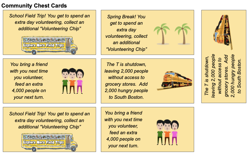
The board game, property cards, chance cards, and  community chest cards are displayed in figures in the following pages.

Figure 1: Volunteer-opoly Board
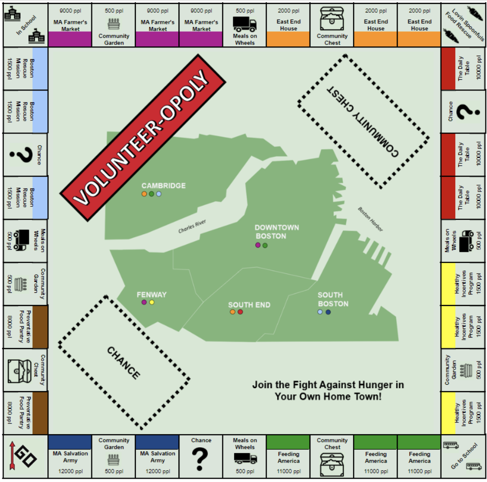
Figure 2: Property Cards (Front and Back of Cards)
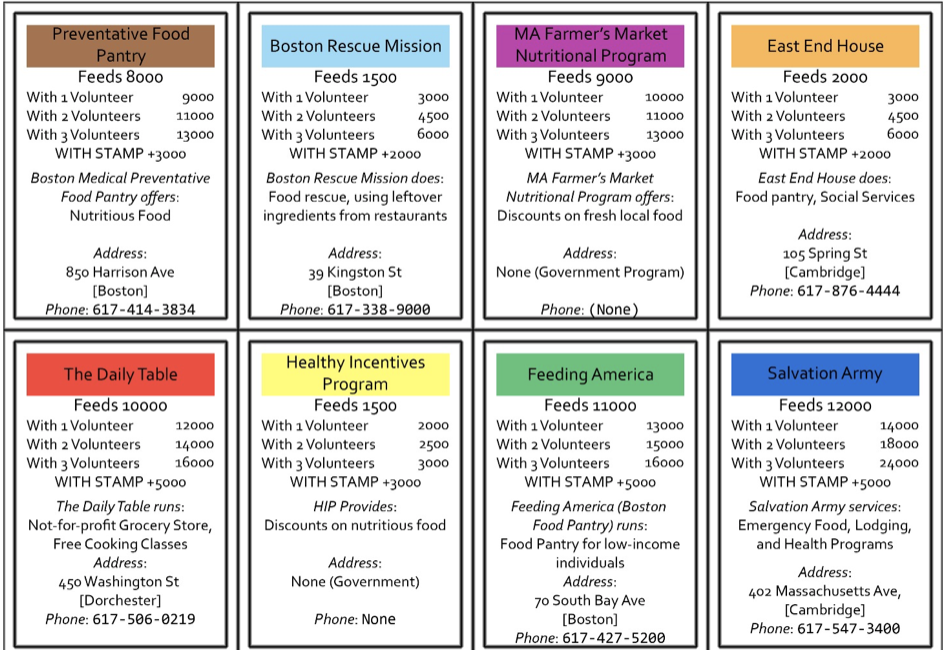
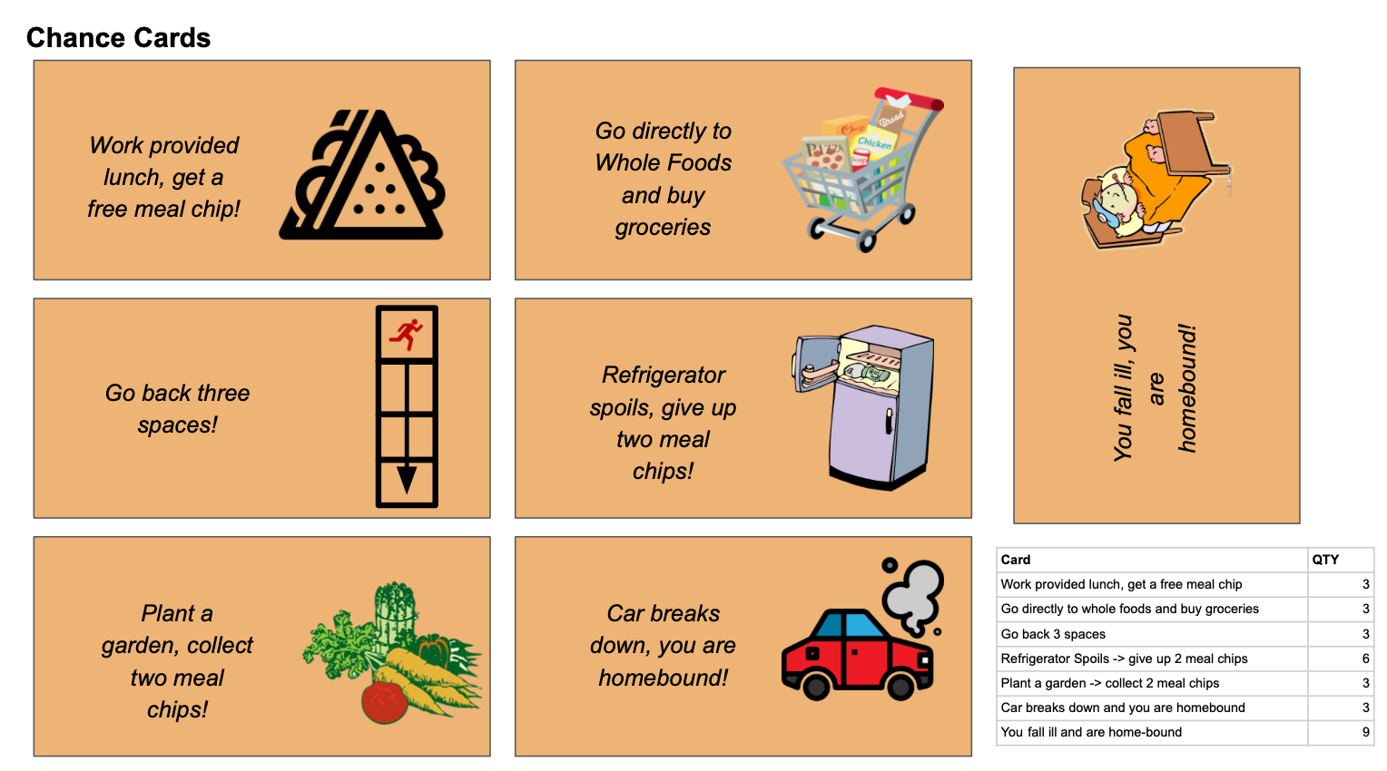
Figure 3: Chance Cards
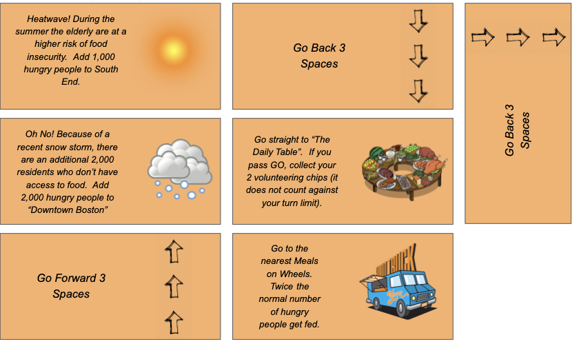
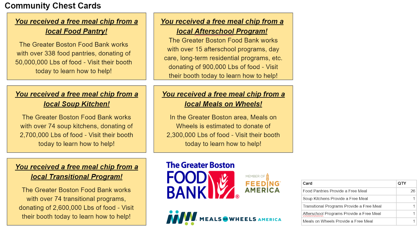
Figure 4: Community Chest Cards
             

Assessment of the game:

  • In order to assess the impact of the game, we are going to use a pre and post-survey that participants will fill out. We hope that people will retain the information presented to them within the game and that they obtain a better understanding of food insecurity and other related issues within their community. The surveys ask certain questions to determine if these goals were met. A “success” for us would be that the players learned about fighting hunger, the details of the problem, and how they can help at different organizations to truly make an impact in the lives of others.


  • The game was tested by a family that Rahul provided as a contact. Overall, the play test went alright. The kids and the parent seemed to enjoy the game and learn some new information, yet the kids seemed bored at times. The volunteer chips gave a sense of choice, but using chips for everything may have been a bit confusing. That being said, the parent was excited about the volunteering opportunities and ideas to do with her kids. After talking with the family about the game, one main recommendation was to make the game more discretized, such as choosing what you can do at a particular location or organization and how long (number of hours) you choose to spend there.


  • Please use the link seen below for a full list of the survey questions:

https://docs.google.com/document/d/1XIF4ql6CLKZzX-T-n82g9OkY7XciQwZEk6AzptCLiw0/edit?ts=5cd6db83


  • Reflection: Even though we did not have great results, it does not mean that the game failed, and we can use this as a learning opportunity in which we act upon feedback from our audience. For instance, this has shown us that rule sets for games are very difficult to write and that we most likely needed to place greater emphasis on the gameplay and less focus on the data to get a more positive result. That being said, we believe that if we target an older audience (middle school to high school kids), keep the same goals, and develop a more new game, then the game would be received better. For example, older kids would be more capable of acting upon any intentions of volunteering that may arise.


    • Based on this reflection, we created a new game based upon the premise of Forbidden Island. We titled this game “Food Desert”. We addressed the feedback given to us by having a more collaborative game with an older audience.
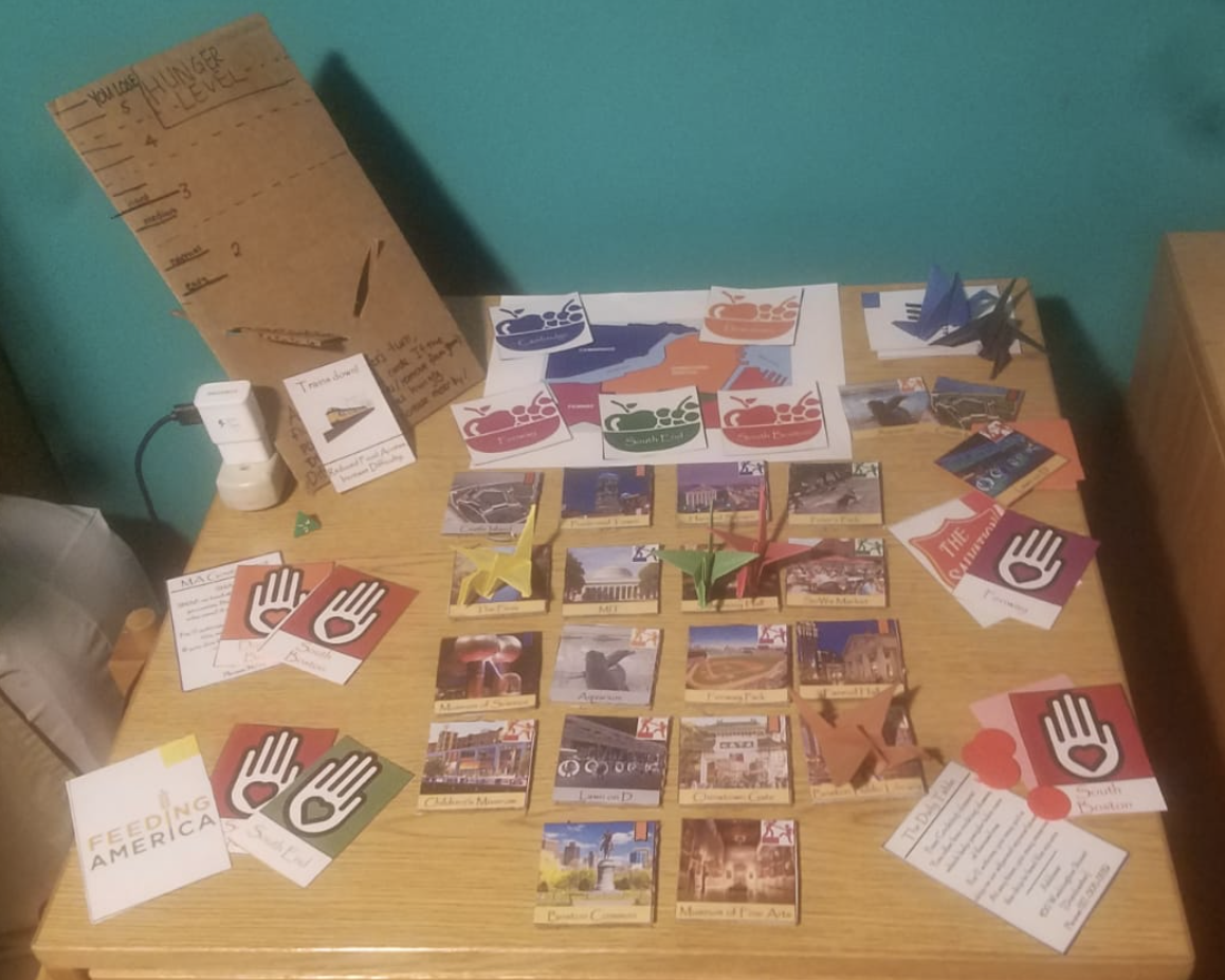
      • In order to make this game we created the following items: 18 points of interest tiles, 18 points of interest hunger cards, one hunger meter with slider, 25 volunteer cards, 5 disaster cards, 6 charity role cards, 5 city volunteer crests, a color coded map, and origami crane player pieces colored according to the colors of the corresponding charity logo. Please see the picture below for what the game looks like.

      • The end goal of this game is to feed the city of Boston, by getting volunteers in each part of the city. The terminology of the game is carefully chosen so that when players strategize, they talk about volunteering, their home city, and the charity organizations that they are playing. This is in contrast to monopoly, where there was very little player choice, and thus there was little discussion between players about what to do. Part of the playtesting feedback for this new game was that having the game be collaborative was a good decision, because it keeps goodwill between the players. During the playtest, the huge difference between food pantries and all other charities meant that the players only ever cared about food pantries. This difference has been artificially reduced, in order to provide game balance, and stress the importance of all these programs

————————————————————————————————————————–

Data Used:

  • Food stamp monthly budget for single person
  • Pounds of food donated to the Greater Boston Food Bank by donation type (food bank, soup kitchen, after school programs, etc.)
  • Meals on Wheels food donated, scaled to city of Boston population
  • General statistics from food rescue organizations and shelters
  • Weekly meal data from the USDA

References:


Data Games – SNAPOPOLY

Team member names: Sarah, Kate, Wataru, and Michael

Audience of the story: playing the game (Snapopoly) with middle school and high school kids as a kick off to a volunteer fair at their school. This can help people to learn about how to help fight hunger in their area (city, state, etc.)

Our goal: the main objective is to demonstrate the importance and interdependence of SNAP, food banks and charities in fighting food insecurity, and to encourage people to take a more active role in volunteering for this cause.  

Who we are in the story: we are the people that organized the volunteer fair at the school and we work with local food donation organizations to combat food security problems.

Context of the story: we are presenting a monopoly board at a school volunteer fair. The board and the game mechanics are driven by food stamp (SNAP) data, USDA budget spending data, and food bank donations data. By going to the fair and by playing the game, people can learn about how to volunteer in their community from different organizations.

The Sketch:

This project is focused on participatory data games. Our group was interested in food security data and how SNAP (food stamps) affects people’s lives here in Cambridge, MA. We also used data from different grocery stores and vendors to help create the game. Please see the “Data” section at the end of this blog post for more detail regarding the data used for this project.

We used the mechanics and ideas of the very popular board game, Monopoly, but changed the underlying meaning behind the spaces and rules of traditional Monopoly. We considered many potential variations of the rules, but ultimately chose a set of rules that we believed helped represent that data well. Our full list of rules and instructions are detailed in the provided instruction manual, but some of the most important pieces of the game are listed below:

  • Each of the colored spaces represents a location in which a player would purchase food or some sort of sustenance. The least expensive options at the beginning and most expensive options at the end of the round.  The price of food was determined by a USDA study on average grocery budgets from “Thrifty” to “Luxury”. In order to purchase groceries, you spend your SNAP food stamp allotment at each store and get 1 meal chip. Each meal chip is worth 1 week’s worth of food.


  • Players can land on chance or community chest cards that are either detrimental or beneficial in the player’s fight against hunger.  The community chest cards all represent different organizations present at the volunteer fair (e.g. food bank, meals on wheels, etc.), and the frequency of the community chest cards is proportional to the pounds of food donated in boston.  Each community chest card has a more detailed description of the charity so that you can learn more about the group.


  • Each trip around the board represents a month.  After you have made one trip around the month, you need to trade in 4 meal chips (equivalent to 1 month’s worth of food) in order to pass go, collect another month’s worth of food stamps, and keep playing.


  • The gameplay slightly changes between rounds:


    • Round 1: no charities are present (community chest cards are out of play), additionally the free parking “food rescue” spot is out of play, and all food is considered “wasted”.
    • Round 2: all community chest cards are in play, and meal chips start accruing in the food rescue spot at the rate of a quarter chip accrued for every meal chip purchased. Anyone who lands on food rescue gets all of the accrued meal chips for free.

The game has been designed, based on the pre-established probabilities of landing on each monopoly square so that on average, after Round 1, the player will be out of money and will have ~2.8 meal chips (fewer than the 4 meal chips required to keep playing).  Then, after the game restarts for Round 2, the odds are now that, on average, the player will still be out of money, but they will have accrued 4.4 meal chips and can therefore keep playing. We have purposefully designed these odds (using the chance cards to make the game play at the right level of difficulty) so that it is very difficult to win the game in the first round, and moderately difficult (but not impossible) to win the game during the 2nd round.  This will provide a “Call to Action” showing that these organizations serve a vital role in the community and are still very much in need of help.

In order to further assist the call to action, the instruction manual has added resources on how to navigate the volunteer fair (where the different booths are), contact information for how to get involved, etc.

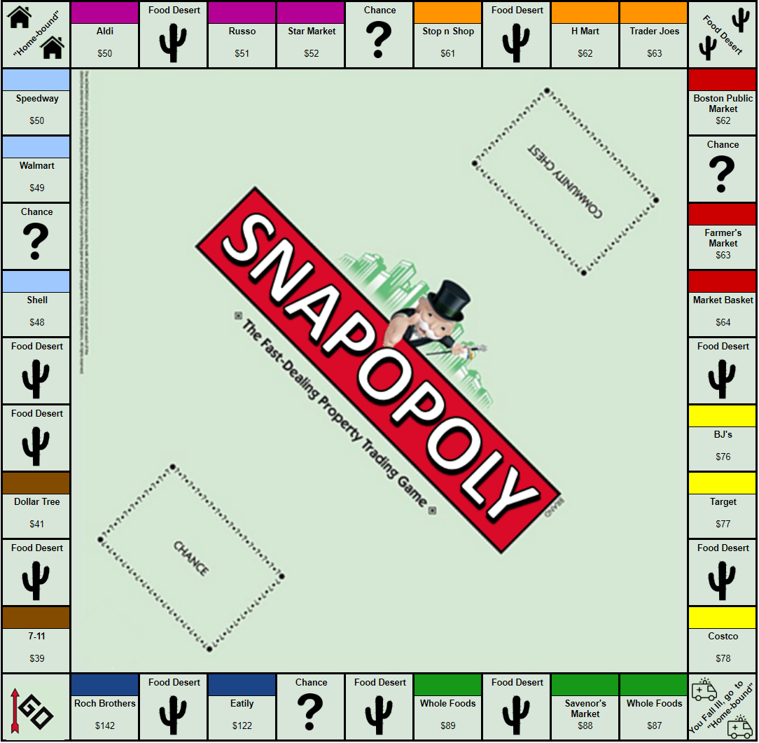
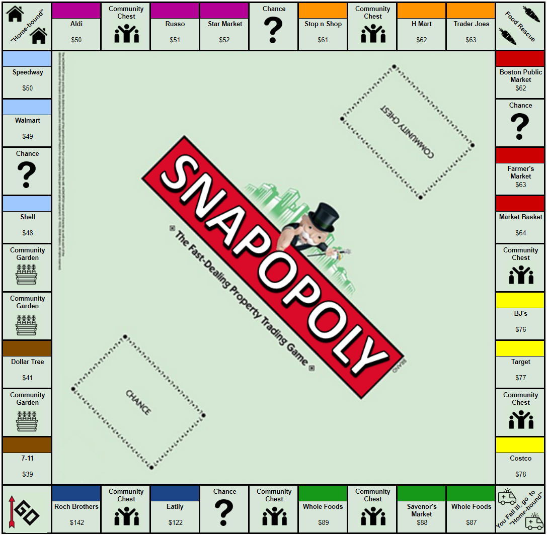
The Board Game in Round 1, Round 2, Chance Cards, and Community Chest Cards are displayed in the figures at the end of the blog.

Data Used:

  • Food stamp monthly budget for single person
  • Pounds of food donated to the Greater Boston Food Bank by donation type (food bank, soup kitchen, after school programs, etc.)
  • Meals on Wheels food donated, scaled to city of Boston population
  • Average weekly meal spend according to USDA:
  • Food waste generated (40% of all food produced is wasted, we are generously assuming you can recover 25% of all food produced through food rescue, this is to make sure the food rescue dynamic comes into the game play, otherwise it is too small)
  • Food Deserts – (40% of Boston is a Food Desert, we have 26% of our board occupied by food deserts in round 1, due to game play mechanics, otherwise the proportion is too large to demonstrate other concepts).

Figure 1: Snapopoly game board (Round 1)


Figure 2: Snapopoly game board (Round 2)


Figure 3: Chance cards


Figure 4: Community Chest Cards


References:

Food insecurity, ethnicity, and SNAP in Massachusetts

Team member names: Sanjay Ganeshan, Wataru Doita, Zhu Shikun, and Michael Rieker

Audience of the story: legislative members that are government workers for Massachusetts. It’s important to understand what visuals, formats, and colors work for them. For instance, using red and blue would signify different political parties whereas we may be wanting to emphasize good and bad. Considering this, we will focus on quick, high level summaries at first, and then dive into the specifics of our narrative.

Our goal:  examine demographic disparities in food insecurity in Massachusetts using the given data and various data mapping tools (such as Tableau or CartoDB). More specifically, we want to see how race relates to food insecurity.  A final goal would be to have the government change the amount of money going to different areas in order to address food issues.

Who we are in the story: organizing body (a lobbying group, for example) presenting our findings to Massachusetts legislature advocating for the expansion of food assistance programs by county.

Abstract words that we need help presenting: change, hunger, food assistance, demographics, racism, poverty.

Context of the story: we want to convince the Massachusetts legislature to take a deeper look at their food assistance programs and some underlying biases that may be affecting their decisions. The presentation can be viewed as a meeting with these legislative members in which we present the data we have found.


The Sketch:

The main focus of this sketch is maps and creative maps. More specifically, our group chose to use the “Feeding America – Hunger in America (2016)” dataset as well as other data sources that we have listed in the references. These other data sources allowed us to gain information on the demographic and income inequality situations within the counties and cities of Massachusetts.

First step: we start with a broader narrative that concerns food security, food assistance, and demographics for all of Massachusetts. More specifically, we are interested in the Supplemental Nutrition Assistance Program (SNAP), previously known as the Food Stamp Program. This program focuses on providing food-purchasing assistance for low-income people in the United States. This step helps to build context for the overall problem. If we had more time beyond this sketch, we would start the presentation with an overview of what the problem looks like across the United States.

Second step: we dive into the more detailed aspects of food security and demographics. For this sketch, that means honing in on multiple counties in one state, which is Massachusetts. We could ask the question: “How much do you think hunger is a problem in your district or county?” This serves as a way to draw the audience into the discussion and to make them more engaged.

We will compare statistics among different counties and use this to educate the legislative members. We will focus on a limited number of counties given the nature of the sketch. That being said, this type of analysis could easily be generalized to other counties and states.

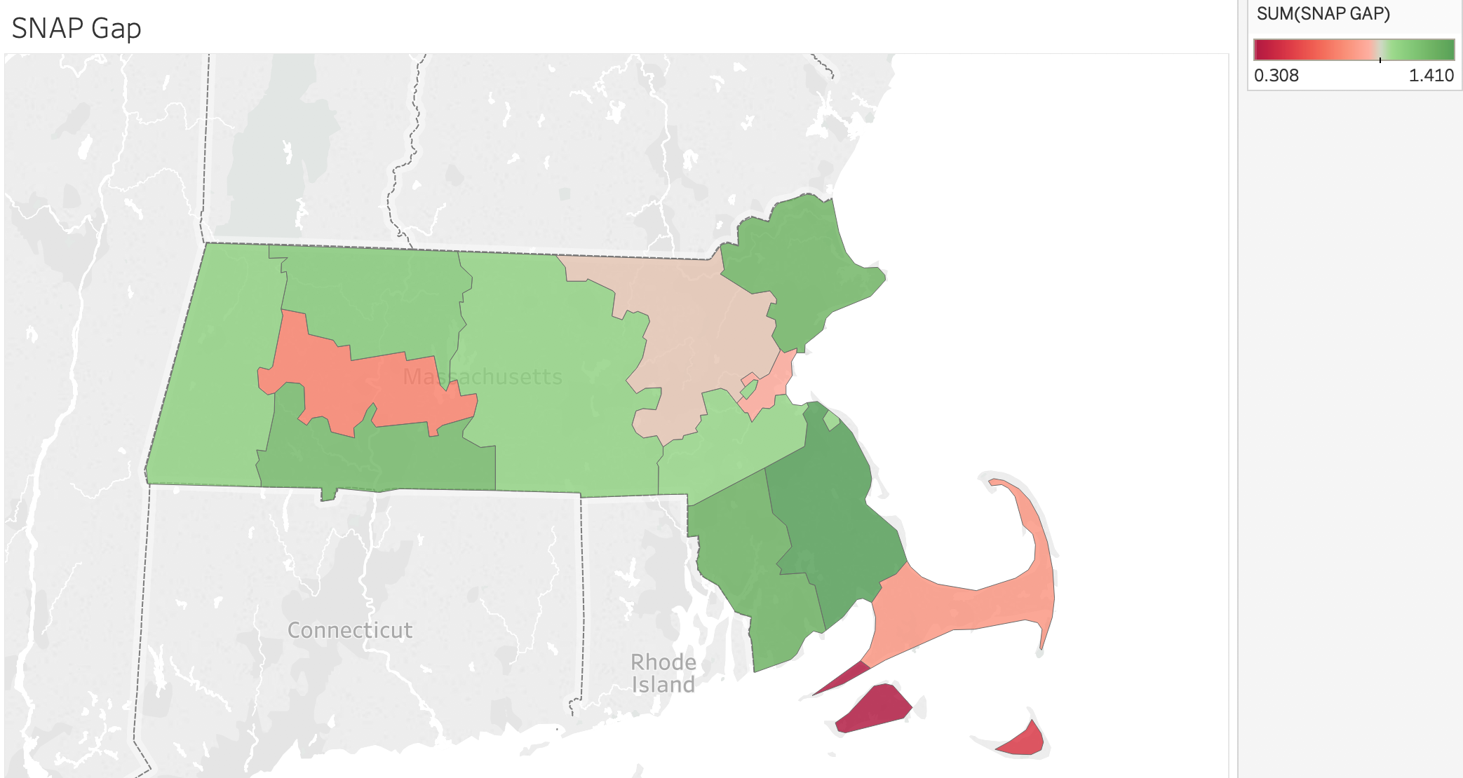
It’s important to note that about 1,443,000 Masshealth Recipients are eligible for SNAP. However, only 763,000 are SNAP recipients, leaving 680,000 people without the aid of snap. That’s a gap of close to 50% in terms of aid received.

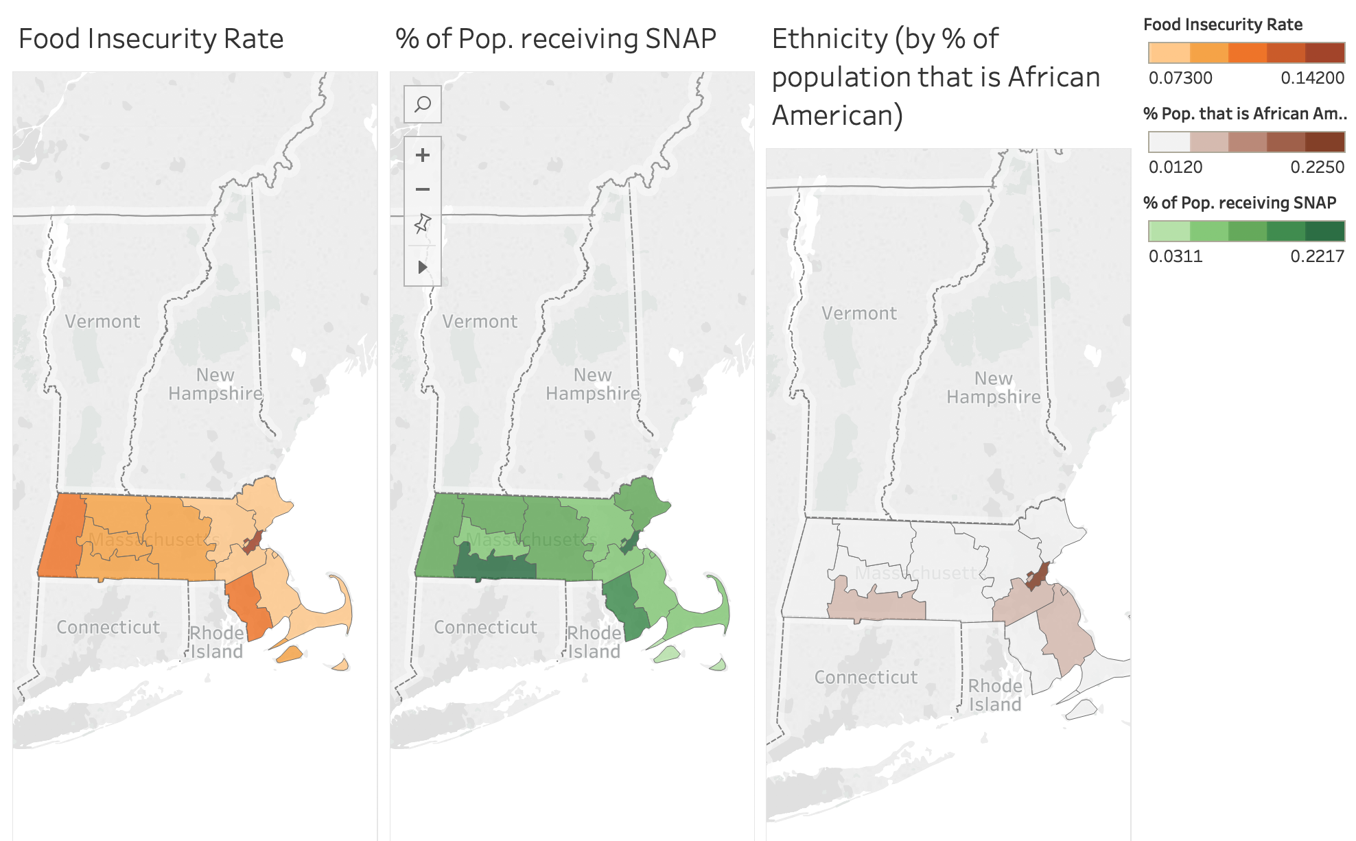
Third step: use multiple “comparative” maps in which we show how the counties differ from one another in topics such as food insecurity, ethnicity, and involvement in SNAP. This will challenge the knowledge of the legislative officials and hopefully give them insight into issues in their respective county or district. We will highlight differences in demographics, ethnicity, and SNAP within Massachusetts and how this relates to differences based on location. An example with an interactive maps and related statistics can be seen below. If we were continuing this sketch, we would dive deeper into other ethnicities and demographic characteristics.


Conclusion: One of the main takeaways is that we do not want to let biases and perceived and/or actual inequalities take over funding choices as this results in unfair treatment of others. We will give the audience information/statistics that they can take away so that a lasting impression is made on the minds of the government officials. In the end, we hope to convince the audience, who are stakeholders in the government, that providing more people with assistance from SNAP can stimulate the economy, increase food access, and help low income residents.


References:

  1. https://www.feedingamerica.org/sites/default/files/research/map-the-meal-gap/2016/overall/MA_AllCounties_CDs_MMG_2016.pdf
  2. https://www.feedingamerica.org/sites/default/files/research/map-the-meal-gap/2016/child/MA_AllCounties_CDs_CFI_2016.pdf
  3. https://statisticalatlas.com/state/Massachusetts/Race-and-Ethnicity
  4. https://public.tableau.com/profile/food.bank.of.western.ma#!/vizhome/MHandSNAP/Story1

The Great British Buffet: 1974 vs. Now

Team Member Names: Melinda Salaman, Ayush Chakravarty, Kate Soule, and Michael Rieker

Audience of the story: focusing on small farmers growing several key food types, such as potatoes, vegetables, etc. Our audience can also be considered to be members of the general public who are interested in learning about different food practices.

Our goal:  educate farmers at a farmers market about the trends in consumption of different key food groups. While overall consumption of produce (writ large) has remained relatively constant in the UK, some categories are faring better (increasing) than others (decreasing). We want farmers to understand where their category lies and walk away with concrete ideas on how to improve or maintain their position.

Who we are in the story: organizing body (of some sort) advocating for farmers’ best interest.

Context of the story: we are presenting a display at a farmer’s market in the United Kingdom. We hope to educate people on food growth, use, and consumption.


The Sketch:

The story we want to tell is that while farmers’ produce has stayed at a relatively level percentage of the UK’s overall consumption (hovering around 50% from 1974 – 2014), there are certain key types of produce that have seen a dramatic decline. We want to draw attention to those groups. We’ll do this through an interactive display: a large tray of food representing each of the different food groups we call out. Each piece of produce represents the consumption of that food type in a particular year.


This interactive display will have farmers participating in telling the story of key groups of produce in the UK. This will be a four stage process in which participants will assess their own ideas about how food consumption has changed in the UK over the past four decades (1974-2014).


  • Stage #1: Show the weekly proportion (in grams) of fruit, vegetables, meat, and dairy consumed by people in the UK in 1979. This will be represented by an actual plate of food in front of the participant. The food will be labeled and these labels will have relevant statistics and graphics that help the small farmers to gain a better understanding of the story behind each food group.


  • Stage #2: Have an audience member construct a plate of food on their own using their understanding of what UK residents currently (2014) consume. In other words, we’ll ask the participants at the market to look at a tray of food with different groups of produce, pick up different pieces of produce, and compare consumption in the past to that of the present.


  • Stage #3: Reveal the actual current consumption of different food groups in the United Kingdom by using a third plate that has the correct proportion of food. This will help people to learn about what is actually occurring and how this may differ from their own understanding.  


  • Stage #4: Provide participating members with a pamphlet that helps them to learn more about how consumption patterns of the groups of produce have changed over time. The follow-up pamphlets will emphasize what they can do next: organize politically, increase farm productivity, and diversify crop yields.


We will go through these four stages during our class presentation to show how the idea would work in practice. We also considered weighting the items of food differently and using a scale to show how consumption had changed.

A very similar process could be undertaken with other types of food (such as industrial meat), but we are clearly focusing on produce for this sketch. An alternate idea would be carving the information into the food itself instead of using toothpicks and labels.

References:

http://britains-diet.labs.theodi.org


Threats to the North Dakota Bee Industry and What Can Be Done to Fix Them

Team Member Names: Zhu Shikun, Theresa Machemer, and Michael Rieker

Audience of the story: government officials and policy makers in North Dakota

Our goal: improve the overall health of honeybees and develop healthy farmer/beekeeper relationships, which will lead to better agricultural, honey production, and pollination results.

Who we are in the story: we are part of a honey bee advocacy group, and we are members of the Honey Bee Health Coalition. We secured a short meeting with their board to talk about the economic benefits of bee health.

Context of the story: We are presenting to the Economic Development Foundation of North Dakota, a board of their state government. More specifically, this is a meeting in North Dakota’s capital building, and we are discussing legislation with policymakers and head environmentalists.

Link to the presentation:

https://docs.google.com/presentation/d/1_XnFRfQMA0xmcTtTzFRbu0tbcwyBZp5GsfZJhoL3HeQ/edit#slide=id.g524761fe51_1_0


The Story:

When considering what we would do for our first sketch, we ended up choosing to work with the bee data. After analyzing the bee colony and honey yield data, the next step was trying to determine a story that we could tell using this data. Bees, the honey they produce, and their relationship with agriculture are an important story because one-third of the food we eat depends on bees and other pollinators.

Our first thought was to split the data up into three geographic regions and see how honey production and bee health differed among those regions. The three regions were the Pacific Northwest, Southeast, and the Midwest. The Pacific Northwest included Washington, Oregon, Idaho, Montana, and Wyoming. The Southeast included North Carolina, South Carolina, Tennessee, Florida, Georgia, Alabama, and Mississippi. The Midwest included Illinois, Indiana, Iowa, Kansas, Michigan, Minnesota, Missouri, Nebraska, North Dakota, Ohio, South Dakota, and Wisconsin. When comparing the data exploration for each of the regions, we realized that something about the Midwest really stood out.

We realized that North Dakota produces the most honey in the United States and has been doing so for many years. North Dakota is also the largest exporter of bees for the purpose of pollination. Our group analyzed features such as number of honey producing colonies, yield per colony, honey stocks, and the price of honey. We believe that most of these features would be suitable proxies for bee health. North Dakota also ranks first in the production of flaxseed, canola, durum wheat, all dry edible beans, all dry edible peas, spring wheat, honey, lentils, sunflowers, barley and oats. Flaxseed, canola, dry edible beans, and sunflowers are all pollinated by bees.

The data for North Dakota was very surprising as no one in our group knew this information beforehand. This led us to performing a lot of research about North Dakota beekeeping and how it affects the United States. More specifically, we learned about the problems that the beekeeping industry is currently experiencing and what can be done to address these issues. The focus of our presentation is bringing up these problems and showing the effects that they can have on the economy, agriculture, and consumers. We are advocating for more assistance to mitigate these issues in the best way possible. This involves a more sustainable relationship between farmers and beekeepers that will lead to better overall bee colony health.

The data used for this project came from USDA honey bee surveys (honey production and colony health), the Honey Bee Health Coalition Website, and the Bee Culture website. The USDA surveys helped us to come up an initial analysis of the situation and allowed to provide evidence of the importance of North Dakota and the problems associated with the U.S. beekeeping industry. The Honey Bee Health Coalition is composed of numerous organizations, agencies, researchers, and beekeepers that seek to improve the conditions of the honeybee. The coalition provided much more detail about the situation at hand and helped us to gain a better understanding of what is being done to help the bees.

When considering how to present the data, we opted for mostly traditional charts and graphs considering our audience and the type of meeting we are having to present the data. Creative charts also worked for some of the statistics that we wanted to emphasize. We felt that a PowerPoint would work well for this scenario, given that it is representative of a meeting with policymakers. We used graphics to show comparisons and relationships between different states and honey production related variables. This is effective because it enabled us to differentiate North Dakota from other states in a way that was simple, yet very descriptive. For the presentation itself, we first wanted to highlight the importance of North Dakota in the bee industry, and then second, present the problem to the stakeholders and its impact on the world around us. We then propose some potential solutions and next steps that can be taken to improve the plight of the bees. Finally, the presentation goes into the impact of these solutions and corrective actions. We also included numerous supporting slides that can be used to address questions from the policymakers or to go into further detail about the beekeeping situation.

It’s important to note that we could definitely have used data to support other pieces of the sketch, but we will be focusing on the main parts of the project for this turn-in.


——————————————————————————————————————

REFERENCES:  


  • https://www.agweb.com/article/honey_bee_health_report_cites_multiple_factors_for_bee_disappearance/