Data Visualization Review
https://www.politico.com/magazine/story/2017/11/03/are-american-women-really-better-off-215782
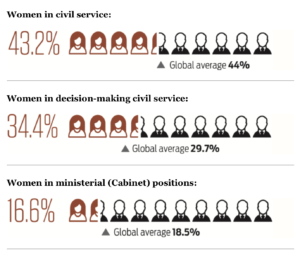
The piece I selected is from Politico, “Are American Women really better off?” The article made visualization based on an index that measures women’s public service leadership by country. It highlights certain data from the overall dataset. For instance, the percentage of women in civil service (43.2%), the percentage of women in decision-making civil service (34.4%), and the percentage of women in ministerial positions (16.6%). The author chose to visualize it based on a scale presentation. Out of 10 “individual images”, roughly 4.32 indicates female images using red outline whereas the rest shows male images using a black outline. I thought instead of a pie chart, such illustration made it more apparent the gender gap in decision-making public service positions. In addition, there is a text and triangle indicating a global average to show where the US is compared to the global average.
Other visualization in this article includes donut charts, bar chart and pie chart, etc.
When I first read the article (right after it was published), I found the representation using personal image to indicate gender gap in positions was very effective. However, now when I look back, I found a different way to visualize may have a better impact.
Actually, I was as involved with the global women’s leadership index creation process at the Wilson Center before the index got launched. The index was created based on three pillars: pathway, position and power of women in public leadership. The rationale is that we shouldn’t solely look at positions women held – because in some context, a majority in positions doesn’t mean power (like Rwanda); in another context, there was no pathway to enable decision-making position. Therefore, the index was measured by the weighted average of three scores based on the pathway (data collected based on access to education, labor market, maternity leave, etc), position, and power(data collected based on good governance index, public perception, etc).
If I were to replicate this visualization, I would use graphics to showcase the steps from the pathway, to position and to power for women in leadership positions in a storyline – so that it is not just a creative use of individual datapoint, but to connect different data points to tell a story. I also thought when we managed to translate the numbers into human narratives using data visualization, it will not only enhance the importance of the numbers themselves but amplify the impact that can be relatable to a wider audience.