- Alarm goes off: Sleep cycle
- Emails: emails sent/received
- Whatsapp: messages sent/received
- iMessage: messages sent/received
- Spotify: “Made for you” – tracks my music likes/dislikes
- Calendar: day’s activities/whereabouts, “new events”
- Social Media: Facebook, Instagram
- Google maps: GPS location at any point in time (!!)
- BlueBikes: bike dock location, time & distance travelled
- Charlie card: commute
- Venmo: $$ transfers, social circle
- Podcasts: podcast preferences
- Credit card: purchases and location of purchase
- Media Lab pantry: no. of times I enter the pantry in a day
- Health app: constantly tracking my physical movement/distance travelled
- Treadmill at the gym: distance ran, calories burned, time spent
- Background phone/computer apps: screen time, browsing history
Author: Rubez Chong
Mass Incarceration in the U.S.
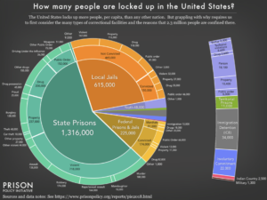
I came across Prison Policy Initiative’s Mass Incarceration: The Whole Piece 2018 whilst doing research for a project. The pie chart shows the no. of people incarcerated, where (types of facilities) they are incarcerated in, why they are incarcerated, demographics of people incarcerated, and whether they are convicted or not.
The visualization aims to offer up a comprehensive overview of the state of mass incarceration in the United States in a single chart. So much of the information surrounding mass incarceration is fragmented because different facilities are run by different government bodies and states i.e. federal prisons vs. state prisons vs. local jails. Without a comprehensive overview, it is hard to articulate the scale and scope of mass incarceration in the country and harder to make a case for the urgency required for criminal justice reform.
Prison Policy Initiative’s work is mostly targeted at researchers and policymakers but the visualizations are also intended for the general public.
I think this pie chart does a good job at providing a high-level, quick overview of the state of mass incarceration as it shows the distribution of incarcerated individuals across federal, state prisons and local jails and a broad breakdown of the offenses. It is also helpful having all of that information encapsulated within a single chart. However, it works as a double-edged sword. Whilst helpful for a quick introductory overview of mass incarceration, compressing all that data in one chart doesn’t leave room for nuances; offense categories are blanketed. From a design perspective, the use of colors is confusing; the bar on the right seems misplaced; the groupings of categories is not consistent i.e. the middle ring shows a breakdown of convicted vs. non-convicted persons in local jails whereas the same ring shows a breakdown of offenses in state prisons. Finally, the visualization is incomplete is illustrating the state of mass incarceration – it only shows a breakdown of people in correctional facilities but doesn’t account for almost 5 million on probation and parole.