H2OMG – Do you want me to dump water on your head?

Team: Julie, Viki, Wataru

The data say that a lot of water is used to produce foods, while the amounts vary by crops, animals, and how foods are processed. We want to tell this story because we rarely have a chance to know this fact. We aim to let hungry goers aware that 1. huge amount of water is used to produce foods, 2. water footprint is different by foods and they can lower it by their food choices (less processed foods, more local foods, less meat and more veggies).

Our audience is people who come to a beach restaurant in California. We selected this audience and setting because we assume that they are so hungry that the restaurant can get their buy-in relatively easily by offering free food and also they would feel a good level of pleasure and stress about dumping water on them. We don’t want them to think the water dumping is either too pleasant nor too horrible so that they can take the learning about water footprint seriously but not unpleasantly through the experience. We believe our data sculpture is an effective way to tell the story because dumping should be a rare, memorable experience and also the restaurant setting allows the audience to see how different the water footprint of each food is. Providing a choice not to have the water dumped on them but to lean how to reduce their water footprint also works well to educate even people who don’t want to be damped.

The data we used is the water footprint data, in which you can see the amount of water used to produce each food is wide-ranging. Since the unit of the data is cubic meter, we broke it down into a per-serve basis and picked some foods which need a lot of water such as hamburger and vanilla and others which don’t like fresh pineapple. We also used the data of total water consumption among agriculture, domestic, and industry and showed them by labeling a pile of gallon water bottles.
Data Log – Digital Data I Created on a Day

Following are the data I created on a day;

iPhone/PC
Screen time
Battery usage
Data usage
App engagement (Facebook, Instagram, Spotify, Slack) – time, in-app activities (likes, messages, etc.)
Music preference
Location
Words I searched on google
Website I visited
Emails received and sent
New events on my calendar

Health devices
Sleep duration and quality
Heart rate and Respiration (rate, variability, inhalation/exhalation time)
Number of steps
Weight, Body fat, and BMI

School
Class attendance/participation
TechCash usage

Exercise
Check-in time for a gym
Distance and duration I biked, and calories I burned

Others
Water usage
Electricity usage
Food I ordered
Payment information by credit card

How World Economy Has Changed?

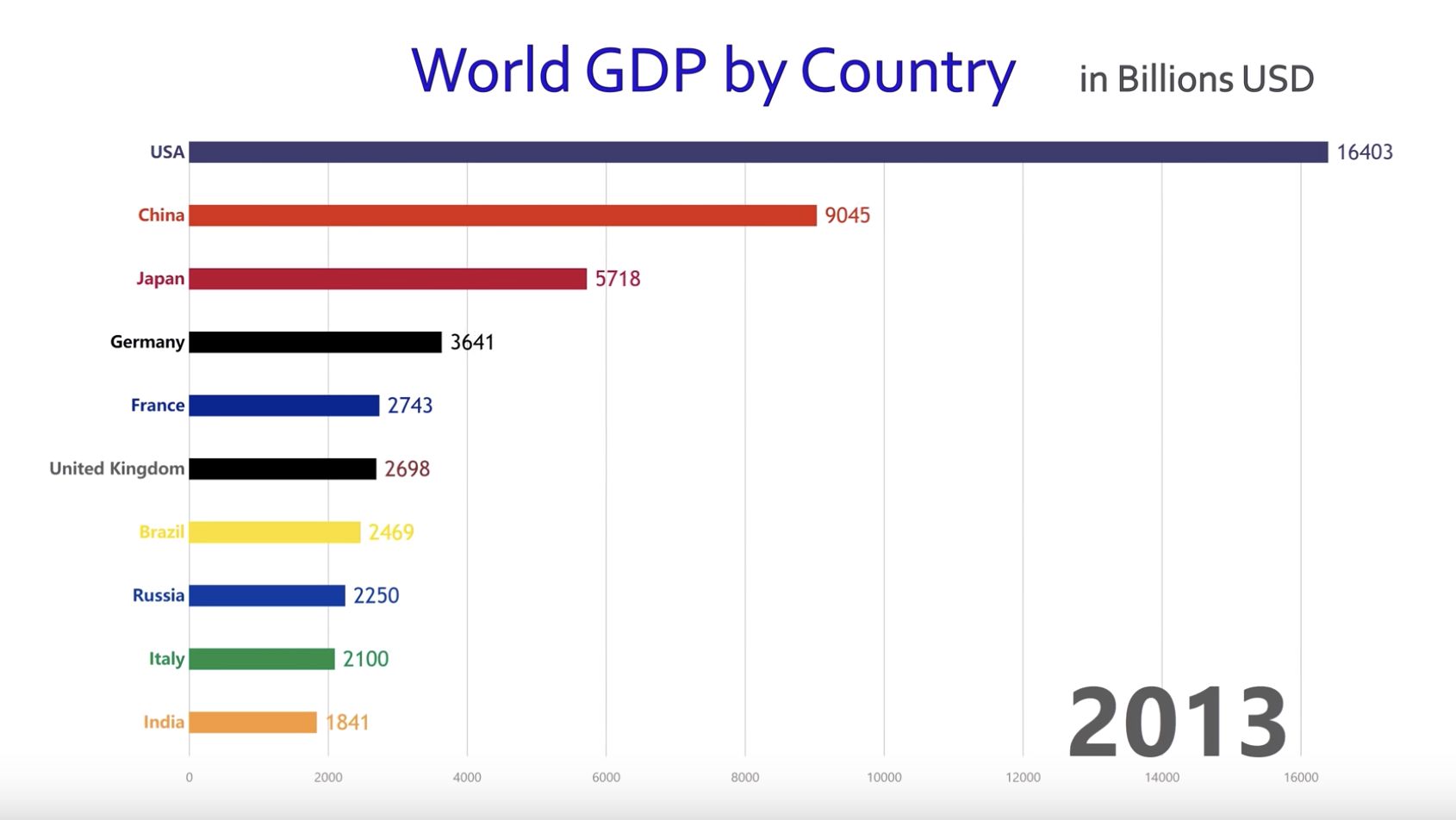
This is a powerful data visualization showing how the top 10 countries in GDP ranking has changed for 1960 – 2017. Basically it’s a simple bar chart but presented in a short video, which makes the presentation more dynamic. You can see US has been dominant for the entire period, Japan grew dramatically in 80s and 90s before it got stagnant, and recently China has grown remarkably. Since this is shared in YouTube and presented in a really simple way, the audience can be anyone interested in the world economy. The goal of this visualization looks really broad and I guess it is to attract many viewers by showing how the world economy has changed over the past 60 years in an interesting way.

I think this is effective in showing the change over the period in a dynamic way. Although the same message can be conveyed by putting different bar charts at different years, this visualization gives more vivid impression. On the other hand, the main message of this video can be focused better. I feel the chart uses too many colors and three minutes is too long. By highlighting charts of some specific countries, the main message of this presentation might be clearer and become more effective.