https://fivethirtyeight.com/features/the-trouble-with-leaving-facebook-is-that-we-like-facebook/
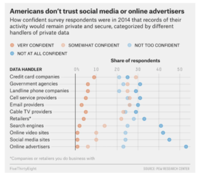
- What data is being shown – this data presentation shows how Americans responded to a 2014 survey detailing how confident they were about the secure usage of their data by various data handlers. The survey results are broken down into four levels of confidence, and this is shown by the different colors in the graphic. The survey responses are split into 11 different data handler categories.
- Intended audience(s) – two possible intended audiences are: 1) managers or executives of companies in these various industries, and 2) Americans or others who are interested in how people feel about the use of their personal data within different sectors.
- Goals of the data presentation – the objective of the graph is to show that Americans are not confident at all in certain industries regarding how their personal data is used or stored. From the graphic, it seems that Americans do not trust a majority of the data handlers. In particular, the author of the graph wants to highlight the extreme lack of confidence in social media sites and online advertisers among other industries and companies.
- Effectiveness of the data visualization: I do not think this data presentation is effective because it is difficult to determine what the audience is supposed to be focusing on in the graph. The headline tells you the main point of the visual, but the actual data handler categories that are mentioned in the headline are placed at the bottom of the graph. I think it would be more effective to move the “social media sites” and “online advertisers” categories to the top of the visual and make them stand out more. However, the data presentation does have a clear and concise headline and the horizontal representation of the data seems to work well.