Team Members: Kate Soule, Tanaya Srini, Nora Wu
Our Audience & Goals:
Our sketch mapping tool is focused on helping health inspectors in Massachusetts do their jobs better and more efficiently, given that the budget allotted for food inspections in MA has not increased since FY2015. As part of our preparation for the sketch, we read about how health inspectors tend to stick to similar routes, which can create blind spots in the food safety of cities. We also read about new research suggesting that there are different dimensions of foodborne illness that have not yet made it to mainstream of health inspections. With these budget constraints in mind, and after reading about some low-income areas in big cities that are experiencing a greater volume of food safety violations, we wanted to begin to incorporate often overlooked analytics, like regional threats ((both regional, state, and local– as food can be sourced at larger geographies but is prepared at local ones)or socio-economic status (certain strains of foodborne illness are more associated with higher-income areas versus others that are more associated with lower-income areas) to offer alternative routes to health inspectors that may be fruitful.
Our goal is to create a tool for health inspectors to unseat some of the typical analytics used to determine foodborne illness (# of failed inspections, days since last inspection) and widening the lens to look at 1) regional and 2) SES concerns to explore how that may change inspectors routes. In this scenario, we are data scientists hired by the state to improve the efficiency of food inspections in light of stagnant budget appropriations. Our presentation will be staged as a run through of the tool, not in its final form, to walk health inspectors through how it would be used and solicit feedback for other data sources or functionalities that would be useful.
The Sketch:
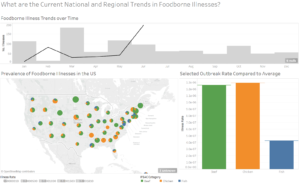
The sketch consists of a few screens, generated in Tableau. First, the health inspector is able to look at current national and regional trends, with the idea being that regional trends are not always considered but can serve as a valuable warning for a neighboring state, since foodborne illness is both an issue of food sourcing (regional/national) and food preparation (local). The inspector can see a pie chart of illness rates in their own state between beef, chicken, and fish, and then look at neighboring states with a regional zoom-in. They can also look at the foodborne illness rates over time to understand how the seasonality affects the likelihood of illness. This is accomplished using the CDC Foodborne Outbreak database.
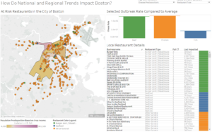
Next, inspectors can zoom to a specific city (we use Boston as a test case) and look at typical data like inspection frequency and failure frequency, before being prompted to look at more exploratory data like median income by zip code in the region and how that might predict a higher likelihood of listeria or e coli. The study linked here suggests that e.coli is associated with high-income areas whereas listeria is more prevalent in low-income areas. By mapping the incomes by zip code, inspectors can begin to chart new paths for their inspections. We incorporated Boston 311 data for restaurant inspections and census data for income for this portion.
At this point in the demonstration, we would ask health inspectors to reflect on the difference between the typical route and the new inspection routes based on a broader set of indicators. Are there public safety threats that are being ignored by the typical routes? What are the new routes missing? This feedback can help us to sharpen our tool. Future directions for the work might include incorporating Yelp data to understand whether the restaurant’s clientele (as judged by number of $ for the restaurant) is predictive of health code violations and/or if there are certain kinds of restaurants (those serving seafood or steak houses) that are more susceptible.