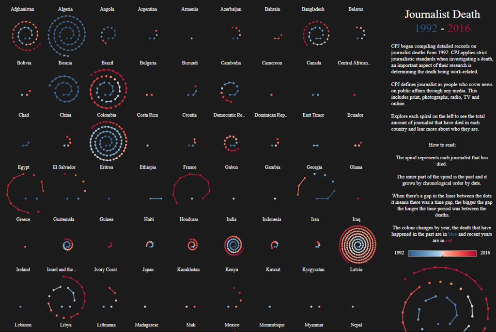
This interactive graph by Soha Elghany portrays the death records from the CPJ (Committee to Protect Journalists). The visualization shows the number of journalists who have died around the world, it uses blue to represent past deaths and red for recent ones. It is also possible to interact with each of the spirals and explore every data point as a story.
The visualization’s goal is to provide an overview of a global problem and let the reader explore it story by story. In my opinion, the main audiences for this work are researchers and the general public. Because the focus is put into navigating stories rather than stats and predictions.
The visualization does a good job getting its core message through as in “journalists are being oppressed worldwide”. Also, having the data points represented as spirals helps to understand the scale of the problem. However, each data point in the spiral is not the same, while for some countries a data point represents 2 deaths for others it can represent dozens. Also, there is no consistent datapoint sizing, in some cases, 49 deaths can be 4 data points whereas in others they are represented by 2 or 3 data points. From a reader perspective, the choice of font type and size is not ideal, it makes the visualization harder to read. In addition, the choice of colors does not enhance the reading experience. Regional filtering/grouping would have been very insightful to have in this viz.