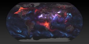
This flowing data blog post creates an aesthetically pleasing visualization of estimates of aerosol particulates in the atmosphere on August 23rd, 2018. This visualization uses mathematically modeled data created by NASA, and overlays the aerosol modeled data with nigh-light data collected by the Visible Infrared Imaging Radiometer Suite (VIIRS).
The audience is likely intended to be uneducated public, as opposed to NASA scientists that created the data, because the visualization is more artistic than quantitative. It would be very difficult to pull and hard numbers or takeaways from the visualization.
The goal of this presentation is likely to raise awareness of the scope of the fires that were going on at the time in both Southern Africa and the US’s West Coast. However, this goal is ineffectively met as there is no clear labels for the images, and it is only after reading a heavy descriptive paragraph that the audience realize this information. I also believe too many artistic licenses were taken, as cyclones are visualized in bright blue, contrasting the red of the fire. This is distracting and irrelevant to the goal of the visual, albeit being very cool to look at.