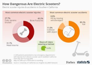
I recently saw a data presentation about electric scooter injuries. It shows data on what types of injuries occur, what type of accidents occur, and the helmet wearing percentage of riders. The data is from two emergency departments in Southern California. The target audience is people who ride or may consider riding electric scooters. The goal of the presentation is to convince people that electric scooters are more dangerous than one might initially think and that they should take precautions such as wearing a helmet. It is mostly effective at doing this but could have a clearer message. I think they could make the helmet wearing message more prominent. It is small and at the bottom. The percentage is strikingly low and they don’t do much to draw attention to it. A visualization of the 4.4% would really help it out. The title sort of implies a message of “scooters are dangerous and should be avoided “rather than “riders need to take the risks of scooters more seriously and wear helmets”. They could also strengthen their message by highlighting how common serious injuries and accidents are by using the color code in the donut chart to indicate severity rather than commonness (which is already being shown by the donut chart). The graphics do a good job of emphasizing the danger aspect and drawing the readers attention.