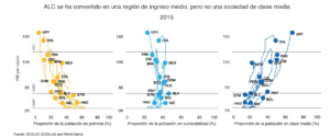
This data presentation tries to portray how as Latin American and the Caribean has transitioned to become a middle-income region, it has failed to increase the size of its middle class. In the graphs, we can see the per capita Gross National Income on the y axis. On the x axis, we can find the percentage of the population living in poverty (less than $ 5.50), in a condition of vulnerability (between$ 5.50- $ 13.00) or who belong to the middle class ($ 13.00- $ 70.00), respectively.
We can observe how the percentage of people living in poverty has decreased. However, at the same time, the percentage of people living in vulnerable conditions has increased. This suggests that, while households have managed to escape from poverty, their economic security is far from being achieved. The goal of this data is to provide a more nuanced perspective on the economic development that the region has experienced.
The audience should be people interested in the region. Probably, it would include people with a background in economics, public policy or international development. This data can be interesting for different types of audiences, including students, government officials, grassroots organizations and in general people with specific interest in the region.
I like that the visualization provides information for several years. Seeing how the data points move around the different graphs made me pay more attention and had a better idea of the evolution of the variables through time.