By: Julie Ganeshan, Berlynn Bai, Nora Wu
The data says that the majority of college-age students eat less than one serving of fruit and one serving of vegetables each day. A study at New York University found that the prevalence of obesity almost doubled from the time that the a class year arrives on campus and when it graduates. While the “Freshman 15” is a hyperbole, college students gain an average of 12 pounds between entry and graduation. This represents only a small fraction of the problem, as sometimes people can make poor nutrition choices, without being overweight. Poor nutrition can appear as too few fruits and veggies, or as too many calories coming from carbs. The NYU study showed that college students average eating fast-food 1 to 3 times a week – much more frequently than any other age group. These foods are usually very unhealthy.
So how come college nutrition is so poor?
There are many factors – college students are usually completely on their own for the first time, and can make whatever choices they want. Some students are on all-you-can-eat dining plans, which make it very easy to get junk food, and lots of it. Some students live in cook-for-yourself communities, but the constant time stresses from work mean that many don’t have the time to worry about nutritious diets.
Let’s look at the current system for cook-for-yourself students. How would you maintain a nutritious diet?
- Look up daily intake requirements
- (Optional) Find recipes for healthy foods you like
- Create a grocery list from these recipes – some recipes won’t intersect well, so you may need to pick different ones
- Buy groceries from the store
- Cook & Eat
- Log what you ate into a fitness app
Each of these steps is disjoint – you, the student, must bridge the gap between the information and tasks. That can be a lot of work!
Enter, The Grocery Game.
The Grocery Game is a mobile app designed to help college students cook themselves healthy, nutritious meals while having a fun social experience. It combines the different parts of the “nutritious diet” problem in one place. We, the developers, represent a grocery chain such as Stop & Shop.
The Grocery Game focuses on grocery shopping. The game is played in social circles – a player can be part of as many social circles as they wish. You’ll compete with and help your social circles.
Each week, we’ll release a set of “awards”. Then, members of each social circle will compete to see who gets the award. Your performance is based on how healthy your grocery cart is.
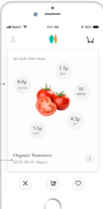
When using the app, you first choose ingredients to compose your cart. Each ingredient has a health score and a calorie score, and your running totals are shown. Once you’ve finished making your cart, our app will make AI-powered recommendations on healthy substitutes for items in your cart. Once you’ve finalized your cart, the app places an order via a grocery delivery service such as Peapod for all items in your cart. We save your cart to your history, to track your weekly caloric and nutrient intake. At the end of the week, the app awards the best cart in each social circle depending on the week’s challenges with a small coupon for their next purchase.
When you choose ingredients, you have a choice between ingredient mode, and recipe mode. In either mode, we keep a running tally of your health and calorie scores that you see while you shop. In ingredient mode, you will browse different ingredients that you can add to your cart. You can browse by category (ex: “Recommended”, “Produce”, “Frozen”), and in the list view swipe left on ingredients you don’t like and swipe right on ingredients you do (these are added to your cart). Tapping on any ingredient brings you to a summary page which summarizes the key nutrition facts of the ingredient and displays its health and calorie scores. You can go to a further details screen that shows all the nutrition facts. Recipe mode is almost identical, except the categories are different cuisines, and adding a recipe adds each of its component ingredients. The recommended section is populated with ingredients or recipes that we think will fit well into your lifestyle, given your past carts.
Some examples of awards we might give:
“Balanced on a Budget”: Cheapest cart with a high enough health score (say, above 90).
“Experimental Foodie”: Cart that has the most new, healthy ingredients that you have not bought in the past.
“Health-Nut”: Highest health score.
Once you’ve made a cart, you can share it with friends, view recipes that can be made from the items in that cart (either those you selected, or generated recipes if you shopped in ingredient mode), and of course view your nutrition intake.
By “gamifying” the grocery-shopping process, and incorporating health recommendations, tracking, recipes, and history into The Grocery Game, we hope to make it easy and enjoyable for college students to choose nutritious diets. By integrating with Peapod, we bridge the gap between what you plan and record, and what you actually do. By adding achievements and social circles, we hope to make grocery shopping fun, and to have friends help each other stay nutritious.
The Grocery Game was our second big idea. The first idea that we pursued was an outdoor activity game that fostered nutrition. However, we found it difficult to incorporate nutrition facts into gameplay, and thus came up with The Grocery Game. This idea was also inspired by first-hand experience in a cook-for-yourself dorm, where students have expressed sentiments like “I love cooking, but hate grocery shopping and planning” , and “taking care of food is really hard”.