Data Map Sketch

Stop&Shop Gives Back

Sarah Caso, Theresa Machemer, Amy Vogel

The data say that food insecurity is spread across Massachusetts, and by mapping it, epicenters of food insecurity become visible. The data also say that institutions around Massachusetts produce a significant amount of food waste. Stop&Shop is one of these institutions and their store locations are correlated with food insecurity epicenters.

We wanted to tell this story as PR managers at Stop&Shop. Stop&Shop already has programs in sustainable food waste management, one aspect of which is food rescue by donating to local food banks. The goal of sharing this community-focused and environmentally-friendly message is to bring new audiences into the store. Our audience is environmentally-minded millennials who may currently shop at Whole Foods and Trader Joe’s, but with our campaign, may be convinced to look into their local Stop&Shops instead. As students, it is interesting for us to share this message from Stop&Shop’s perspective as a way to branch out from presenting from the point of view of activists and educators, who may tell these stories more often than corporate figures. Our goals are to show how Stop&Shop is helping local communities and convince our audience both to shop at Stop&Shop and to support local food banks.

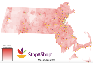
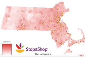
We used the Hunger in America data from Feeding America and MA Food Waste data set to tell a story. The Hunger in America data provides county-level information on the percentage and count of food insecure people, the same data for just children, the percentage who are SNAP-eligible, the total annual budget shortfall to feed everyone who is food insecure, and the average cost per meal. The MA Food Waste data includes information on the entity producing waste, the location of the entity, and the tons of waste per year generated. Our final product is a dynamic map showing food insecure people per acre in Massachusetts, the Stop & Shop locations in MA, and the projected reduction in food insecure people per acre after Stop & Shop donates meals to curb food insecurity and prevent waste. Based on research of Stop & Shop’s current initiative to donate, compost, or recycle 90% of their waste by 2020, we approximated the amount of waste they would be able to donate at the onset of their campaign to be 60%. We also made a map of the number of meals donated per acre each day. The maps we made are appropriate because we are telling a geographic story: the Stop & Shops have decided to donate to food banks within a 5 mile radius of each location, so the reduction in food insecurity in a given block largely depends on its location (along with the amount of food waste that particular Stop & Shop generates). Showing the data in geographic form rather than a chart makes the story more compelling because the audience can see affected areas, and as residents of Massachusetts, probably have an emotional connection to some/many of these places. For example, the zoomed-in “before” and “after” maps of Cape Cod show a visible amount of food insecurity reduction in a few blocks that people are probably quite familiar with because either they live there, they know somebody else that does, and/or they visit the Cape during the summer. The map brings the issue closer to home for the viewers and allows them to physically see the effect on places they recognize better than reading a list of numbers would.

“Before” Map:

“After” Map:

Link to all media:

https://drive.google.com/drive/folders/1N4VraOqmHTrO9ak0oMsAYpDEM3jmCzJe?usp=sharing

My Digital Data Log on a Regular Sunday

I created the following types of data on Sunday, 2/24:

  • What time I woke up (when I turned off my alarm and started actively using my phone)
  • The distance and time I ran on the treadmill (assuming the treadmill has some sort of data log)
  • When I entered a T station
  • When and where I bought coffee and lunch, what items I purchased and how much they cost
  • When I called an Uber/Lyft and my location during this time period
  • When I tapped into my dorm and other dorms on campus
  • When I bought groceries, where I bought them, and which items I purchased
  • How much I walk over the course of the day
  • What food I ate (I have a food diary app to track what I eat throughout the day)
  • Which songs I listened to on Spotify, when, and on which device
  • Who I sent text messages or facebook messages to (or received from) and the content of those messages
  • What times I called people and how long the calls were
  • Which shows I watched on Netflix and for how long
  • When I listened to podcasts online
  • What I Google searched
  • What Google Docs/Sheets I wrote in, who it was shared with, and when they were edited

Data on Who is Fighting Who in Syria

Link: http://www.slate.com/blogs/the_slatest/2015/10/06/syrian_conflict_relationships_explained.html

What data is being shown: The relationship between each “player” in the Syria conflict. The players are either countries/governments, alliances of countries, or militant groups. Relationship is represented as a categorical variable with the following categories: “Friends”, “It’s Complicated”, or “Enemies”.

Who you think the audience is: This presentation was published in 2015, four years after the conflict began in 2011, and shows the data in such a simplistic way. From this, one can infer it is meant for readers who haven’t been following the conflict in Syria and want to get up to speed about who is involved and where they stand with each other. It does have small explanations for each relationship if the reader chooses to mouse over a particular square in the chart, but it is not meant for someone who wants to know all the details or an in-depth analysis of the war. Additionally, it is probably meant mainly for Americans since it is written in English and refers to the “US and allies.”

What do you think the goals of the presentation are: Educate the public on a complicated issue that is prominent in a lot of U.S. military decisions. Since the issue is confusing with so many different players and interests, the presentation tries to make the information as accessible as possible so people will actually educate themselves on the conflict rather than give up because keeping track of all the details is a headache. Perhaps another goal or desired result of this goal is for people to make more informed decisions when they vote; however, this presentation seems objective and factual, so swaying political leanings is most likely not one of its goals.

Whether you think it is effective: I think it is effective because 1) it summarizes the complicated relationships in such a way that the audience can see everything laid out at once. This makes comparison easier and allows the audience to easy select the relationships they are interested in learning more about. 2) It has three color-coded categories and only displays words when the audience decides to learn more. This makes consuming the information simpler and more effective because the reader isn’t overwhelmed with text or too many icons to decipher. Overall, I think the presentation accomplishes the goal of educating people on the topic without giving them so much information that they can’t quickly synthesize or remember most of it.