Fueling Frenzy: Methodology

Team Members: Theresa, Tanaya, Philip

Fueling Frenzy is an iteration of the Games Sketch: Fuel Frenzy data game, with a complete deck of cards and two sets of rules, so the deck can be used for a suite of multiplayer games that teach basic concepts of meal planning with balanced nutrition.

The data we used appears mostly in the cards’ attributes.
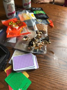
Data: Cards

We surveyed the free food available in the Sloan Slack to create the “Free food” deck, with card frequency based directly on the number of times each food was offered in the free food channel. The foods available in general deck were chosen after observing the food available on campus in dining halls, the student center, and an independent living group’s monthly menu. Foods that were observed more frequently (3+ times) appear twice in the deck, and foods that appear less frequently (1 or 2 times) appear once in the deck. Event cards were based on the MIT event calendar and food outbreak data.

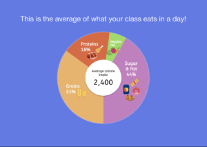
The foods are divided into four categories: Protein, starch, fruits&veggies, and junk. The cards are ranked within their category based on what we judged as the category’s stereotypically-associated nutrient. Proteins were ranked by grams of protein, starches by grams of fiber, fruits&veggies by milligrams of vitamins, and junk by kilocalories. The nutrient data was found in the USDA food composition database. Most categories have foods ranked from 10 points to 2 points. Junk food is the only category with foods worth only 1 point, and with a maximum of only 5 points, after we agreed through discussion that some junk foods are substantial enough that it is unrealistic to rank them all as 1 point. However, junk foods still do not qualify for any bonus points, and thus simulate the fact that junk food is used only to meet immediate hunger/snackish-ness and not for nutritional gain.

The data as it’s applied to the cards is summarized in the Food Scores spreadsheet.

Story: Orientation, Freshman Year

The story is follows the ways that freshmen learn to be thoughtful when making food choices over the course of their first semester at MIT. The games are intended to be played in order during a session of orientation.

The session begins with the game of chance, followed by a discussion in the orientation group, followed by the strategy game. The random chance game simulates the mentality that freshmen often start with–just eat enough to be full, find food wherever it’s available–and then makes them reconsider whether this strategy is sustainable. Discussion questions asked by the orientation leader may include: What kinds of meals did you make? Is anything missing from, or over-abundant in, those meals? Would you eat like that in real life? Do you think the meals you created here provide enough fuel to a) go on a run? or b) ace a long test? How have you been eating during orientation?  

The orientation leader would then explain the rules of the strategy game, which incorporates a more thoughtful approach to meal planning through a point-based card game. Through bonus points and nutrition goals, the game encourages players to think about balanced meals and the ways that different foods complement each other nutritionally.

A concrete, material takeaway of this orientation session is a booklet of simple recipes teaching freshmen how to cook staple foods like steamed broccoli, fish, and potatoes. While the orientation leader is passing this out, he or she could again have a short discussion and answer questions from the freshmen about food options on campus. Some of the prompts for this discussion might include: were you surprised by any of the nutritional values of the foods? Were the meals you made in the strategy game more like meals you’d eat in real life? What strategies were more successful in pairing foods to maximize nutrition? If you ran out of cards before the end of the game, how might you change your strategy in the future?

The combination of the simulation through game play and debrief discussion create an environment for thoughtful engagement with the challenges of eating healthy at MIT.

The presentation for our game, which includes rule sheets, can be found here.

Fueling Frenzy: Impact

Fueling Frenzy is a specialized card deck designed for use in a suite of games related to meal planning and nutrition on campus. After hearing about some of the politics around meal plans and food insecurity for undergraduates on campus, we started to think about how reliant students might be on free food and how much of that free food isn’t particularly healthy. Based on a combination of the USDA nutritional database, campus free food listservs, and campus dining hall menus, we identified a set of foods commonly found on campus (both for free and at dining halls), and assessed their healthiness based on different metrics. We found that many of the most frequently available foods on campus are not particularly healthy, which made us want to encourage healthy eating and thoughtfulness around meals through a set of games. One is a game of chance meant to simulate unthoughtful eating habits and one is a strategy game meant to encourage a more thoughtful approach to nutrition on campus.

Our game is meant as an orientation activity for incoming college freshmen (“prefrosh” at MIT). In general, these are young people who previously lived at home where their eating habits were externally determined and who rarely prepared their own meals. They have fast metabolisms, but only about a quarter of them will join sports teams. When combined, these factors suggest that the average freshman at MIT has probably not given much thought to his or her eating habits and might not see a need to do so. Prefrosh are also probably unprepared for the diversity of foods available on campus, and the sheer volume of free foods especially.  As such, we want to intervene at the first possible moment–during orientation–to encourage healthy eating habits, play out MIT scenarios that might affect one’s nutrition, and ultimately make the connection between eating healthy foods and high cognitive functioning.

Because of finals-related constraints, we were not able to pilot with college freshmen. Instead, we ran two pilot games with former and future orientation leaders in MIT’s School of Architecture and Planning. This audience is useful to work out the kinks of facilitation, and were also all college freshman at one point in time. After each pilot, we conducted focus groups with the players to assess strengths and weaknesses of the games (this was in addition to the semi-structured conversations that happened at the mid- and end-points of each game).

Questions included:

  • How clear were the game’s goals?
  • How well did you think the importance of healthy eating was conveyed to students? How would you sharpen this message?
  • How helpful did you find the mid and end facilitated discussions? Were there directions you’d like to take these conversations that weren’t explored this time?
  • To what extent did you think the design of the game aided in its purpose? DId you think the “takeaway card” would be appealing/useful to your students?
  • How empathetic do you think the game was, in terms of meeting students where they’re at as prefrosh and orienting them towards MIT dining? Are there potential areas of stigma that we should be aware of?

Feedback was largely positive. Players universally agreed that the game was “actually fun” and that the data associated with the cards yielded some surprising insights. For example, one player exclaimed “I always thought dumplings were a meal in themselves! …seeing them categorized as a starch, and not even that healthy of one… that will stick with me.” In terms of our logic model, the realizations about the relative nutrition of common foods available at MIT achieved the goal of providing helpful heuristics for judging the nutritional qualities of familiar foods. Players also agreed that the need in both games to recognize “balanced meals” was a good exercise; one player remarked that “the idea of pairing free foods with healthy ones should be obvious, except it’s really not!” Comments like this suggest that the goal of encouraging the enhancement of free foods with healthy additions, while recognizing that free food is enticing, was met through the second game.

The conversations were well received, especially for the first game that is meant to be played at a faster pace. A player in the second pilot explained “the discussions really helped to reframe the game– I tend to get caught up with winning, so the prompts were a necessary redirection.” Most of the constructive feedback concerned design and game logistics. For example, players found the different colors of the suits to be helpful, but thought that junk food should have been a “junky” color “like neon or black” to really distinguish their lack of utility as compared to the other suits. Another helpful suggestion was directed at the “takeaway” cards, that serve as a takeaway recipe card for game participants. While the aesthetics of these cards was appreciated, players raised the helpful point that the recipes should be pitched to what freshman can reasonably make in a dorm kitchen; instead of “how to cook fish,” toaster oven and microwave recipes would be more immediately useful to the audience.

The spreadsheet with our logic model with our short-term goals, and questions for freshman and orientation leaders can be found here.

A Day in the Life of Health Inspectors

Team Members: Kate Soule, Tanaya Srini, Nora Wu

Our Audience & Goals:

Our sketch mapping tool is focused on helping health inspectors in Massachusetts do their jobs better and more efficiently, given that the budget allotted for food inspections in MA has not increased since FY2015. As part of our preparation for the sketch, we read about how health inspectors tend to stick to similar routes, which can create blind spots in the food safety of cities. We also read about new research suggesting that there are different dimensions of foodborne illness that have not yet made it to mainstream of health inspections. With these budget constraints in mind, and after reading about some low-income areas in big cities that are experiencing a greater volume of food safety violations, we wanted to begin to incorporate often overlooked analytics, like regional threats ((both regional, state, and local– as food can be sourced at larger geographies but is prepared at local ones)or socio-economic status (certain strains of foodborne illness are more associated with higher-income areas versus others that are more associated with lower-income areas) to offer alternative routes to health inspectors that may be fruitful.

Our goal is to create a tool for health inspectors to unseat some of the typical analytics used to determine foodborne illness (# of failed inspections, days since last inspection) and widening the lens to look at 1) regional and 2) SES concerns to explore how that may change inspectors routes. In this scenario, we are data scientists hired by the state to improve the efficiency of food inspections in light of stagnant budget appropriations. Our presentation will be staged as a run through of the tool, not in its final form, to walk health inspectors through how it would be used and solicit feedback for other data sources or functionalities that would be useful.

The Sketch:

The sketch consists of a few screens, generated in Tableau. First, the health inspector is able to look at current national and regional trends, with the idea being that regional trends are not always considered but can serve as a valuable warning for a neighboring state, since foodborne illness is both an issue of food sourcing (regional/national) and food preparation (local). The inspector can see a pie chart of illness rates in their own state between beef, chicken, and fish, and then look at neighboring states with a regional zoom-in. They can also look at the foodborne illness rates over time to understand how the seasonality affects the likelihood of illness. This is accomplished using the CDC Foodborne Outbreak database.

Next, inspectors can zoom to a specific city (we use Boston as a test case) and look at typical data like inspection frequency and failure frequency, before being prompted to look at more exploratory data like median income by zip code in the region and how that might predict a higher likelihood of listeria or e coli. The study linked here suggests that e.coli is associated with high-income areas whereas listeria is more prevalent in low-income areas. By mapping the incomes by zip code, inspectors can begin to chart new paths for their inspections. We incorporated Boston 311 data for restaurant inspections and census data for income for this portion.

At this point in the demonstration, we would ask health inspectors to reflect on the difference between the typical route and the new inspection routes based on a broader set of indicators. Are there public safety threats that are being ignored by the typical routes? What are the new routes missing? This feedback can help us to sharpen our tool. Future directions for the work might include incorporating Yelp data to understand whether the restaurant’s clientele (as judged by number of $ for the restaurant) is predictive of health code violations and/or if there are certain kinds of restaurants (those serving seafood or steak houses) that are more susceptible.


Where is Your Water From?

By: Lily Xie, Sarah Caso, and Tanaya Srini

Our group worked with many of the tables provided in the Food Water Footprint report and eventually settled on using the “virtual water” data to demystify where our water comes from, and how much water we consume beyond typical household uses. The data say that only 5% of the water we consume on a daily basis in the US is related to household uses like drinking water, washing our clothes, and showering. Industrial uses account for 10%–double household use–of the water we consume, which was very surprising since we didn’t know what industrial uses actually included. We wanted to tell this story because we we wanted to correct misconceptions about water usage in the hopes of influencing how people think about their water consumption when trying to be more environmentally friendly.

Our audience are Boston Museum of Science visitors on World Water Day (March 22, 2019). We selected this audience for our demonstration because we wanted to deepen the knowledge of those with some preexisting engagement with science (i.e. visiting the Museum of Science on World Water Day). Our assumption is that these visitors would both be interested in learning about water and generally committed to environmental justice (given their celebration of World Water Day, a holiday created by the United Nations to further issues of water access). In crafting our sculpture/demonstration, we considered the all-ages audience we’d likely encounter at the Museum of Science and the way the audience would cycle through the museum, and concluded that we needed to utilize a more personal and interactive format to capture their attention initially and keep the demonstration concise to maintain our audience’s attention.


Caption: Setting up the demonstration 

Our sculpture and accompanying demonstration use water and cups (labeled with daily use, agricultural, and industrial) to invite visitors to guess how their water consumption is distributed across the three categories before revealing the actual distribution in pre-poured cups. Next, we introduce the idea that water shortages are a possible outcome of global climate change, to demonstrate the consequences such a shortage may have on one’s personal consumption. We do this by reducing the amount of water available for distribution, and asking visitors to make choices about how they would distribute their consumption under these conditions. The demonstration ends with an explanation of what the visitor’s new water consumption may change their life (i.e., less paper or cutting fresh produce in half).

We stick to household objects for our sculpture so that visitors feel comfortable interacting with the materials, and so that we can run multiple demonstrations at one time. We chose to discuss water shortages to challenge/broaden the visitor’s understanding of how their consumption may be affected. A water shortage would not just mean having to take shorter showers, but could also affect the kinds of foods we are able to eat, and how the material world around us looks and feels (in terms of industrial uses). The intent of the sculpture/demonstration aligns well with the goals of World Water Day and would slot in to the Museum of Science’s programming easily.


PROCESS

Our group never strayed from the Food Water Footprint data but abandoned a few ideas along the way. We crunched virtual water data that showed how much water countries imported and exported (disaggregated to green, blue, and gray water categories). We compared this data to global projections for drought severity, the Palmer Drought Severity Index to understand whether countries that were more or less susceptible to drought were also reliant on internal or external virtual water sources . We planned to do this by building lego blocks for each country to a height representing the share of the country’s total water usage that was imported. The color of the lego model represented the projection for drought severity on a color ramp from red (severely drought prone) to white (moderately drought prone) to blue (not drought prone). We then planned to pump water into a fish tank with selected countries, and lower the water level to simulate countries that would be left “high and dry” in the event of a water shortage. Unfortunately the message we were trying to deliver–about countries that were over-reliant on external water sources being particularly prone to drought– was not aligned with the visual approach: the countries more reliant on virtual water would be “revealed” by the falling water line first, but people tend to look at the emergence from water as a positive thing, since being submerged in water is associated with drowning. We also found it difficult to make the data land for our audience. It was difficult to personalize international water flows, and that message was taking precedence over our intent to explain the concept of “virtual water.” For these reason, we decided to return to our message and audience and try to simplify our sculpture to deliver a meaningful message about where their water comes from and how it is distributed.

MOCK DEMO SCRIPT

Welcome to the Museum of Science and thank you for attending our 2019 World Water Day event. Today we’re going to talk about where our water comes from.


Where do you think the water you use comes from?

(Audience answers: the tap, aquifers, rain)


All the answers you gave are correct – these sources contribute to domestic water – all the things you do at home: drinking, cooking, bathing, washing clothes and dishes, brushing your teeth, etc.


But there are actually OTHER ways we use water that do not fall into this category. What do you think these ways are?

(Audience answers: food, gardening)


[ Present the cups ]


In our day-to-day, we also consume water in the form of agriculture – such as the water it took to grow the vegetables we eat, or the water needed to feed livestock. We also consume water by ways of industrial products – for instance, the water it takes to make paper and plastic and even the clothes you wear.


[ Give everyone a cup full of water ]


Let’s say that this is how much water you use in a day. Go ahead and pour how much water you think you consume in each of these categories.


[ Reveal actual cups ]


Actually, 85% of the water we use is in the form of agriculture. 10% is in the form of industrial products, and only 5% of the water we consume daily is in the form of drinking or bathing.


[ Hand out marker ]

Now let’s draw a line around our cups to mark the current level of water use and pour the water back in our cup.


For many of us in Massachusetts, we are able to get enough water to live our day-to-day lives. However, not having enough water is a problem in much of the world, and will become an even bigger problem in the future. Due to growing population demands and climate change, scientists project that global water supply will only meet 40% of demand by 2050.


Let’s think about how your life might change if you only had access to 40 % of  the water you have today. Pour out half of your cup, and redistribute the water once more.

(Audience fills domestic cup 4%, industrial 5%, and agriculture only 31%)


It looks like you chose to fill up your agriculture cup roughly a third of the way.  Let’s see what the repercussions of this water shortage would look like.


[ demonstration ]


[Reveals the apple]

For every apple you eat today, you’ll only have access to ⅓ of the amount in the water shortage scenario.


[Reveals the soap]

For every container of soap you buy today, you’ll only have access to about ½ of this amount to wash your hands and dishes in the event of  a global water shortage.


[Reveals the water bottle]

Lastly, since you decided to keep your domestic water close to what it is today, you’ll still be able to access almost the same amount of drinking water, about enough to fill 80% of a water bottle for every water bottle you fill up today.

Food for Thought: Understanding Food Insecurity in Middle School

Our audience for this teacher-facilitated interactive are middle schoolers in the setting of a nutrition or health class. We chose to target this audience because food insecurity is a newer and more nuanced term than hunger—one that much of the team did not encounter until later on in our educations—but can affect people at any age. Because middle school aged children are beginning to go through puberty, gain autonomy in different realms of their lives and are not the intended audience in any food security interactive we encountered in our research, we thought this provided the unique opportunity to contribute to the available resources and do so for a population not usually targeted.

The data say 12 million American youth experienced food insecurity in the past year. As we embarked on our research, we noted how many resources geared toward youth focused on the causality between abject poverty (often in the global south) and hunger, even though food insecurity is a widespread phenomenon in the United States—even in wealthier, progressive states. We wanted shine a light on this problem at home because food insecurity can have effects on one’s academic performance, energy for activities, mood, physical appearance, and long term health, and we thought it was likely that this audience would not have engaged with food (in)security substantively in their educations, despite certainly understanding the concept of feeling hunger as a universal human experience. The Feeding America dataset is among the most accessible resources available for measuring food access in America, so we wanted to create a resource using this data that teachers could utilize in familiarizing their students with the concept of food (in)security as a localized concept.

Our interactive aims to provide  moments where students’ are co-creating data that can be used to question their assumptions about food (in)security (i.e. in comparing their caloric intake to that of the class, and understanding that food insecurity does not just involve not having any food to eat, but also not having high quality food to eat). The interactive also tries to demonstrate why food insecurity matters to middle school students using accessible examples (i.e. scoring poorly on an exam or not performing well in an athletic competition).  Finally, in an effort to avoid imparting widespread anxiety about food (in)security, the interactive includes suggestions of how to combat food insecurity in one’s hometown via ideas like planting food in a community garden or volunteering at a food rescue.


We feel the interactive succeeds in using easily understood, but powerful, data to introduce students to a sophisticated concept, and providing simple examples, explanations, and recommendations that can be absorbed within one class setting. Our interactive could be improved in a myriad of ways including incorporating more types and sources of data (as more youth-specific

or hyperlocal data becomes available) and sharpening the connection between online and offline activities that the students are asked to engage with throughout the facilitation.


Team: Rubez, Wataru, Tanaya