Data presentation: museum of capitalism

Capitalism Museum

Recently, I visited the Museum of Capitalism exhibit at SMFA. Among the pieces on display, there was an interactive sculpture titled “The Minimum Wage Machine”, which invited folks to crank a handle to churn out one penny every four seconds – or, $9/hour.

Since the piece sits in a gallery within a university, I think the audience of this piece might be students, academics, and folks wanting (and able) to seek out art. Not everyone has the time, mobility, or financial resources to make the trip out to this gallery, and not everyone might know about or be the target market for the SMFA. I only happened to stumble upon this gallery when I was trying to get to the SMFA store, and likely wouldn’t have known about it otherwise. I would also guess that the audience of this piece is folks who do not earn minimum wage.

I think the goal of this presentation is to create a personal connection and understanding of the minimum wage. By inviting active participation with the body through the use of the hand crank, the artist creates an embodied understanding of what it means to earn $9/hour through active work (rather than purely an intellectual one). There is also a temporal element of this presentation – in order to “make” the hourly wage, the viewer understands that they would need to stand there and crank the machine for a full sixty minutes; the time it takes to earn $9 is also embodied. I also think that, by creating the base unit a single cent, this presentation also aimed to emphasize how low the minimum wage is. A penny is generally understood to be low value, and by breaking down $9 into one-cent units, the artist invites viewers to think about how little money is being made.

I thought that this was an effective data presentation. I personally am very interested by kinetic communication of data/communication that involves the physical body, and thought that this presentation made the feeling of earning minimum wage relatable for anyone who saw the sculpture. I also think the piece was memorable, in part because it involved movement and touch, which also makes the presentation effective in my mind.
Can Statistics Learning be Intuitive?

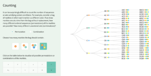
Can statistics learning be intuitive? How can learning experience be more creative? Here is an interactive data storytelling example that I found both accurate and engaging: Seeing Theory.

Seeing Theory is an interactive data visualization that makes statistics more accessible. It was built using D3.js, by a group of students from Brown University. By decomposing classic statistics theories to step-by-step playful interactions, Seeing Theory visualizes different statistical events to allow users to better comprehend the seemingly complicated logic behind statistics theories.

Seeing Theory has a wide range of audiences – from high school and college students who just entered the field of statistics, to professionals who want to have a brief understanding of statistics to help with decision-making but nothing too deep. It does a great job in combining both playfulness and learning objective, and tackles the very pain-point of traditional statistics learning experience – where the theories are counterintuitive and difficult to comprehend.

The methods that this visualization applies are groundbreaking and worth-scaling. Thinking about the common methods that embedded within our day-to-day learnings and teachings, are there opportunities can be further explored in order to make the process more engaging and enjoyable? How human-factors can better inform the design of data storytelling? Seeing Theory offers us an alternative of how future learning might look like.

Moovit Public Transit Insights

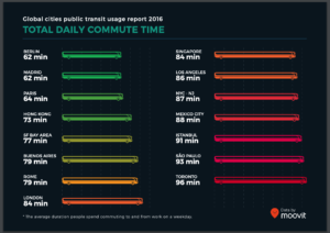
I found Moovit’s Global Cities Public Transit Usage Report while looking for public transit statistics to use to market a different transit-related company. Moovit is a transit navigation app — the data presented here was collected through that app. From this page, you can access the same report in many languages, as well as similar reports that are country-specific. This suggests that Moovit wants to appeal to a global audience. Across that global audience, I think Moovit wants the attention of people in the public transit realm — the major players (e.g. planners) and the stakeholders (e.g. committed transit users). I think that this is ultimately meant to market their products, as they have a newer product (mobility analytics tool) meant for planners and want to demonstrate that they have lots of data.

Overall, I found most of the slides visually compelling and easy to understand. The slide pictured above represents commute time by bus length and color gradient (green to red). The color gradient is intuitive because the longer/slower the commute, the more red it is. However, showing commute length through bus length is a bit odd — though it’s a public transit symbol, they could have chosen something more relevant to the notion of time.

The second-to-last slide, on the other hand, demonstrates walking distance (also length) in a very intuitive way. For each city, we see a person walking towards a flag/bus stop, with the length of their path proportional to that city’s average walking distance to transit. The slide after it shows the percentage of people walking over 1 km to transit, and uses the exact same visual – this is slightly confusing because the percentage is represented as a distance.

In general, I appreciate Moovit’s consistent use of the green-to-red gradient, with green = good/convenient/fast and red = bad/inconvenient/slow. They use transit graphics when possible, but sometimes it was forced and did not make sense in context. Lastly, the overall format of the report makes it easy to compare many cities within different categories, but far less intuitive to compare one city over multiple categories. Though, I was happy to discover they have a webpage especially for this purpose. I think that this report is effective in showing off their transit data to people already interested in the topic (such as major players and stakeholders); however, the interactive webpage is probably more fun, engaging, and easy-to-follow for the average person.

Mass Incarceration Graphic from the ACLU

Link to data visualization from the American Civil Liberties Union (ACLU): https://www.aclu.org/infographic-combating-mass-incarceration-facts

I picked the linked data visualization about mass incarceration in the United States for a few reasons: first, the topic itself is of interest to me. Secondly, this is an example of a non-profit organization trying to call the attention of the general public to facts that are uncomfortable and at times unbelievable, which presents an interesting challenge to grab their attention and then deliver a message that motivates them to act on the information provided.

Looking at the infographic, there are a few choices the author made that make it difficult to fully understand the information delivered, as well as things s/he got right. I’ll pick two as examples:

  • Mistake: color and icon choices in the first quarter of the infographic. The author of the piece chose to use a row of 10 stars to represent the total global population and then again 10 stars to represent the total global prison population. Given that this is an infographic about the United States (signaled by the red, white, and blue colors throughout and the stars and stripes motif), I expected the denominator of each statistic shared to be the total selected U.S. population, and it was not, requiring more reading. Furthermore, the decision to represent the United States’ share of the global population in gray in the first row of stars was confusing (I typically think of gray coloring in a graphic as empty, rather than filled in…especially on a gray background). This is particularly true when in the next row of stars immediately following, the United States’ share of the global prison population is shown in red.

    Suggested fix: Use other icons (perhaps people? Globes?) to represent the total global populations of interest, and use consistent coloring when highlighting the same country of interest (in this case, the United States).

  • Well-done: The points made with the prison building graphic and the barbed wire fence spending graphic are clear and digestible. It was clear to me by looking at the illustrated prison building and reading the legend beneath it that roughly half of all prisoners are incarcerated for non-violent offenses (shown in blue) and half are jailed for violent offenses (shown in red). Looking just below, the author of the piece also did a good job showing that spending over time for corrections has grown much faster relative to spending on higher education.

    Suggested improvement: I think the point about spending would have been made more real if there were numbers attached to the values of each bar in the bar chart. Though it is clear to see that the red bars (corrections spending) are higher than the blue bars (higher education spending), as a reader I’m left wondering how that gap has widened over time, and just how much we’re spending on incarceration in this country.

Looking at the infographic holistically, I fear that the main point (or points) are buried in a sea of information that is difficult to read through and digest quickly. Given that the audience for this infographic is the general public, the ACLU should revise this piece with the intent of making a few salient, related points using clear graphics that capture the challenge or teaching point they are trying to convey.

Aerosols Billowing in the Wind

https://i2.wp.com/flowingdata.com/wp-content/uploads/2018/08/atmosphere_geo5_2018235_lrg.jpg?w=2180&ssl=1


This flowing data blog post creates an aesthetically pleasing visualization of estimates of aerosol particulates in the atmosphere on August 23rd, 2018.  This visualization uses mathematically modeled data created by NASA, and overlays the aerosol modeled data with nigh-light data collected by the Visible Infrared Imaging Radiometer Suite (VIIRS).


The audience is likely intended to be uneducated public, as opposed to NASA scientists that created the data, because the visualization is more artistic than quantitative.  It would be very difficult to pull and hard numbers or takeaways from the visualization.


The goal of this presentation is likely to raise awareness of the scope of the fires that were going on at the time in both Southern Africa and the US’s West Coast.  However, this goal is ineffectively met as there is no clear labels for the images, and it is only after reading a heavy descriptive paragraph that the audience realize this information.  I also believe too many artistic licenses were taken, as cyclones are visualized in bright blue, contrasting the red of the fire.  This is distracting and irrelevant to the goal of the visual, albeit being very cool to look at.