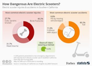
We are swimming in data – “Big” and small, global and personal. And we are also facing complicated problems like Climate Change and inequality whose stories can only be told with data. The need for public understanding of data-driven issues is higher than ever before. But raw data doesn’t make a good story… and that’s where you come in.
This is not a data visualization course.
This is not a statistics course.
This is a storytelling course.
This class is focused on how to tell stories with data to create social change. We will learn through case studies, invited guests, examples, and hands-on work with tools and technologies. We will introduce basic methods for research, cleaning and analyzing datasets, but the focus in on creative methods and media for data presentation and storytelling. We will consider the emotional, aesthetic and practical effects of different presentation methods as well as how to develop metrics for assessing impact. Over the course of the semester, students will work in small groups to create “sketches”, each using a different technique for telling a data-driven story. Think about a sketch as a half-realized project; where you have implemented just enough of the most important details of the idea in order for us to understand your vision. A sketch is NOT a fully realized presentation of a data story. For the final project, students will have the chance to expand on one of these sketches to create fully realized presentation of a data-driven story. Why is this called a studio? This course has few lectures and lots of group project work time.
The course is open to all technical levels and backgrounds. We will prioritize students with a strong background in one or more of the following areas: journalism, software development, data analysis, documentary, visual and performing arts.
The course will have a special focus on food security data. Most examples will use data related to this topic, homework will be related to it, and sketches and final projects must be connected to it as well. I welcome a broad definition of that topic.
Learning Objectives
- Students will learn techniques for finding a story in data, building a basic set of tool-assisted data analysis skills
- Students will build things that tell data-driven stories with a rich set of digital and non-digital tools, online and offline
- Students will practice arts- and rhetoric-based approaches to telling data-driven stories
- Students will learn to connect data stories to meaningful, situated social action
- Students will learn basic techniques for measuring the impact of data-driven storytelling
- Students will learn basic ethnographic and anthropological approaches to identifying and researching audiences
Logistics
- Spring 2019 Semester
- Category: Hass Arts
- Units: 3-0-9
- Meets Tuesday & Thursday from 11am-12:30pm in room E15-341
- Undergrad (CMS.631) and Graduate (MAS.784/CMS.831) meet together
- Admission is by permission of the instructor – please fill in this quick enrollment survey
Faculty
Instructor: Rahul Bhargava <rahulb@mit.edu> Research Scientist, MIT Center for Civic Media
Faculty Sponsor: Jim Paradis – Robert M. Metcalfe Professor of Writing and Comparative Media Studies