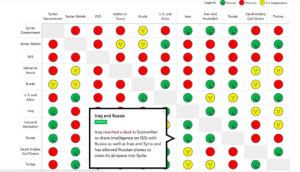
Data on Who is Fighting Who in Syria

Link: http://www.slate.com/blogs/the_slatest/2015/10/06/syrian_conflict_relationships_explained.html

What data is being shown: The relationship between each “player” in the Syria conflict. The players are either countries/governments, alliances of countries, or militant groups. Relationship is represented as a categorical variable with the following categories: “Friends”, “It’s Complicated”, or “Enemies”.

Who you think the audience is: This presentation was published in 2015, four years after the conflict began in 2011, and shows the data in such a simplistic way. From this, one can infer it is meant for readers who haven’t been following the conflict in Syria and want to get up to speed about who is involved and where they stand with each other. It does have small explanations for each relationship if the reader chooses to mouse over a particular square in the chart, but it is not meant for someone who wants to know all the details or an in-depth analysis of the war. Additionally, it is probably meant mainly for Americans since it is written in English and refers to the “US and allies.”

What do you think the goals of the presentation are: Educate the public on a complicated issue that is prominent in a lot of U.S. military decisions. Since the issue is confusing with so many different players and interests, the presentation tries to make the information as accessible as possible so people will actually educate themselves on the conflict rather than give up because keeping track of all the details is a headache. Perhaps another goal or desired result of this goal is for people to make more informed decisions when they vote; however, this presentation seems objective and factual, so swaying political leanings is most likely not one of its goals.

Whether you think it is effective: I think it is effective because 1) it summarizes the complicated relationships in such a way that the audience can see everything laid out at once. This makes comparison easier and allows the audience to easy select the relationships they are interested in learning more about. 2) It has three color-coded categories and only displays words when the audience decides to learn more. This makes consuming the information simpler and more effective because the reader isn’t overwhelmed with text or too many icons to decipher. Overall, I think the presentation accomplishes the goal of educating people on the topic without giving them so much information that they can’t quickly synthesize or remember most of it.
Rethinking development in Latin America

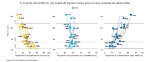
This data presentation tries to portray how as Latin American and the Caribean has transitioned to become a middle-income region, it has failed to increase the size of its middle class. In the graphs, we can see the per capita Gross National Income on the y axis. On the x axis, we can find the percentage of the population living in poverty (less than $ 5.50), in a condition of vulnerability (between$ 5.50- $ 13.00) or who belong to the middle class ($ 13.00- $ 70.00), respectively.

We can observe how the percentage of people living in poverty has decreased. However, at the same time, the percentage of people living in vulnerable conditions has increased. This suggests that, while households have managed to escape from poverty, their economic security is far from being achieved. The goal of this data is to provide a more nuanced perspective on the economic development that the region has experienced.

The audience should be people interested in the region. Probably, it would include people with a background in economics, public policy or international development. This data can be interesting for different types of audiences, including students, government officials, grassroots organizations and in general people with specific interest in the region.

I like that the visualization provides information for several years. Seeing how the data points move around the different graphs made me pay more attention and had a better idea of the evolution of the variables through time.

Link to graphic

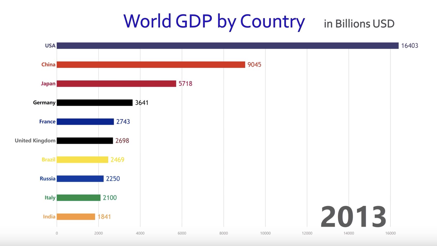
How World Economy Has Changed?

This is a powerful data visualization showing how the top 10 countries in GDP ranking has changed for 1960 – 2017. Basically it’s a simple bar chart but presented in a short video, which makes the presentation more dynamic. You can see US has been dominant for the entire period, Japan grew dramatically in 80s and 90s before it got stagnant, and recently China has grown remarkably. Since this is shared in YouTube and presented in a really simple way, the audience can be anyone interested in the world economy. The goal of this visualization looks really broad and I guess it is to attract many viewers by showing how the world economy has changed over the past 60 years in an interesting way.

I think this is effective in showing the change over the period in a dynamic way. Although the same message can be conveyed by putting different bar charts at different years, this visualization gives more vivid impression. On the other hand, the main message of this video can be focused better. I feel the chart uses too many colors and three minutes is too long. By highlighting charts of some specific countries, the main message of this presentation might be clearer and become more effective.

Average Voter Wait Time by Race

This graphic illustrates average poll wait time by race in the 2012 presidential election. The data comes from the Cooperative Congressional Election Study, a survey administered by YouGov and analyzed by Harvard University.

The graphic was published on Mona Chalabi’s Instagram page. The intended audience is interested in politics and current events, but not interested in digesting large amounts of technical information. The caption reads “This is what happens when people of color live in places with a lack of poll workers and voting machines.” The author seeks to catch the audience’s attention and to highlight an unjust situation: longer wait times for people of color, and link it to an actionable policy: the distribution of poll workers and voting machines.

This graphic is effective in catching the audience’s  attention and communicating in a charismatic and approachable way. I like the way the author blends illustration and data. She brakes the rule of bar charts and wraps the bars to illustrate a line. In my opinion, the aesthetic advantage of this artistic license outweighs the disadvantage that numeric comparisons are harder to measure visually.

Additionally, I believe that she chose a convincing metric to support her point. However, I would like more information on how the data was gathered, the distribution of voting resources, and the effect of wait time on voters in order to better understand the apparent injustice highlighted. Additionally, I worry that with more information, for example average wait times grouped in other ways, a more complex story could arise.

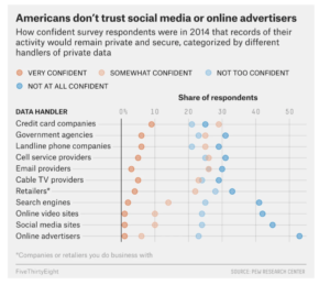
American Survey on Private Data Usage


https://fivethirtyeight.com/features/the-trouble-with-leaving-facebook-is-that-we-like-facebook/


  • What data is being shown – this data presentation shows how Americans responded to a 2014 survey detailing how confident they were about the secure usage of their data by various data handlers. The survey results are broken down into four levels of confidence, and this is shown by the different colors in the graphic. The survey responses are split into 11 different data handler categories.


  • Intended audience(s) – two possible intended audiences are: 1) managers or executives of companies in these various industries, and 2) Americans or others who are interested in how people feel about the use of their personal data within different sectors.


  • Goals of the data presentation – the objective of the graph is to show that Americans are not confident at all in certain industries regarding how their personal data is used or stored. From the graphic, it seems that Americans do not trust a majority of the data handlers. In particular, the author of the graph wants to highlight the extreme lack of confidence in social media sites and online advertisers among other industries and companies.


  • Effectiveness of the data visualization: I do not think this data presentation is effective because it is difficult to determine what the audience is supposed to be focusing on in the graph. The headline tells you the main point of the visual, but the actual data handler categories that are mentioned in the headline are placed at the bottom of the graph. I think it would be more effective to move the “social media sites” and “online advertisers” categories to the top of the visual and make them stand out more. However, the data presentation does have a clear and concise headline and the horizontal representation of the data seems to work well.