Food insecurity, ethnicity, and SNAP in Massachusetts

Team member names: Sanjay Ganeshan, Wataru Doita, Zhu Shikun, and Michael Rieker

Audience of the story: legislative members that are government workers for Massachusetts. It’s important to understand what visuals, formats, and colors work for them. For instance, using red and blue would signify different political parties whereas we may be wanting to emphasize good and bad. Considering this, we will focus on quick, high level summaries at first, and then dive into the specifics of our narrative.

Our goal:  examine demographic disparities in food insecurity in Massachusetts using the given data and various data mapping tools (such as Tableau or CartoDB). More specifically, we want to see how race relates to food insecurity.  A final goal would be to have the government change the amount of money going to different areas in order to address food issues.

Who we are in the story: organizing body (a lobbying group, for example) presenting our findings to Massachusetts legislature advocating for the expansion of food assistance programs by county.

Abstract words that we need help presenting: change, hunger, food assistance, demographics, racism, poverty.

Context of the story: we want to convince the Massachusetts legislature to take a deeper look at their food assistance programs and some underlying biases that may be affecting their decisions. The presentation can be viewed as a meeting with these legislative members in which we present the data we have found.


The Sketch:

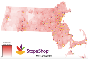
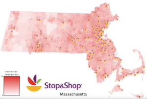
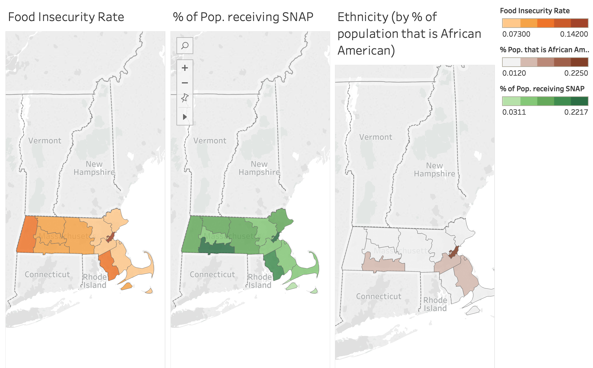
The main focus of this sketch is maps and creative maps. More specifically, our group chose to use the “Feeding America – Hunger in America (2016)” dataset as well as other data sources that we have listed in the references. These other data sources allowed us to gain information on the demographic and income inequality situations within the counties and cities of Massachusetts.

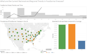
First step: we start with a broader narrative that concerns food security, food assistance, and demographics for all of Massachusetts. More specifically, we are interested in the Supplemental Nutrition Assistance Program (SNAP), previously known as the Food Stamp Program. This program focuses on providing food-purchasing assistance for low-income people in the United States. This step helps to build context for the overall problem. If we had more time beyond this sketch, we would start the presentation with an overview of what the problem looks like across the United States.

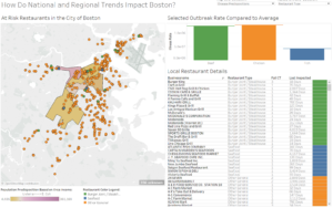
Second step: we dive into the more detailed aspects of food security and demographics. For this sketch, that means honing in on multiple counties in one state, which is Massachusetts. We could ask the question: “How much do you think hunger is a problem in your district or county?” This serves as a way to draw the audience into the discussion and to make them more engaged.

We will compare statistics among different counties and use this to educate the legislative members. We will focus on a limited number of counties given the nature of the sketch. That being said, this type of analysis could easily be generalized to other counties and states.

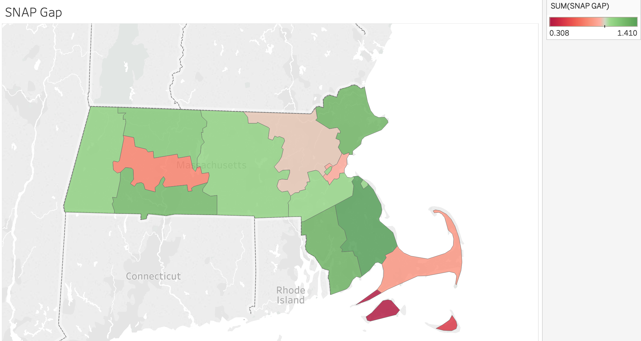
It’s important to note that about 1,443,000 Masshealth Recipients are eligible for SNAP. However, only 763,000 are SNAP recipients, leaving 680,000 people without the aid of snap. That’s a gap of close to 50% in terms of aid received.

Third step: use multiple “comparative” maps in which we show how the counties differ from one another in topics such as food insecurity, ethnicity, and involvement in SNAP. This will challenge the knowledge of the legislative officials and hopefully give them insight into issues in their respective county or district. We will highlight differences in demographics, ethnicity, and SNAP within Massachusetts and how this relates to differences based on location. An example with an interactive maps and related statistics can be seen below. If we were continuing this sketch, we would dive deeper into other ethnicities and demographic characteristics.


Conclusion: One of the main takeaways is that we do not want to let biases and perceived and/or actual inequalities take over funding choices as this results in unfair treatment of others. We will give the audience information/statistics that they can take away so that a lasting impression is made on the minds of the government officials. In the end, we hope to convince the audience, who are stakeholders in the government, that providing more people with assistance from SNAP can stimulate the economy, increase food access, and help low income residents.


References:

  1. https://www.feedingamerica.org/sites/default/files/research/map-the-meal-gap/2016/overall/MA_AllCounties_CDs_MMG_2016.pdf
  2. https://www.feedingamerica.org/sites/default/files/research/map-the-meal-gap/2016/child/MA_AllCounties_CDs_CFI_2016.pdf
  3. https://statisticalatlas.com/state/Massachusetts/Race-and-Ethnicity
  4. https://public.tableau.com/profile/food.bank.of.western.ma#!/vizhome/MHandSNAP/Story1

Data Map Sketch

Stop&Shop Gives Back

Sarah Caso, Theresa Machemer, Amy Vogel

The data say that food insecurity is spread across Massachusetts, and by mapping it, epicenters of food insecurity become visible. The data also say that institutions around Massachusetts produce a significant amount of food waste. Stop&Shop is one of these institutions and their store locations are correlated with food insecurity epicenters.

We wanted to tell this story as PR managers at Stop&Shop. Stop&Shop already has programs in sustainable food waste management, one aspect of which is food rescue by donating to local food banks. The goal of sharing this community-focused and environmentally-friendly message is to bring new audiences into the store. Our audience is environmentally-minded millennials who may currently shop at Whole Foods and Trader Joe’s, but with our campaign, may be convinced to look into their local Stop&Shops instead. As students, it is interesting for us to share this message from Stop&Shop’s perspective as a way to branch out from presenting from the point of view of activists and educators, who may tell these stories more often than corporate figures. Our goals are to show how Stop&Shop is helping local communities and convince our audience both to shop at Stop&Shop and to support local food banks.

We used the Hunger in America data from Feeding America and MA Food Waste data set to tell a story. The Hunger in America data provides county-level information on the percentage and count of food insecure people, the same data for just children, the percentage who are SNAP-eligible, the total annual budget shortfall to feed everyone who is food insecure, and the average cost per meal. The MA Food Waste data includes information on the entity producing waste, the location of the entity, and the tons of waste per year generated. Our final product is a dynamic map showing food insecure people per acre in Massachusetts, the Stop & Shop locations in MA, and the projected reduction in food insecure people per acre after Stop & Shop donates meals to curb food insecurity and prevent waste. Based on research of Stop & Shop’s current initiative to donate, compost, or recycle 90% of their waste by 2020, we approximated the amount of waste they would be able to donate at the onset of their campaign to be 60%. We also made a map of the number of meals donated per acre each day. The maps we made are appropriate because we are telling a geographic story: the Stop & Shops have decided to donate to food banks within a 5 mile radius of each location, so the reduction in food insecurity in a given block largely depends on its location (along with the amount of food waste that particular Stop & Shop generates). Showing the data in geographic form rather than a chart makes the story more compelling because the audience can see affected areas, and as residents of Massachusetts, probably have an emotional connection to some/many of these places. For example, the zoomed-in “before” and “after” maps of Cape Cod show a visible amount of food insecurity reduction in a few blocks that people are probably quite familiar with because either they live there, they know somebody else that does, and/or they visit the Cape during the summer. The map brings the issue closer to home for the viewers and allows them to physically see the effect on places they recognize better than reading a list of numbers would.

“Before” Map:

“After” Map:

Link to all media:

https://drive.google.com/drive/folders/1N4VraOqmHTrO9ak0oMsAYpDEM3jmCzJe?usp=sharing

A Day in the Life of Health Inspectors

Team Members: Kate Soule, Tanaya Srini, Nora Wu

Our Audience & Goals:

Our sketch mapping tool is focused on helping health inspectors in Massachusetts do their jobs better and more efficiently, given that the budget allotted for food inspections in MA has not increased since FY2015. As part of our preparation for the sketch, we read about how health inspectors tend to stick to similar routes, which can create blind spots in the food safety of cities. We also read about new research suggesting that there are different dimensions of foodborne illness that have not yet made it to mainstream of health inspections. With these budget constraints in mind, and after reading about some low-income areas in big cities that are experiencing a greater volume of food safety violations, we wanted to begin to incorporate often overlooked analytics, like regional threats ((both regional, state, and local– as food can be sourced at larger geographies but is prepared at local ones)or socio-economic status (certain strains of foodborne illness are more associated with higher-income areas versus others that are more associated with lower-income areas) to offer alternative routes to health inspectors that may be fruitful.

Our goal is to create a tool for health inspectors to unseat some of the typical analytics used to determine foodborne illness (# of failed inspections, days since last inspection) and widening the lens to look at 1) regional and 2) SES concerns to explore how that may change inspectors routes. In this scenario, we are data scientists hired by the state to improve the efficiency of food inspections in light of stagnant budget appropriations. Our presentation will be staged as a run through of the tool, not in its final form, to walk health inspectors through how it would be used and solicit feedback for other data sources or functionalities that would be useful.

The Sketch:

The sketch consists of a few screens, generated in Tableau. First, the health inspector is able to look at current national and regional trends, with the idea being that regional trends are not always considered but can serve as a valuable warning for a neighboring state, since foodborne illness is both an issue of food sourcing (regional/national) and food preparation (local). The inspector can see a pie chart of illness rates in their own state between beef, chicken, and fish, and then look at neighboring states with a regional zoom-in. They can also look at the foodborne illness rates over time to understand how the seasonality affects the likelihood of illness. This is accomplished using the CDC Foodborne Outbreak database.

Next, inspectors can zoom to a specific city (we use Boston as a test case) and look at typical data like inspection frequency and failure frequency, before being prompted to look at more exploratory data like median income by zip code in the region and how that might predict a higher likelihood of listeria or e coli. The study linked here suggests that e.coli is associated with high-income areas whereas listeria is more prevalent in low-income areas. By mapping the incomes by zip code, inspectors can begin to chart new paths for their inspections. We incorporated Boston 311 data for restaurant inspections and census data for income for this portion.

At this point in the demonstration, we would ask health inspectors to reflect on the difference between the typical route and the new inspection routes based on a broader set of indicators. Are there public safety threats that are being ignored by the typical routes? What are the new routes missing? This feedback can help us to sharpen our tool. Future directions for the work might include incorporating Yelp data to understand whether the restaurant’s clientele (as judged by number of $ for the restaurant) is predictive of health code violations and/or if there are certain kinds of restaurants (those serving seafood or steak houses) that are more susceptible.


Helping HS Chaperones Get the Most Out of “The Road to Nowhere”

Team: Rubez Chong, Melinda Salaman, Viki Silva, Sarah Von Anh

Our Data
Our team decided to use the CDC online database that shares the data on foodborne outbreaks that result in illnesses, hospitalizations, and death in the United States. We wanted to build an informative map aimed at travelers from outside the U.S. who are embarking on a cross-country road trip for the first time. We wanted to tell this story because it brings the data points to life, and makes it feel relevant to the user – as they are excited about a first-time trip, they can also keep precautions in mind to fully enjoy the journey without falling prey to foodborne illness or worse.

Our Audience
We are assuming the role of an international organization like the Rotary Club that sends groups of high school students each year to the U.S. for a few weeks in the summer. Our primary audience for this presentation are the planners and chaperones of these student trips: teachers, parents, and other adults are in charge of keeping groups of high school students safe during their travels. While the chaperones ultimately have final say on the restaurants and eating establishments they take their student groups to, we as members of the sponsor organization want to be sure that all students return home healthy. With that in mind, we are concerned about foodborne illnesses and infectious diseases.

Our goal is to educate chaperones, warn them of potential dangers, and present them with practical, actionable advice on how to keep their student groups healthy.

Our Approach
We wanted to use the map of the United States in a creative and purposeful way. After brainstorming common cases where a map is necessary, interesting, and additive, we ultimately settled on a road trip, where one needs driving directions to get from point A to point B. With that in mind, we researched popular road trips across the U.S. and found resources with routes that transversed multiple states. It goes without saying that there are many, many options; we decided to focus on “The Road to Nowhere”, a route that goes through the midwest from North Dakota to Texas as an example for this sketch.

More than just driving directions, we also wanted to use this map as a field guide for chaperones: we would highlight points of interest they are visiting along the route and the associated health hazards and recommendations we have related to each stop.

After checking in with Rahul during the last class working session, we decided to create an interactive slide deck instead of a dashboard/map. We made this decision after considering what was the best format for our audience. Bearing in mind the amount of content we thought necessary for chaperones to see and digest, we decided it was too much information to put into a dashboard. On the other hand, a slide deck is easily usable by teachers and chaperones of all levels of comfort with technology, can be easily disseminated via email or in print, and is a medium that our audience is comfortable and familiar with.

APPENDIX

Close-Up on “The Road to Nowhere”

Stop #1: Knife River Indian Villages (ND): Person-to-person; The Knife River Indian Villages National Historic Site, which was established in 1974, preserves the historic and archaeological remnants of bands of Hidatsa, Northern Plains Indians. This area was a major trading and agricultural area. Three villages were known to occupy the Knife area.

Stop #2: Sitting Bull Memorial (SD): Food; The Sitting Bull Monument is located about seven miles southwest of Mobridge. Chief Sitting Bull, or Tatanka Iyotake, was a Hunkpapa Teton Sioux spiritual leader. In the 1870s, Sitting Bull had relocated to the Standing Rock Indian Reservation near the Grand River in present day Corson County.

Stop #3: Buffalo Bill Rodeo (NE): Person-to-person; The Nebraskaland Days Buffalo Bill Rodeo will be held on Wednesday, June 12th – Saturday, June 15th, 2019 in North Platte, Nebraska. This North Platte rodeo is held at Wild West ARena and hosted by Beutler & Son Rodeo Co.

Stop #4: OzFest (Liberal, KS): Person-to-person / Food; Come celebrate the Anniversary of the movie “The Wizard of Oz” at Dorothy’s House and the Land of Oz. The day will include live entertainment, games, costume contests, food and fun!

Stop #5: Remember the Alamo! (TX): Person-to-person; The Alamo Mission in San Antonio, commonly called The Alamo and originally known as the Misión San Antonio de Valero, is a historic Spanish mission and fortress compound founded in the 18th century by Roman Catholic missionaries in what is now San Antonio, Texas, United States.

Stop #6: South Padre Island (TX): Person-to-person; South Padre Island is a resort town on a barrier island of the same name, off the southern coast of Texas. It’s known for its beaches and calm waters. South Padre Island Birding and Nature Center is home to a 5-story watchtower with views of migrating birds. The South Padre Island Dolphin Research & Sealife Nature Center offers boat tours and touch tanks. Sea turtles are rescued and rehabilitated at Sea Turtle Inc.

The Great British Buffet: 1974 vs. Now

Team Member Names: Melinda Salaman, Ayush Chakravarty, Kate Soule, and Michael Rieker

Audience of the story: focusing on small farmers growing several key food types, such as potatoes, vegetables, etc. Our audience can also be considered to be members of the general public who are interested in learning about different food practices.

Our goal:  educate farmers at a farmers market about the trends in consumption of different key food groups. While overall consumption of produce (writ large) has remained relatively constant in the UK, some categories are faring better (increasing) than others (decreasing). We want farmers to understand where their category lies and walk away with concrete ideas on how to improve or maintain their position.

Who we are in the story: organizing body (of some sort) advocating for farmers’ best interest.

Context of the story: we are presenting a display at a farmer’s market in the United Kingdom. We hope to educate people on food growth, use, and consumption.


The Sketch:

The story we want to tell is that while farmers’ produce has stayed at a relatively level percentage of the UK’s overall consumption (hovering around 50% from 1974 – 2014), there are certain key types of produce that have seen a dramatic decline. We want to draw attention to those groups. We’ll do this through an interactive display: a large tray of food representing each of the different food groups we call out. Each piece of produce represents the consumption of that food type in a particular year.


This interactive display will have farmers participating in telling the story of key groups of produce in the UK. This will be a four stage process in which participants will assess their own ideas about how food consumption has changed in the UK over the past four decades (1974-2014).


  • Stage #1: Show the weekly proportion (in grams) of fruit, vegetables, meat, and dairy consumed by people in the UK in 1979. This will be represented by an actual plate of food in front of the participant. The food will be labeled and these labels will have relevant statistics and graphics that help the small farmers to gain a better understanding of the story behind each food group.


  • Stage #2: Have an audience member construct a plate of food on their own using their understanding of what UK residents currently (2014) consume. In other words, we’ll ask the participants at the market to look at a tray of food with different groups of produce, pick up different pieces of produce, and compare consumption in the past to that of the present.


  • Stage #3: Reveal the actual current consumption of different food groups in the United Kingdom by using a third plate that has the correct proportion of food. This will help people to learn about what is actually occurring and how this may differ from their own understanding.  


  • Stage #4: Provide participating members with a pamphlet that helps them to learn more about how consumption patterns of the groups of produce have changed over time. The follow-up pamphlets will emphasize what they can do next: organize politically, increase farm productivity, and diversify crop yields.


We will go through these four stages during our class presentation to show how the idea would work in practice. We also considered weighting the items of food differently and using a scale to show how consumption had changed.

A very similar process could be undertaken with other types of food (such as industrial meat), but we are clearly focusing on produce for this sketch. An alternate idea would be carving the information into the food itself instead of using toothpicks and labels.

References:

http://britains-diet.labs.theodi.org