Fuel Frenzy

Fuel Frenzy

Tanaya, Melinda, Theresa, Victoria

The data say that nutritious eating is complicated–not all foods are equally nutritious even if they’re just as green–and many events may influence the choices a person makes when planning their meals for the week. Additionally, the data say that one tenth of MIT students face food insecurity on campus. We wanted to tell this story because most young adults have not needed to independently choose their diets until they reach college, so this game is an exercise in the challenges and rewards of choosing a balanced diet as an individual, and as a second level, the game promotes discussion within the group about community action on campus related to food insecurity.  

Our audience is freshman orientation groups– mostly 17-to-19-year-old MIT “prefrosh” who are arriving to campus and learning about how to live independently. Our goals are to teach the prefrosh how to balance their diets by playing a game that assigns point values to more ‘nutritious’ foods (for example, a bran muffin is worth more points than a serving of pasta) and gives bonuses for a diversely nutritious ‘plate’ (playing a hand with a protein, a vegetable, and a starch gives a point bonus). Additionally, we aim to highlight campus resources such as the ‘SwipeShare’ program that allows students to transfer extra meal swipes to those who need them. A final goal is to show that free food alone is not a consistent or sufficient source of food.

We combined multiple data sources to create the content for our game. By reviewing the foods available in dining halls and those common for ‘cook for yourself’ communities, and by reviewing the Sloan Slack for free food offerings, we gathered the data to inform the list of foods available in the two game decks: personal and free food. We categorized the approximately 40 foods into four categories: Protein, fruits/veggies, starches, and junk food. We then used the USDA nutrition database to assign point values to each food. Proteins were ranked by their protein per 100 grams, starches by their fiber per 100 grams, and fruits/veggies by their total vitamins and minerals per 100 grams. Junk foods were assigned a flat 1-point value.

We determined a point threshold, 10 points, that players are required to meet every turn as a ‘reasonable minimum for survival.’ In future iterations of this game, there may be a consequence for failing to meet this value for a certain number of turns in a row. We also assign bonuses for diverse plates. For example, a plate with 2 categories (ex. protein and veggie) will give a +2 bonus, but a plate with all 3 nutrition categories will give  a +5 bonus. Meals composed of junk food never gives a bonus. This rewards healthy and nutritionally balanced eating with points.

We used additional datasets including the MIT event calendar, the CDC Foodborne Outbreak dataset for Massachusetts, and news stories to inform the ‘Event” cards in the game, which introduce an element of randomness.  t For example, an event like Campus Preview Weekend increases the available free food. However, an event like a Hell Week increases the required nutrition threshold for the turn, and ‘feeling in a slump’ increases the value of fruits and vegetables. These latter two events highlight the importance of healthy eating not “because we told you so,” and instead link healthy eating to academic performance and mental health.

Prefrosh will be engaged in this game because it begins as a strategic, competitive game. However, at the end of the first half, the orientation leader can lead a discussion about the difficulties of the game, and the advantages that some people may have randomly started with, as some players will have been dealt a stronger hand (this is meant to mimic different levels of food access present on MIT’s campus). In the second half, the game becomes collaborative, and prefrosh are encouraged to talk to each other and share or trade cards so that everyone can meet the nutrition threshold every turn. This accomplishment may give a ‘group bonus’ in the second half, but the details of collaborative gameplay will be worked out in future iterations.
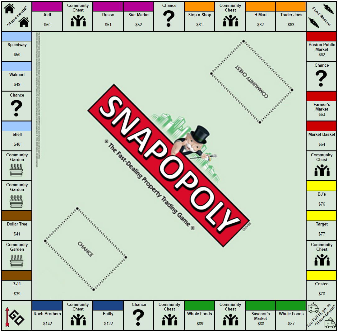
Data Games – SNAPOPOLY

Team member names: Sarah, Kate, Wataru, and Michael

Audience of the story: playing the game (Snapopoly) with middle school and high school kids as a kick off to a volunteer fair at their school. This can help people to learn about how to help fight hunger in their area (city, state, etc.)

Our goal: the main objective is to demonstrate the importance and interdependence of SNAP, food banks and charities in fighting food insecurity, and to encourage people to take a more active role in volunteering for this cause.  

Who we are in the story: we are the people that organized the volunteer fair at the school and we work with local food donation organizations to combat food security problems.

Context of the story: we are presenting a monopoly board at a school volunteer fair. The board and the game mechanics are driven by food stamp (SNAP) data, USDA budget spending data, and food bank donations data. By going to the fair and by playing the game, people can learn about how to volunteer in their community from different organizations.

The Sketch:

This project is focused on participatory data games. Our group was interested in food security data and how SNAP (food stamps) affects people’s lives here in Cambridge, MA. We also used data from different grocery stores and vendors to help create the game. Please see the “Data” section at the end of this blog post for more detail regarding the data used for this project.

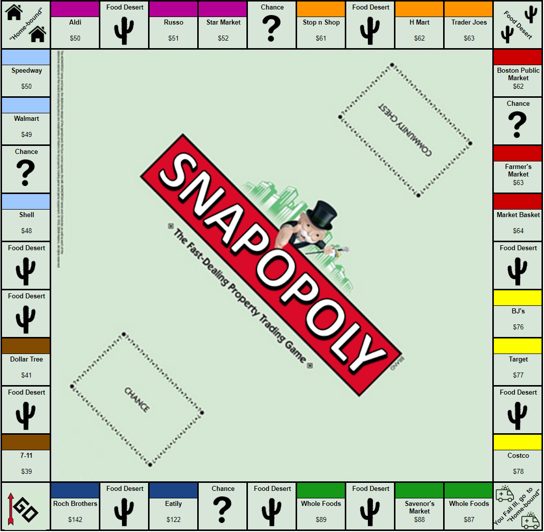
We used the mechanics and ideas of the very popular board game, Monopoly, but changed the underlying meaning behind the spaces and rules of traditional Monopoly. We considered many potential variations of the rules, but ultimately chose a set of rules that we believed helped represent that data well. Our full list of rules and instructions are detailed in the provided instruction manual, but some of the most important pieces of the game are listed below:

  • Each of the colored spaces represents a location in which a player would purchase food or some sort of sustenance. The least expensive options at the beginning and most expensive options at the end of the round.  The price of food was determined by a USDA study on average grocery budgets from “Thrifty” to “Luxury”. In order to purchase groceries, you spend your SNAP food stamp allotment at each store and get 1 meal chip. Each meal chip is worth 1 week’s worth of food.


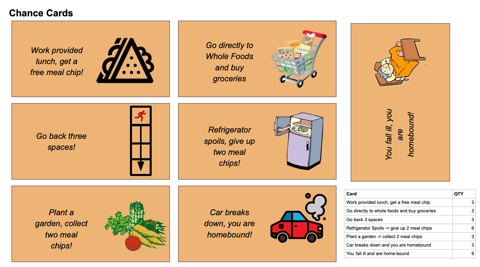
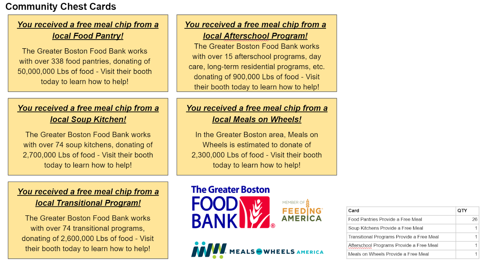
  • Players can land on chance or community chest cards that are either detrimental or beneficial in the player’s fight against hunger.  The community chest cards all represent different organizations present at the volunteer fair (e.g. food bank, meals on wheels, etc.), and the frequency of the community chest cards is proportional to the pounds of food donated in boston.  Each community chest card has a more detailed description of the charity so that you can learn more about the group.


  • Each trip around the board represents a month.  After you have made one trip around the month, you need to trade in 4 meal chips (equivalent to 1 month’s worth of food) in order to pass go, collect another month’s worth of food stamps, and keep playing.


  • The gameplay slightly changes between rounds:


    • Round 1: no charities are present (community chest cards are out of play), additionally the free parking “food rescue” spot is out of play, and all food is considered “wasted”.
    • Round 2: all community chest cards are in play, and meal chips start accruing in the food rescue spot at the rate of a quarter chip accrued for every meal chip purchased. Anyone who lands on food rescue gets all of the accrued meal chips for free.

The game has been designed, based on the pre-established probabilities of landing on each monopoly square so that on average, after Round 1, the player will be out of money and will have ~2.8 meal chips (fewer than the 4 meal chips required to keep playing).  Then, after the game restarts for Round 2, the odds are now that, on average, the player will still be out of money, but they will have accrued 4.4 meal chips and can therefore keep playing. We have purposefully designed these odds (using the chance cards to make the game play at the right level of difficulty) so that it is very difficult to win the game in the first round, and moderately difficult (but not impossible) to win the game during the 2nd round.  This will provide a “Call to Action” showing that these organizations serve a vital role in the community and are still very much in need of help.

In order to further assist the call to action, the instruction manual has added resources on how to navigate the volunteer fair (where the different booths are), contact information for how to get involved, etc.

The Board Game in Round 1, Round 2, Chance Cards, and Community Chest Cards are displayed in the figures at the end of the blog.

Data Used:

  • Food stamp monthly budget for single person
  • Pounds of food donated to the Greater Boston Food Bank by donation type (food bank, soup kitchen, after school programs, etc.)
  • Meals on Wheels food donated, scaled to city of Boston population
  • Average weekly meal spend according to USDA:
  • Food waste generated (40% of all food produced is wasted, we are generously assuming you can recover 25% of all food produced through food rescue, this is to make sure the food rescue dynamic comes into the game play, otherwise it is too small)
  • Food Deserts – (40% of Boston is a Food Desert, we have 26% of our board occupied by food deserts in round 1, due to game play mechanics, otherwise the proportion is too large to demonstrate other concepts).

Figure 1: Snapopoly game board (Round 1)


Figure 2: Snapopoly game board (Round 2)


Figure 3: Chance cards


Figure 4: Community Chest Cards


References:

What Does Data Tell Us About Refugee Flows? And what it failed to tell?

Link to data visualization for What Does Data Tell Us About Refugee Flows In Africa And The Rest Of The World?

Link:  https://www.iafrikan.com/2015/08/13/what-does-data-tell-us-about-refugee-flows-in-africa-and-the-rest-of-the-world/

As one of the most controversial and ongoing topics in the world, refugee and immigrants are important issue in international affairs. The two sets of diagram in the link covered pretty much everything about the issue: population, year, origin country – asylum country, the trend of population change etc. I will analyse the one of “refugee project”. (Link: http://www.therefugeeproject.org/#/2017)

The Refugee Project


1.What data is being shown?

The population of refugee from known origin country and how they distribute into different asylum countries from 1975-2017. When clicking a specific year with specific country or the default “world”, it also tells you those important events happening to that country from the 1975-2017 or events happening on that year. You can also choose between origin country and asylum country, divided by color, to have two perspectives about the flow of refugee population.

2.Who you think the audience is?

It`s a strong database and beautifully designed interactive diagram, very useful for both researcher and people who are interested in refugee topic.

3.What you think the goals of the data presentation are?

Using both cartography and specific statistics of the population and flow of refugee, it successfully provide audience a brief idea of what countries/regions generated most refugee and what countries/regions accept the most of them. Cross-referenced with the chronicle suggested, it highlighted the possible cause of refugees.

4.Whether you think it is effective or not and why?

The interactive of origin/asylum country, divided by color and the radial pattern is very effective to see the flow. Also they set a histogram to indicate the overall population trend which tells you the flow in a timeline. Both of them are impressive and useful. The only drawback I can think of is the lack of the comparison between different countries, and the percentage of refugee with the population of the whole countries. If provided, we can better understand the density of the incident which caused the refugee flow and how much they affected the country.


Data Visualization Review

https://www.politico.com/magazine/story/2017/11/03/are-american-women-really-better-off-215782

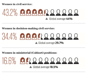
The piece I selected is from Politico, “Are American Women really better off?” The article made visualization based on an index that measures women’s public service leadership by country. It highlights certain data from the overall dataset. For instance, the percentage of women in civil service (43.2%), the percentage of women in decision-making civil service (34.4%), and the percentage of women in ministerial positions (16.6%). The author chose to visualize it based on a scale presentation. Out of 10 “individual images”, roughly 4.32 indicates female images using red outline whereas the rest shows male images using a black outline. I thought instead of a pie chart, such illustration made it more apparent the gender gap in decision-making public service positions. In addition, there is a text and triangle indicating a global average to show where the US is compared to the global average. 

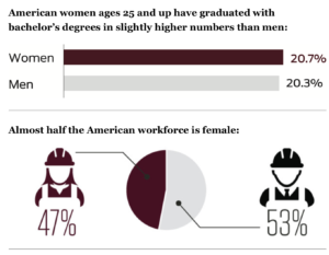
Other visualization in this article includes donut charts, bar chart and pie chart, etc.

When I first read the article (right after it was published), I found the representation using personal image to indicate gender gap in positions was very effective. However, now when I look back, I found a different way to visualize may have a better impact.

Actually, I was as involved with the global women’s leadership index creation process at the Wilson Center before the index got launched. The index was created based on three pillars: pathway, position and power of women in public leadership. The rationale is that we shouldn’t solely look at positions women held – because in some context, a majority in positions doesn’t mean power (like Rwanda); in another context, there was no pathway to enable decision-making position. Therefore, the index was measured by the weighted average of three scores based on the pathway (data collected based on access to education, labor market, maternity leave, etc), position, and power(data collected based on good governance index, public perception, etc).

If I were to replicate this visualization, I would use graphics to showcase the steps from the pathway, to position and to power for women in leadership positions in a storyline – so that it is not just a creative use of individual datapoint, but to connect different data points to tell a story. I also thought when we managed to translate the numbers into human narratives using data visualization, it will not only enhance the importance of the numbers themselves but amplify the impact that can be relatable to a wider audience. 

Rescue Mission

Food Rescue: High School Edition

Berlynn Bai, Ayush Chakravarty, Lily Xie


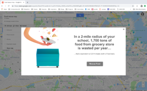
The data say that within two miles of one Boston High School in the Fenway area, over 9,000 pounds of food is wasted a day from grocery stores alone. We want to tell this story because more people, especially high school students about to venture out into the real world, deserve to understand food reuse and rescue initiatives better.

Our audience is high school students at Boston High Schools, and our goals are to (1) convey the pressing issue of food waste, and (2) demonstrate the ease of participating in food rescue, particularly for students who may have a community service requirement before graduating from high school.

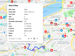
To build this interactive google maps experience, we used two data sources. The first is the list Boston, Cambridge, and Somerville list of public high schools, and the second is a dataset of Massachusetts Food Waste. Using a batch geocoder, we converted the addresses of the high schools to latitude/longitude coordinates so that they could be mapped over the Massachusetts Food Waste data. The key variables of concern were the establishment name, location, and the pounds of food wasted per year.


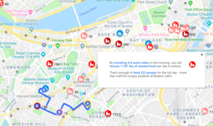
The idea behind using Google Maps to tell this particular story was to use a medium that students were familiar with — after all, this is an app that integrates into our everyday lives. First, we hope to make it easier to link their own location to the hyperlocal nature of food waste. Seeing red dots next to one’s own blue dot might make it easier to realize that students walk past these places every day. Second, it makes the ask easier to explore: what does the student need to do to get involved? If they have 30 minutes a week, where could they go to pick up food?

The final activity for students would look as follows:

  1. Students open the food rescue map, where darker colors indicate higher amounts of food waste.
  2. They search for their home address and add a marker
  3. Based on their commutes, they find out how to add one stop to their commute to school
  4. Calculate how much food they rescued and this is how much they could feed their school!