The Shrinking Middle Class Data Viz

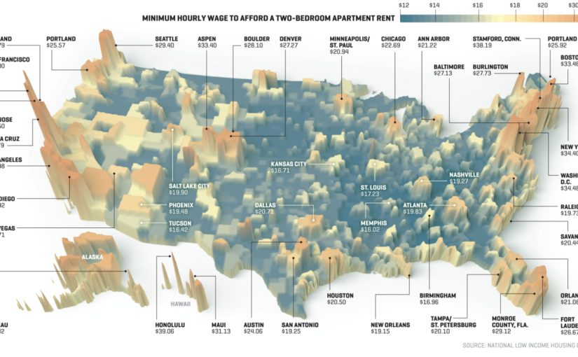
Nicholas Rapp and Matthew Heimer released a set of visualizations on Fortune this past December illustrating different metrics to understand the economic status of the American middle class amidst growing economic inequality. The map pictured above depicts the “housing wage,” or hourly wage needed by a renter to afford the rent for a 2-bedroom apartment at the Fair Market Rent (FMR) in different cities across the country.

The intended audience here is anyone who would consider themselves a member of the middle class. We know from recent studies that many more Americans believe themselves to be middle class than are in actuality, and this viz capitalizes on that outsized identification by not defining what it means by the “middle class” in income, employment, or other economic terms.

The goal of this project is to demonstrate just how economically burdened middle class Americans are as the rich grow richer. The additional graphs and charts shown in this feature show America’s “awkward global company” in being a highly unequal developed country, and how the economic standing of the American middle class has degraded over the years in terms of personal savings, retirement savings, and purchasing power.

Though I think the housing wage map is evocative, it left me with more questions than answers about the state of housing for the middle class in different US cities.  The housing wage is depicted by the height of the skyscraper over the city, which is not the clearest symbology visually: the differences do not render well across all cases, and are mostly useful in understanding the extreme outliers (San Francisco, Seattle, NYC, etc.). The color gradient is organized from low to high required hourly wages, which is logical, but the shades of blue and orange at the bottom and top of the gradient respectively are not so easily deciphered with the naked eye and comparing heights of skyscrapers for cities not geographically near one another is also challenging.

I would appreciate more context with this data, since its ultimate goal is to generalize across a class of people. Including data about how many residents achieve this hourly wage level would be helpful to understand how inclusive the housing market is of the middle class. The available documentation do not help in answering some of my questions because I have a feeling the data were compiled at different geographies (e.g. the map indicates cities, but Area Median Income (AMI) is measured at the metro level). While the map is no doubt beautiful, and is admirable for labeling large and small cities across the country (despite choosing symbology that best serves the outliers), I found its symbology more confusing than visually inventive.


Mass Incarceration in the U.S.

I came across Prison Policy Initiative’s Mass Incarceration: The Whole Piece 2018 whilst doing research for a project. The pie chart shows the no. of people incarcerated, where (types of facilities) they are incarcerated in, why they are incarcerated, demographics of people incarcerated, and whether they are convicted or not.

The visualization aims to offer up a comprehensive overview of the state of mass incarceration in the United States in a single chart. So much of the information surrounding mass incarceration is fragmented because different facilities are run by different government bodies and states i.e. federal prisons vs. state prisons vs. local jails. Without a comprehensive overview, it is hard to articulate the scale and scope of mass incarceration in the country and harder to make a case for the urgency required for criminal justice reform.

Prison Policy Initiative’s work is mostly targeted at researchers and policymakers but the visualizations are also intended for the general public.

I think this pie chart does a good job at providing a high-level, quick overview of the state of mass incarceration as it shows the distribution of incarcerated individuals across federal, state prisons and local jails and a broad breakdown of the offenses. It is also helpful having all of that information encapsulated within a single chart. However, it works as a double-edged sword. Whilst helpful for a quick introductory overview of mass incarceration, compressing all that data in one chart doesn’t leave room for nuances; offense categories are blanketed. From a design perspective, the use of colors is confusing; the bar on the right seems misplaced; the groupings of categories is not consistent i.e. the middle ring shows a breakdown of convicted vs. non-convicted persons in local jails whereas the same ring shows a breakdown of offenses in state prisons. Finally, the visualization is incomplete is illustrating the state of mass incarceration – it only shows a breakdown of people in correctional facilities but doesn’t account for almost 5 million on probation and parole.

Data on Who is Fighting Who in Syria

Link: http://www.slate.com/blogs/the_slatest/2015/10/06/syrian_conflict_relationships_explained.html

What data is being shown: The relationship between each “player” in the Syria conflict. The players are either countries/governments, alliances of countries, or militant groups. Relationship is represented as a categorical variable with the following categories: “Friends”, “It’s Complicated”, or “Enemies”.

Who you think the audience is: This presentation was published in 2015, four years after the conflict began in 2011, and shows the data in such a simplistic way. From this, one can infer it is meant for readers who haven’t been following the conflict in Syria and want to get up to speed about who is involved and where they stand with each other. It does have small explanations for each relationship if the reader chooses to mouse over a particular square in the chart, but it is not meant for someone who wants to know all the details or an in-depth analysis of the war. Additionally, it is probably meant mainly for Americans since it is written in English and refers to the “US and allies.”

What do you think the goals of the presentation are: Educate the public on a complicated issue that is prominent in a lot of U.S. military decisions. Since the issue is confusing with so many different players and interests, the presentation tries to make the information as accessible as possible so people will actually educate themselves on the conflict rather than give up because keeping track of all the details is a headache. Perhaps another goal or desired result of this goal is for people to make more informed decisions when they vote; however, this presentation seems objective and factual, so swaying political leanings is most likely not one of its goals.

Whether you think it is effective: I think it is effective because 1) it summarizes the complicated relationships in such a way that the audience can see everything laid out at once. This makes comparison easier and allows the audience to easy select the relationships they are interested in learning more about. 2) It has three color-coded categories and only displays words when the audience decides to learn more. This makes consuming the information simpler and more effective because the reader isn’t overwhelmed with text or too many icons to decipher. Overall, I think the presentation accomplishes the goal of educating people on the topic without giving them so much information that they can’t quickly synthesize or remember most of it.

Rethinking development in Latin America

This data presentation tries to portray how as Latin American and the Caribean has transitioned to become a middle-income region, it has failed to increase the size of its middle class. In the graphs, we can see the per capita Gross National Income on the y axis. On the x axis, we can find the percentage of the population living in poverty (less than $ 5.50), in a condition of vulnerability (between$ 5.50- $ 13.00) or who belong to the middle class ($ 13.00- $ 70.00), respectively.

We can observe how the percentage of people living in poverty has decreased. However, at the same time, the percentage of people living in vulnerable conditions has increased. This suggests that, while households have managed to escape from poverty, their economic security is far from being achieved. The goal of this data is to provide a more nuanced perspective on the economic development that the region has experienced.

The audience should be people interested in the region. Probably, it would include people with a background in economics, public policy or international development. This data can be interesting for different types of audiences, including students, government officials, grassroots organizations and in general people with specific interest in the region.

I like that the visualization provides information for several years. Seeing how the data points move around the different graphs made me pay more attention and had a better idea of the evolution of the variables through time.

Link to graphic

How World Economy Has Changed?

This is a powerful data visualization showing how the top 10 countries in GDP ranking has changed for 1960 – 2017. Basically it’s a simple bar chart but presented in a short video, which makes the presentation more dynamic. You can see US has been dominant for the entire period, Japan grew dramatically in 80s and 90s before it got stagnant, and recently China has grown remarkably. Since this is shared in YouTube and presented in a really simple way, the audience can be anyone interested in the world economy. The goal of this visualization looks really broad and I guess it is to attract many viewers by showing how the world economy has changed over the past 60 years in an interesting way.

I think this is effective in showing the change over the period in a dynamic way. Although the same message can be conveyed by putting different bar charts at different years, this visualization gives more vivid impression. On the other hand, the main message of this video can be focused better. I feel the chart uses too many colors and three minutes is too long. By highlighting charts of some specific countries, the main message of this presentation might be clearer and become more effective.